PGFPlots Gallery
The following graphics have been generated with the LaTeX Packages PGFPlots and PGFPlotsTable.
They have been extracted from the reference manuals.
PGFPlots Home
[.tex]
[.pdf]
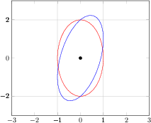
\begin{tikzpicture}
\begin{axis}[
xmin=-3, xmax=3,
ymin=-3, ymax=3,
extra x ticks={-1,1},
extra y ticks={-2,2},
extra tick style={grid=major},
]
\draw[red] \pgfextra{
\pgfpathellipse{\pgfplotspointaxisxy{0}{0}}
{\pgfplotspointaxisdirectionxy{1}{0}}
{\pgfplotspointaxisdirectionxy{0}{2}}
% see also the documentation of
% 'axis direction cs' which
% allows a simpler way to draw this ellipse
};
\draw[blue] \pgfextra{
\pgfpathellipse{\pgfplotspointaxisxy{0}{0}}
{\pgfplotspointaxisdirectionxy{1}{1}}
{\pgfplotspointaxisdirectionxy{0}{2}}
};
\addplot [only marks,mark=*] coordinates { (0,0) };
\end{axis}
\end{tikzpicture}
[.tex]
[.pdf]
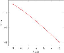
\begin{tikzpicture}
\begin{axis}[
xlabel=Cost,
ylabel=Error]
\addplot[color=red,mark=x] coordinates {
(2,-2.8559703)
(3,-3.5301677)
(4,-4.3050655)
(5,-5.1413136)
(6,-6.0322865)
(7,-6.9675052)
(8,-7.9377747)
};
\end{axis}
\end{tikzpicture}
[.tex]
[.pdf]
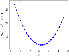
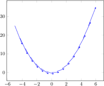
\begin{tikzpicture}
\begin{axis}[
xlabel=$x$,
ylabel={$f(x) = x^2 - x +4$}
]
% use TeX as calculator:
\addplot {x^2 - x +4};
\end{axis}
\end{tikzpicture}
[.tex]
[.pdf]
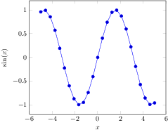
\begin{tikzpicture}
\begin{axis}[
xlabel=$x$,
ylabel=$\sin(x)$
]
% invoke external gnuplot as
% calculator:
\addplot gnuplot[id=sin]{sin(x)};
\end{axis}
\end{tikzpicture}
[.tex]
[.pdf]
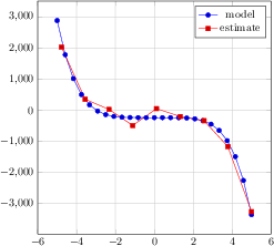
\begin{tikzpicture}
\begin{axis}[
height=9cm,
width=9cm,
grid=major,
]
\addplot {-x^5 - 242};
\addlegendentry{model}
\addplot coordinates {
(-4.77778,2027.60977)
(-3.55556,347.84069)
(-2.33333,22.58953)
(-1.11111,-493.50066)
(0.11111,46.66082)
(1.33333,-205.56286)
(2.55556,-341.40638)
(3.77778,-1169.24780)
(5.00000,-3269.56775)
};
\addlegendentry{estimate}
\end{axis}
\end{tikzpicture}
[.tex]
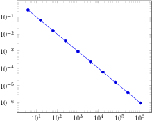
[.pdf]
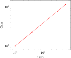
\begin{tikzpicture}
\begin{loglogaxis}[xlabel=Cost,ylabel=Gain]
\addplot[color=red,mark=x] coordinates {
(10,100)
(20,150)
(40,225)
(80,340)
(160,510)
(320,765)
(640,1150)
};
\end{loglogaxis}
\end{tikzpicture}

[.tex]
[.pdf]
\begin{tikzpicture}
\begin{loglogaxis}[
xlabel=Cost,
ylabel=Error]
\addplot[color=red,mark=x] coordinates {
(5, 8.31160034e-02)
(17, 2.54685628e-02)
(49, 7.40715288e-03)
(129, 2.10192154e-03)
(321, 5.87352989e-04)
(769, 1.62269942e-04)
(1793, 4.44248889e-05)
(4097, 1.20714122e-05)
(9217, 3.26101452e-06)
};
\addplot[color=blue,mark=*]
table[x=Cost,y=Error] {pgfplots.testtable};
\legend{Case 1,Case 2}
\end{loglogaxis}
\end{tikzpicture}
[.tex]
[.pdf]
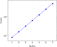
\begin{tikzpicture}
\begin{semilogyaxis}[
xlabel=Index,ylabel=Value]
\addplot[color=blue,mark=*] coordinates {
(1,8)
(2,16)
(3,32)
(4,64)
(5,128)
(6,256)
(7,512)
};
\end{semilogyaxis}%
\end{tikzpicture}%
[.tex]
[.pdf]
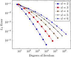
\begin{tikzpicture}
\begin{loglogaxis}[
xlabel={Degrees of freedom},
ylabel={$L_2$ Error}
]
\addplot coordinates {
(5,8.312e-02) (17,2.547e-02) (49,7.407e-03)
(129,2.102e-03) (321,5.874e-04) (769,1.623e-04)
(1793,4.442e-05) (4097,1.207e-05) (9217,3.261e-06)
};
\addplot coordinates{
(7,8.472e-02) (31,3.044e-02) (111,1.022e-02)
(351,3.303e-03) (1023,1.039e-03) (2815,3.196e-04)
(7423,9.658e-05) (18943,2.873e-05) (47103,8.437e-06)
};
\addplot coordinates{
(9,7.881e-02) (49,3.243e-02) (209,1.232e-02)
(769,4.454e-03) (2561,1.551e-03) (7937,5.236e-04)
(23297,1.723e-04) (65537,5.545e-05) (178177,1.751e-05)
};
\addplot coordinates{
(11,6.887e-02) (71,3.177e-02) (351,1.341e-02)
(1471,5.334e-03) (5503,2.027e-03) (18943,7.415e-04)
(61183,2.628e-04) (187903,9.063e-05) (553983,3.053e-05)
};
\addplot coordinates{
(13,5.755e-02) (97,2.925e-02) (545,1.351e-02)
(2561,5.842e-03) (10625,2.397e-03) (40193,9.414e-04)
(141569,3.564e-04) (471041,1.308e-04) (1496065,4.670e-05)
};
\legend{$d=2$,$d=3$,$d=4$,$d=5$,$d=6$}
\end{loglogaxis}
\end{tikzpicture}

[.tex]
[.pdf]
\begin{tikzpicture}
\begin{loglogaxis}[clickable coords=
{Level \thisrow{level} (q=\thisrow{q})}]
\addplot table[x=dof,y=error] {
level dof error q
1 4 2.50000000e-01 48
2 16 6.25000000e-02 25
3 64 1.56250000e-02 41
4 256 3.90625000e-03 8
5 1024 9.76562500e-04 22
6 4096 2.44140625e-04 46
7 16384 6.10351562e-05 40
8 65536 1.52587891e-05 3
9 262144 3.81469727e-06 1
10 1048576 9.53674316e-07 9
};
\end{loglogaxis}
\end{tikzpicture}

[.tex]
[.pdf]
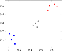
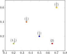
\begin{tikzpicture}
\begin{axis}[%
clickable coords={(xy): \thisrow{label}},%
scatter/classes={%
a={mark=square*,blue},%
b={mark=triangle*,red},%
c={mark=o,draw=black}}]
\addplot[scatter,only marks,%
scatter src=explicit symbolic]%
table[meta=label] {
x y label
0.1 0.15 a
0.45 0.27 c
0.02 0.17 a
0.06 0.1 a
0.9 0.5 b
0.5 0.3 c
0.85 0.52 b
0.12 0.05 a
0.73 0.45 b
0.53 0.25 c
0.76 0.5 b
0.55 0.32 c
};
\end{axis}
\end{tikzpicture}
[.tex]
[.pdf]
\begin{tikzpicture}
\begin{loglogaxis}[clickable coords code={%
\pgfmathprintnumberto[verbatim,precision=1]%
{\thisrow{error}}%
\error%
\pgfmathprintnumberto[verbatim,frac]%
{\thisrow{frac}}%
\fraccomp%
\edef\pgfplotsretval{error \error, R=\fraccomp}%
}]%
\addplot table[x=dof,y=error] {
level dof error frac
1 4 2.50000000e-01 0.5
2 16 6.25000000e-02 0.75
3 64 1.56250000e-02 0.1
4 256 3.90625000e-03 0.2
5 1024 9.76562500e-04 0.5
6 4096 2.44140625e-04 0.8
7 16384 6.10351562e-05 0.125
8 65536 1.52587891e-05 0.725
9 262144 3.81469727e-06 0.625
10 1048576 9.53674316e-07 1
};
\end{loglogaxis}
\end{tikzpicture}
[.tex]
[.pdf]
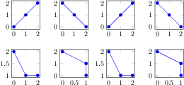
% Example using groupplots library
\begin{tikzpicture}
\begin{groupplot}[group style={group size=2 by 2},height=3cm,width=3cm]
\nextgroupplot
\addplot coordinates {(0,0) (1,1) (2,2)};
\nextgroupplot
\addplot coordinates {(0,2) (1,1) (2,0)};
\nextgroupplot
\addplot coordinates {(0,2) (1,1) (2,1)};
\nextgroupplot
\addplot coordinates {(0,2) (1,1) (1,0)};
\end{groupplot}
\end{tikzpicture}
% Same example created as done without the library
\begin{tikzpicture}
\begin{axis}[name=plot1,height=3cm,width=3cm]
\addplot coordinates {(0,0) (1,1) (2,2)};
\end{axis}
\begin{axis}[name=plot2,at={($(plot1.east)+(1cm,0)$)},anchor=west,height=3cm,width=3cm]
\addplot coordinates {(0,2) (1,1) (2,0)};
\end{axis}
\begin{axis}[name=plot3,at={($(plot1.south)-(0,1cm)$)},anchor=north,height=3cm,width=3cm]
\addplot coordinates {(0,2) (1,1) (2,1)};
\end{axis}
\begin{axis}[name=plot4,at={($(plot2.south)-(0,1cm)$)},anchor=north,height=3cm,width=3cm]
\addplot coordinates {(0,2) (1,1) (1,0)};
\end{axis}
\end{tikzpicture}
[.tex]
[.pdf]
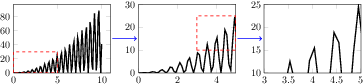
\begin{tikzpicture}
\begin{groupplot}[group style={group size=3 by 1},xmin=0,ymin=0,height=4cm,width=5cm,no markers]
\nextgroupplot
\addplot[very thick] file {plotdata/group-1.dat};
\draw[red,dashed,thick] (axis cs:0,0) rectangle (axis cs:5,30);
\nextgroupplot[xmax=5,ymax=30]
\addplot[very thick] file {plotdata/group-1.dat};
\draw[red,dashed,thick] (axis cs:3,10) rectangle (axis cs:5,25);
\nextgroupplot[xmin=3,xmax=5,ymin=10,ymax=25]
\addplot[very thick] file {plotdata/group-1.dat};
\end{groupplot}
\draw[thick,blue,->,shorten >=2pt,shorten <=2pt]
(group c1r1.east) -- (group c2r1.west);
\draw[thick,blue,->,shorten >=2pt,shorten <=2pt]
(group c2r1.east) -- (group c3r1.west);
\end{tikzpicture}
[.tex]
[.pdf]
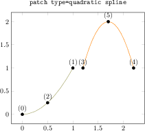
\begin{tikzpicture}
\begin{axis}[nodes near coords={(\coordindex)},
title={\texttt{patch type=quadratic spline}}]
\addplot[
mark=*,
patch,mesh,% without mesh, pgfplots tries to fill
patch type=quadratic spline]
coordinates {
% left, right, middle-> first segment
(0,0) (1,1) (0.5,0.5^2)
% left, right, middle-> second segment
(1.2,1) (2.2,1) (1.7,2)
};
\end{axis}
\end{tikzpicture}
[.tex]
[.pdf]
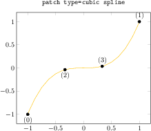
\begin{tikzpicture}
\begin{axis}[nodes near coords={(\coordindex)},
title={\texttt{patch type=cubic spline}}]
\addplot[
mark=*,
patch,mesh,
patch type=cubic spline]
coordinates {
% left, right, left middle, right middle
(-1,-1)
(1,1)
(-1/3,{(-1/3)^3})
(1/3,{(1/3)^3})
};
\end{axis}
\end{tikzpicture}
[.tex]
[.pdf]
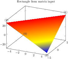
\begin{tikzpicture}
\begin{axis}[nodes near coords={(\coordindex)},
title=Rectangle from matrix input]
% note that surf implies 'patch type=rectangle'
\addplot3[surf,shader=interp,samples=2,
patch type=rectangle]
{x*y};
\end{axis}
\end{tikzpicture}
[.tex]
[.pdf]
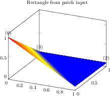
\begin{tikzpicture}
\begin{axis}[nodes near coords={(\coordindex)},
title=Rectangle from patch input]
\addplot3[patch,shader=interp,patch type=rectangle] coordinates {
(0,0,1) (1,0,0) (1,1,0) (0,1,0)
};
\end{axis}
\end{tikzpicture}
[.tex]
[.pdf]
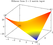
\begin{tikzpicture}
\begin{axis}[nodes near coords={(\coordindex)},
title=Bilinear from $2\times 2$ matrix input]
% note that surf implies 'patch type=rectangle'
\addplot3[surf,shader=interp,samples=2,
patch type=bilinear]
{x*y};
\end{axis}
\end{tikzpicture}
[.tex]
[.pdf]
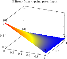
\begin{tikzpicture}
\begin{axis}[nodes near coords={(\coordindex)},
title=Bilinear from $4$--point patch input]
\addplot3[patch,shader=interp,patch type=bilinear]
coordinates {
(0,0,1) (1,0,0) (1,1,0) (0,1,0)
};
\end{axis}
\end{tikzpicture}
[.tex]
[.pdf]
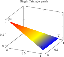
\begin{tikzpicture}
\begin{axis}[enlargelimits,
nodes near coords={(\coordindex)},
title=Single Triangle patch]
\addplot3[patch,shader=interp] coordinates {
(0,0,1)
(1,0,0)
(1,1,0)
};
\end{axis}
\end{tikzpicture}
[.tex]
[.pdf]
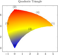
\begin{tikzpicture}
\begin{axis}[nodes near coords={(\coordindex)},
title=Quadratic Triangle]
\addplot[patch,patch type=triangle quadr,
shader=interp,point meta=explicit]
coordinates {
(0,0) [1] (5,4) [2] (0,7) [3]
(2,3) [1] (3,6) [2] (-1,4) [3]
};
\end{axis}
\end{tikzpicture}
[.tex]
[.pdf]
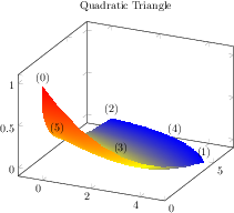
\begin{tikzpicture}
\begin{axis}[nodes near coords={(\coordindex)},
title=Quadratic Triangle]
\addplot3[patch,patch type=triangle quadr,
shader=interp]
coordinates {
(0,0,1) (5,4,0) (0,7,0)
(2,3,0) (3,6,0) (-1,4,0)
};
\end{axis}
\end{tikzpicture}
[.tex]
[.pdf]
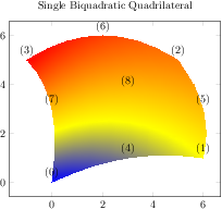
\begin{tikzpicture}
\begin{axis}[nodes near coords={(\coordindex)},
title=Single Biquadratic Quadrilateral]
\addplot[patch,patch type=biquadratic,
shader=interp,point meta=explicit]
coordinates {
(0,0) [1] (6,1) [2] (5,5) [3] (-1,5) [4]
(3,1) [1] (6,3) [2] (2,6) [3] (0,3) [4]
(3,3.75) [4]
};
\end{axis}
\end{tikzpicture}
[.tex]
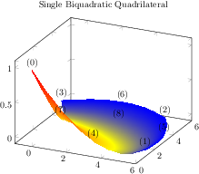
[.pdf]
\begin{tikzpicture}
\begin{axis}[nodes near coords={(\coordindex)},
title=Single Biquadratic Quadrilateral]
\addplot3[patch,patch type=biquadratic,shader=interp]
coordinates {
(0,0,1) (6,1,0) (5,5,0) (-1,5,0)
(3,1,0) (6,3,0) (2,6,0) (0,3,0)
(3,3.75,0)
};
\end{axis}
\end{tikzpicture}
[.tex]
[.pdf]
\begin{tikzpicture}
\begin{axis}
\addplot3[patch,patch refines=3,
shader=faceted interp,
patch type=biquadratic]
table[z expr=x^2-y^2]
{
x y
-2 -2
2 -2
2 2
-2 2
0 -2
2 0
0 2
-2 0
0 0
};
\end{axis}
\end{tikzpicture}
[.tex]
[.pdf]
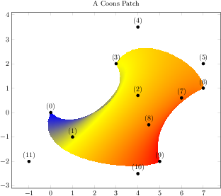
\begin{tikzpicture}
\begin{axis}[nodes near coords={(\coordindex)},
width=12cm,
title=A Coons Patch]
\addplot[mark=*,patch,patch type=coons,
shader=interp,point meta=explicit]
coordinates {
(0,0) [0] % first corner
(1,-1) [0] % Bezier control point between (0) and (3)
(4,0.7) [0] % Bezier control point between (0) and (3)
%
(3,2) [1] % second corner
(4,3.5) [1] % Bezier control point between (3) and (6)
(7,2) [1] % Bezier control point between (3) and (6)
%
(7,1) [2] % third corner
(6,0.6) [2] % Bezier control point between (6) and (9)
(4.5,-0.5) [2] % Bezier control point between (6) and (9)
%
(5,-2) [3] % fourth corner
(4,-2.5) [3] % Bezier control point between (9) and (0)
(-1,-2) [3] % Bezier control point between (9) and (0)
};
\end{axis}
\end{tikzpicture}
[.tex]
[.pdf]
\begin{tikzpicture}
\begin{axis}[view/h=120,xlabel=$x$,ylabel=$y$]
\addplot3[
opacity=0.5,
table/row sep=\\,
patch,
patch type=polygon,
vertex count=5,
patch table with point meta={%
% pt1 pt2 pt3 pt4 pt5 cdata
0 1 7 2 2 0\\
1 6 5 5 5 1\\
1 5 4 2 7 2\\
2 4 3 3 3 3\\
}]
table {
x y z\\
0 2 0\\%0
2 2 0\\%1
0 1 3\\%2
0 0 3\\%3
1 0 3\\%4
2 0 2\\%5
2 0 0\\%6
1 1 2\\%7
};
% replicate the vertex list to show \coordindex:
\addplot3[only marks,nodes near coords=\coordindex]
table[row sep=\\] {
0 2 0\\ 2 2 0\\ 0 1 3\\ 0 0 3\\
1 0 3\\ 2 0 2\\ 2 0 0\\ 1 1 2\\
};
\end{axis}
\end{tikzpicture}
[.tex]
[.pdf]
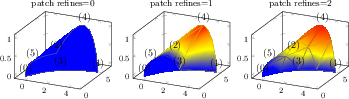
\foreach \level in {0,1,2} {%
\begin{tikzpicture}
\begin{axis}[
nodes near coords={(\coordindex)},
footnotesize,
title={patch refines=\level}]
\addplot3[patch,patch type=triangle quadr,
shader=faceted interp,patch refines=\level]
coordinates {
(0,0,0) (5,4,0) (0,7,0)
(2,3,0) (3,6,1) (-1,4,0)
};
\end{axis}
\end{tikzpicture}
}
[.tex]
[.pdf]
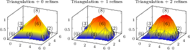
\foreach \level in {0,1,2} {%
\begin{tikzpicture}
\begin{axis}[
nodes near coords={(\coordindex)},
footnotesize,
title={Triangulation + \level\ refines}]
\addplot3[patch,patch type=biquadratic,shader=faceted interp,
patch to triangles,patch refines=\level]
coordinates {
(0,0,0) (6,1,0) (5,5,0) (-1,5,0)
(3,1,0) (6,3,0) (2,6,0) (0,3,0)
(3,3.75,1)
};
\end{axis}
\end{tikzpicture}%
}
[.tex]
[.pdf]
\foreach \level in {0,1,2} {%
\begin{tikzpicture}
\begin{axis}[
footnotesize,
title={Faceted + \level\ refines}]
\addplot3[patch,patch type=biquadratic,shader=faceted,
patch refines=\level]
coordinates {
(0,0,1) (6,1,0) (5,5,0) (-1,5,0)
(3,1,0) (6,3,0) (2,6,0) (0,3,0)
(3,3.75,0)
};
\end{axis}
\end{tikzpicture}
}
[.tex]
[.pdf]
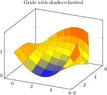
\begin{tikzpicture}
\begin{axis}[
title={Grids with shader=faceted}]
\addplot3[patch,patch type=biquadratic,
shader=faceted,patch refines=3]
coordinates {
(0,0,1) (6,1,1.6) (5,5,1.3) (-1,5,0)
(3,1,0) (6,3,0.4) (2,6,1.1) (0,3,0.9)
(3,3.75,0.5)
};
\end{axis}
\end{tikzpicture}
[.tex]
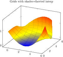
[.pdf]
\begin{tikzpicture}
\begin{axis}[
title={Grids with shader=faceted interp}]
\addplot3[patch,patch type=biquadratic,
shader=faceted interp,patch refines=3]
coordinates {
(0,0,1) (6,1,1.6) (5,5,1.3) (-1,5,0)
(3,1,0) (6,3,0.4) (2,6,1.1) (0,3,0.9)
(3,3.75,0.5)
};
\end{axis}
\end{tikzpicture}
[.tex]
[.pdf]
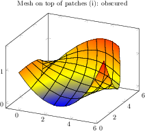
\begin{tikzpicture}
\begin{axis}[
title={Mesh on top of patches (i): obscured}]
\addplot3[patch,patch type=biquadratic,shader=interp,
patch refines=3]
coordinates {
(0,0,1) (6,1,1.6) (5,5,1.3) (-1,5,0)
(3,1,0) (6,3,0.4) (2,6,1.1) (0,3,0.9)
(3,3.75,0.5)
};
\addplot3[patch,patch type=biquadratic,mesh,black,
patch refines=3]
coordinates {
(0,0,1) (6,1,1.6) (5,5,1.3) (-1,5,0)
(3,1,0) (6,3,0.4) (2,6,1.1) (0,3,0.9)
(3,3.75,0.5)
};
\end{axis}
\end{tikzpicture}
[.tex]
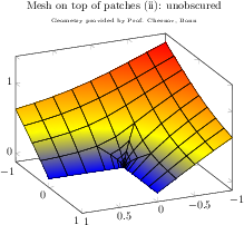
[.pdf]
\begin{tikzpicture}
\begin{axis}[
title={Mesh on top of patches (ii): unobscured\\
\tiny Geometry provided by Prof. Chernov, Bonn},
title style={align=center},
view={156}{28}]
\addplot3[patch,patch type=bilinear,
shader=interp,
patch table=plotdata/patchexample_conn.dat]
file {plotdata/patchexample_verts.dat};
\addplot3[patch,patch type=bilinear,
mesh,black,
patch table=plotdata/patchexample_conn.dat]
file {plotdata/patchexample_verts.dat};
\end{axis}
\end{tikzpicture}
[.tex]
[.pdf]
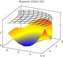
\begin{tikzpicture}
\begin{axis}[
title={Separate Grids (iii)}]
\addplot3[patch,patch type=biquadratic,shader=interp,
patch refines=3]
coordinates {
(0,0,1) (6,1,1.6) (5,5,1.3) (-1,5,0)
(3,1,0) (6,3,0.4) (2,6,1.1) (0,3,0.9)
(3,3.75,0.5)
};
\addplot3[patch,patch type=biquadratic,
mesh,black,
z filter/.code={\def\pgfmathresult{1.8}},
patch refines=3]
coordinates {
(0,0,1) (6,1,1.6) (5,5,1.3) (-1,5,0)
(3,1,0) (6,3,0.4) (2,6,1.1) (0,3,0.9)
(3,3.75,0.5)
};
\end{axis}
\end{tikzpicture}
[.tex]
[.pdf]
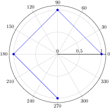
\begin{tikzpicture}
\begin{polaraxis}
\addplot coordinates {(0,1) (90,1)
(180,1) (270,1)};
\end{polaraxis}
\end{tikzpicture}
[.tex]
[.pdf]
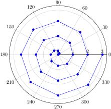
\begin{tikzpicture}
\begin{polaraxis}
\addplot+[domain=0:3] (360*x,x); % (angle,radius)
\end{polaraxis}
\end{tikzpicture}
[.tex]
[.pdf]
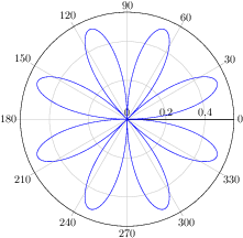
\begin{tikzpicture}
\begin{polaraxis}
\addplot+[mark=none,domain=0:720,samples=600]
{sin(2*x)*cos(2*x)};
% equivalent to (x,{sin(..)cos(..)}), i.e.
% the expression is the RADIUS
\end{polaraxis}
\end{tikzpicture}
[.tex]
[.pdf]
\begin{tikzpicture}
\begin{polaraxis}[
xtick={0,90,180,270},
title=A polar axis]
\addplot coordinates {(0,1) (45,1)};
\addlegendentry{First}
\addplot coordinates {(180,0.5) (0,0)};
\addlegendentry{Second}
\end{polaraxis}
\end{tikzpicture}
[.tex]
[.pdf]
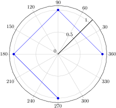
\begin{tikzpicture}
\begin{polaraxis}[title={Degrees and/or Radians}]
\addplot
coordinates {(0,1) (90,1) (180,1) (270,1)};
\addlegendentry{Deg}
\addplot+[data cs=polarrad]
coordinates {(0,1.5) (pi/2,1.5)
(pi,1.5) (pi*3/2,1.5)};
\addlegendentry{Rad}
\end{polaraxis}
\end{tikzpicture}
[.tex]
[.pdf]
\begin{tikzpicture}
\begin{polaraxis}[title=Cartesian Input]
\addplot+[data cs=cart]
coordinates {(1,0) (0,1) (-1,0) (0,-1)};
\end{polaraxis}
\end{tikzpicture}
[.tex]
[.pdf]
\begin{tikzpicture}
\begin{polaraxis}
\addplot3[contour gnuplot,domain=-3:3,
data cs=cart]
{exp(-x^2-y^2)};
\end{polaraxis}
\end{tikzpicture}
[.tex]
[.pdf]
\begin{tikzpicture}
\begin{polaraxis}
\addplot+[polar comb]
coordinates {(300,1) (20,0.3) (40,0.5)
(120,1) (200,0.4)};
\end{polaraxis}
\end{tikzpicture}
[.tex]
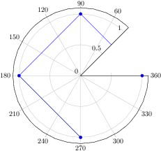
[.pdf]
\begin{tikzpicture}
\begin{polaraxis}[xmin=45,xmax=360]
\addplot coordinates {(0,1) (90,1) (180,1) (270,1)};
\end{polaraxis}
\end{tikzpicture}
[.tex]
[.pdf]
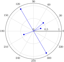
\begin{tikzpicture}
\begin{polaraxis}[xmin=90,xmax=270]
\addplot coordinates {(0,1) (90,1) (180,1) (270,1)};
\end{polaraxis}
\end{tikzpicture}~%
\begin{tikzpicture}
\begin{polaraxis}[xmin=270,xmax=420]
\addplot coordinates {(0,1) (90,1) (180,1) (270,1)};
\end{polaraxis}
\end{tikzpicture}
[.tex]
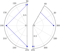
[.pdf]
\begin{tikzpicture}
\begin{polaraxis}[ymin=0.3]
\addplot coordinates {(0,1) (90,1)
(180,1) (270,1)};
\end{polaraxis}
\end{tikzpicture}
[.tex]
[.pdf]
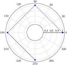
\begin{tikzpicture}
\begin{polaraxis}[xmin=45,xmax=405]
\addplot coordinates {(0,1) (90,1) (180,1) (270,1)};
\end{polaraxis}
\end{tikzpicture}
[.tex]
[.pdf]
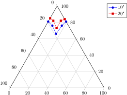
\begin{tikzpicture}
\begin{ternaryaxis}
\addplot3 coordinates {
(0.81, 0.19, 0.00)
(0.76, 0.17, 0.07)
(0.66, 0.16, 0.16)
(0.76, 0.07, 0.17)
(0.81, 0.00, 0.19)
};
\addplot3 coordinates {
(0.85, 0.15, 0.00)
(0.82, 0.13, 0.05)
(0.73, 0.14, 0.13)
(0.82, 0.06, 0.13)
(0.84, 0.00, 0.16)
};
\legend{$10$\textdegree, $20$\textdegree}
\end{ternaryaxis}
\end{tikzpicture}
[.tex]
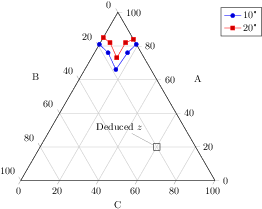
[.pdf]
\begin{tikzpicture}
\begin{ternaryaxis}[xlabel=A,ylabel=B,zlabel=C]
\addplot3 coordinates {
(0.81, 0.19, 0.00)
(0.76, 0.17, 0.07)
(0.66, 0.16, 0.16)
(0.76, 0.07, 0.17)
(0.81, 0.00, 0.19)
};
\addplot3 coordinates {
(0.85, 0.15, 0.00)
(0.82, 0.13, 0.05)
(0.73, 0.14, 0.13)
(0.82, 0.06, 0.13)
(0.84, 0.00, 0.16)
};
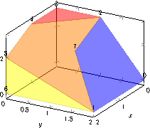
\node[pin=130:Deduced $z$,draw=black] at (axis cs:0.2,0.2) {};
\legend{$10$\textdegree, $20$\textdegree}
\end{ternaryaxis}
\end{tikzpicture}
[.tex]
[.pdf]
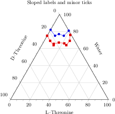
\begin{tikzpicture}
\begin{ternaryaxis}[
title=Sloped labels and minor ticks,
xlabel=Water,
ylabel=D--Threonine,
zlabel=L--Threonine,
label style={sloped},
minor tick num=2,
]
\addplot3 coordinates {
(0.82, 0.18, 0.00)
(0.75, 0.17, 0.08)
(0.77, 0.12, 0.11)
(0.75, 0.08, 0.17)
(0.81, 0.00, 0.19)
};
\addplot3 coordinates {
(0.75, 0.25, 0.00)
(0.69, 0.25, 0.06)
(0.64, 0.24, 0.12)
(0.655, 0.23, 0.115)
(0.67, 0.17, 0.16)
(0.66, 0.12, 0.22)
(0.64, 0.11, 0.25)
(0.69, 0.05, 0.26)
(0.76, 0.01, 0.23)
};
\end{ternaryaxis}
\end{tikzpicture}
[.tex]
[.pdf]
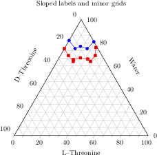
\begin{tikzpicture}
\begin{ternaryaxis}[
title=Sloped labels and minor grids,
xlabel=Water,
ylabel=D--Threonine,
zlabel=L--Threonine,
label style={sloped},
minor tick num=2,
grid=both,
]
\addplot3 coordinates {
(0.82, 0.18, 0.00)
(0.75, 0.17, 0.08)
(0.77, 0.12, 0.11)
(0.75, 0.08, 0.17)
(0.81, 0.00, 0.19)
};
\addplot3 coordinates {
(0.75, 0.25, 0.00)
(0.69, 0.25, 0.06)
(0.64, 0.24, 0.12)
(0.655, 0.23, 0.115)
(0.67, 0.17, 0.16)
(0.66, 0.12, 0.22)
(0.64, 0.11, 0.25)
(0.69, 0.05, 0.26)
(0.76, 0.01, 0.23)
};
\end{ternaryaxis}
\end{tikzpicture}
[.tex]
[.pdf]
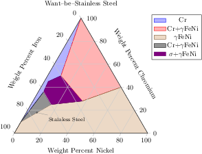
\begin{tikzpicture}
\begin{ternaryaxis}[
title=Want--be--Stainless Steel,
xlabel=Weight Percent Chromium,
ylabel=Weight Percent Iron,
zlabel=Weight Percent Nickel,
label style=sloped,
area style,
]
\addplot3 table {
A B C
1 0 0
0.5 0.4 0.1
0.45 0.52 0.03
0.36 0.6 0.04
0.1 0.9 0
};
\addlegendentry{Cr}
\addplot3 table {
A B C
1 0 0
0.5 0.4 0.1
0.28 0.35 0.37
0.4 0 0.6
};
\addlegendentry{Cr+$\gamma$FeNi}
\addplot3 table {
0.4 0 0.6
0.28 0.35 0.37
0.25 0.6 0.15
0.1 0.9 0
0 1 0
0 0 1
};
\addlegendentry{$\gamma$FeNi}
\addplot3 table {
0.1 0.9 0
0.36 0.6 0.04
0.25 0.6 0.15
};
\addlegendentry{Cr+$\gamma$FeNi}
\addplot3 table {
0.5 0.4 0.1
0.45 0.52 0.03
0.36 0.6 0.04
0.25 0.6 0.15
0.28 0.35 0.37
};
\addlegendentry{$\sigma$+$\gamma$FeNi}
\node[inner sep=0.5pt,circle,draw,fill=white,pin=-15:\footnotesize Stainless Steel]
at (axis cs:0.18,0.74,0.08) {};
\end{ternaryaxis}
\end{tikzpicture}
[.tex]
[.pdf]
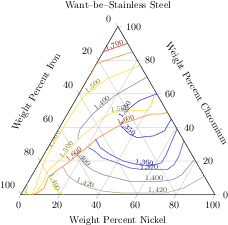
\begin{tikzpicture}
\begin{ternaryaxis}[
title=Want--be--Stainless Steel,
xlabel=Weight Percent Chromium,
ylabel=Weight Percent Iron,
zlabel=Weight Percent Nickel,
label style=sloped,
]
% plotdata/pgfplotsternary.example1.dat:
%
% Chromium Iron Nickel Temperature
% 0.90 0.0 0.10 1700
% 0.85 0.14 0.00 1700
%
% 0.85 0.00 0.15 1600
% 0.78 0.22 0.00 1600
% 0.71 0.29 0.00 1600
% ....
\addplot3[contour prepared={labels over line},
point meta=\thisrow{Temperature}]
table[x=Chromium,y=Iron,z=Nickel]
{plotdata/pgfplotsternary.example1.dat};
\end{ternaryaxis}
\end{tikzpicture}
[.tex]
[.pdf]
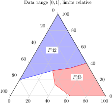
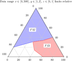
\begin{tikzpicture}
\begin{ternaryaxis}[
ternary limits relative,
title={Data range $[0,1]$, limits relative},
area style]
\addplot3 coordinates {
(0.2,0.8,0)
(0.31,0.4,0.29)
(0.34,0.2,0.46)
(0.4,0,0.6)
(1,0,0)
};
\addplot3 coordinates {
(0.4,0,0.6)
(0.34,0.2,0.46)
(0.31,0.4,0.29)
(0.14,0.46,0.4)
(0,0.37,0.63)
(0,0,1)
};
\node[fill=white]
at (axis cs:0.56,0.28,0.16) {$F 42$};
\node[fill=white]
at (0.7,0.2) {$F 43$};
\end{ternaryaxis}
\end{tikzpicture}
[.tex]
[.pdf]
\begin{tikzpicture}
\begin{ternaryaxis}[
xmax=500,ymin=1,ymax=2,
ternary limits relative,
title={Data range $x\in[0,500]$,
$y\in[1,2]$, $z\in[0,1]$ limits relative},
area style]
\addplot3 coordinates {
(100,1.8,0)
(155,1.4,0.29)
(170,1.2,0.46)
(200,1,0.6)
(500,1,0)
};
\addplot3 coordinates {
(200,1,0.6)
(170,1.2,0.46)
(155,1.4,0.29)
(70,1.46,0.4)
(0,1.37,0.63)
(0,1,1)
};
\node[fill=white]
at (axis cs:280,1.28,0.16) {$F 42$};
\node[fill=white]
at (0.7,0.2) {$F 43$};
\end{ternaryaxis}
\end{tikzpicture}
[.tex]
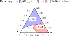
[.pdf]
\begin{tikzpicture}
\begin{ternaryaxis}[
ternary limits relative=false,
xmax=500,ymin=1,ymax=2,
title={Data range $x\in[0,500]$,
$y\in[1,2]$, $z\in[0,1]$ limits absolute},
footnotesize, % just for the sake of demonstration...
area style]
\addplot3 coordinates {
(100,1.8,0)
(155,1.4,0.29)
(170,1.2,0.46)
(200,1,0.6)
(500,1,0)
};
\addplot3 coordinates {
(200,1,0.6)
(170,1.2,0.46)
(155,1.4,0.29)
(70,1.46,0.4)
(0,1.37,0.63)
(0,1,1)
};
\node[fill=white]
at (axis cs:280,1.28,0.16) {$F 42$};
\node[fill=white]
at (0.7,0.2) {$F 43$};
\end{ternaryaxis}
\end{tikzpicture}
[.tex]
[.pdf]
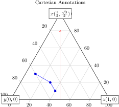
\begin{tikzpicture}
\begin{ternaryaxis}[
title=Cartesian Annotations,
clip=false]
\addplot3 coordinates {
(0.1,0.5,0.4)
(0.2,0.5,0.3)
(0.3,0.6,0.1)
};
\node[fill=white,draw] at (0,0) {$y (0,0)$};
\node[fill=white,draw] at (1,0) {$z (1,0)$};
\node[fill=white,draw] at (0.5,{sqrt(3)/2})
{$x (\frac12,\frac{\sqrt3}{2})$};
\draw[red,-stealth] (0.5,0) -- (0.5,0.7);
\end{ternaryaxis}
\end{tikzpicture}
[.tex]
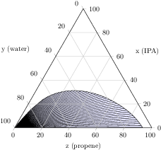
[.pdf]
\begin{tikzpicture}
\begin{ternaryaxis}[
xlabel=x (IPA),
ylabel=y (water),
zlabel=z (propene),
axis on top,
]
% plotdata/ternary_data.txt is a table of the form
%A_propene A_water A_IPA B_propene B_water B_IPA
% 0.0009 0.9990 0 0.9333 0.0667 0
% 0.0009 0.9988 0.0002 0.9303 0.0665 0.0032
% 0.0011 0.9975 0.0013 0.9135 0.0673 0.0191
% 0.0013 0.9962 0.0024 0.8956 0.0693 0.0351
%...
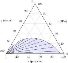
\addplot3[tieline,fill=blue!10]
table [x=A_IPA,y=A_water,z=A_propene]
{plotdata/ternary_data.txt};
\end{ternaryaxis}
\end{tikzpicture}
[.tex]
[.pdf]
\begin{tikzpicture}
\begin{ternaryaxis}[
xlabel=x (IPA),
ylabel=y (water),
zlabel=z (propene),
axis on top,
]
% plotdata/ternary_data.txt is a table of the form
%A_propene A_water A_IPA B_propene B_water B_IPA
% 0.0009 0.9990 0 0.9333 0.0667 0
% 0.0009 0.9988 0.0002 0.9303 0.0665 0.0032
% 0.0011 0.9975 0.0013 0.9135 0.0673 0.0191
% 0.0013 0.9962 0.0024 0.8956 0.0693 0.0351
%...
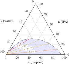
\addplot3[
tieline={each nth tie=5},
fill=blue!10,
]
table [x=A_IPA,y=A_water,z=A_propene]
{plotdata/ternary_data.txt};
\end{ternaryaxis}
\end{tikzpicture}
[.tex]
[.pdf]
\begin{tikzpicture}
\begin{ternaryaxis}[
xlabel=x (IPA),
ylabel=y (water),
zlabel=z (propene),
axis on top,
]
% plotdata/ternary_data.txt is a table of the form
%A_propene A_water A_IPA B_propene B_water B_IPA
% 0.0009 0.9990 0 0.9333 0.0667 0
% 0.0009 0.9988 0.0002 0.9303 0.0665 0.0032
% 0.0011 0.9975 0.0013 0.9135 0.0673 0.0191
% 0.0013 0.9962 0.0024 0.8956 0.0693 0.0351
%...
\addplot3[
point meta=rand,
tieline={
each nth tie=8,
tieline style={contour prepared}
},
fill=blue!10,
]
table [x=A_IPA,y=A_water,z=A_propene]
{plotdata/ternary_data.txt};
\end{ternaryaxis}
\end{tikzpicture}
[.tex]
[.pdf]
\begin{tikzpicture}
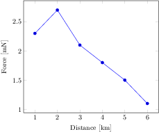
\begin{axis}[use units,
x unit=m,x unit prefix=k,
y unit=N,y unit prefix=m,
xlabel=Distance,ylabel=Force]
\addplot coordinates {
(1,2.3)
(2,2.7)
(3,2.1)
(4,1.8)
(5,1.5)
(6,1.1)
};
\end{axis}
\end{tikzpicture}
[.tex]
[.pdf]
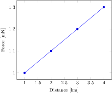
\begin{tikzpicture}
\begin{axis}[change x base,
x SI prefix=kilo,x unit=m,
y SI prefix=milli,y unit=N,
xlabel=Distance,ylabel=Force]
\addplot coordinates {
(1000,1)
(2000,1.1)
(3000,1.2)
(4000,1.3)
};
\end{axis}
\end{tikzpicture}
[.tex]
[.pdf]
\begin{tikzpicture}
\begin{axis}
\addplot+[sharp plot] coordinates
{(0,0) (1,2) (2,3)};
\end{axis}
\end{tikzpicture}
[.tex]
[.pdf]
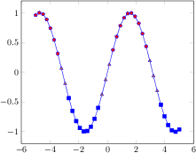
\begin{tikzpicture}
\begin{axis}
\addplot+[smooth] coordinates
{(0,0) (1,2) (2,3)};
\end{axis}
\end{tikzpicture}
[.tex]
[.pdf]
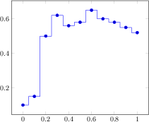
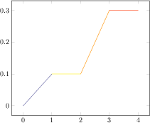
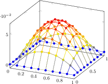
\begin{tikzpicture}
\begin{axis}
\addplot+[const plot]
coordinates
{(0,0.1) (0.1,0.15) (0.2,0.5) (0.3,0.62)
(0.4,0.56) (0.5,0.58) (0.6,0.65) (0.7,0.6)
(0.8,0.58) (0.9,0.55) (1,0.52)};
\end{axis}
\end{tikzpicture}
[.tex]
[.pdf]
\begin{tikzpicture}
\begin{axis}[ymin=0,ymax=1,enlargelimits=false]
\addplot
[const plot,fill=blue,draw=black]
coordinates
{(0,0.1) (0.1,0.15) (0.2,0.5) (0.3,0.62)
(0.4,0.56) (0.5,0.58) (0.6,0.65) (0.7,0.6)
(0.8,0.58) (0.9,0.55) (1,0.52)}
\closedcycle;
\end{axis}
\end{tikzpicture}

[.tex]
[.pdf]
\begin{tikzpicture}
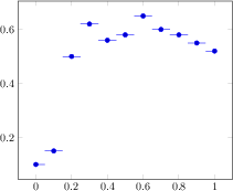
\begin{axis}
\addplot+[const plot mark right]
coordinates
{(0,0.1) (0.1,0.15) (0.2,0.5) (0.3,0.62)
(0.4,0.56) (0.5,0.58) (0.6,0.65) (0.7,0.6)
(0.8,0.58) (0.9,0.55) (1,0.52)};
\end{axis}
\end{tikzpicture}
[.tex]
[.pdf]
\begin{tikzpicture}
\begin{axis}
\addplot+[const plot mark mid]
coordinates
{(0,0.1) (0.1,0.15) (0.2,0.5) (0.3,0.62)
(0.4,0.56) (0.5,0.58) (0.6,0.65) (0.7,0.6)
(0.8,0.58) (0.9,0.55) (1,0.52)};
\end{axis}
\end{tikzpicture}
[.tex]
[.pdf]
\begin{tikzpicture}
\begin{axis}[samples=8]
\addplot+[jump mark left,domain=-5:0]
{4*x^2 - 5};
\addplot+[jump mark right,domain=-5:0]
{0.7*x^3 + 50};
\end{axis}
\end{tikzpicture}
[.tex]
[.pdf]
\begin{tikzpicture}
\begin{axis}
\addplot+[jump mark mid]
coordinates
{(0,0.1) (0.1,0.15) (0.2,0.5) (0.3,0.62)
(0.4,0.56) (0.5,0.58) (0.6,0.65) (0.7,0.6)
(0.8,0.58) (0.9,0.55) (1,0.52)};
\end{axis}
\end{tikzpicture}
[.tex]
[.pdf]
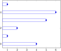
\begin{tikzpicture}
\begin{axis}
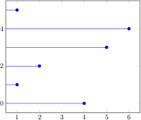
\addplot+[xbar] coordinates
{(4,0) (1,1) (2,2)
(5,3) (6,4) (1,5)};
\end{axis}
\end{tikzpicture}
[.tex]
[.pdf]
\begin{tikzpicture}
\begin{axis}[xbar,enlargelimits=0.15]
\addplot
[draw=blue,pattern=horizontal lines light blue]
coordinates
{(10,5) (15,10) (5,15) (24,20) (30,25)};
\addplot
[draw=black,pattern=horizontal lines dark blue]
coordinates
{(3,5) (5,10) (15,15) (20,20) (35,25)};
\end{axis}
\end{tikzpicture}
[.tex]
[.pdf]
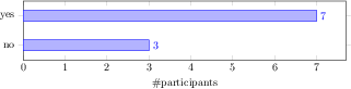
\begin{tikzpicture}
\begin{axis}[
xbar, xmin=0,
width=12cm, height=3.5cm, enlarge y limits=0.5,
xlabel={\#participants},
symbolic y coords={no,yes},
ytick=data,
nodes near coords, nodes near coords align={horizontal},
]
\addplot coordinates {(3,no) (7,yes)};
\end{axis}
\end{tikzpicture}
[.tex]
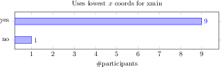
[.pdf]
\begin{tikzpicture}
\begin{axis}[
title=Uses lowest $x$ coords for xmin,
xbar,
width=12cm, height=3.5cm, enlarge y limits=0.5,
xlabel={\#participants},
symbolic y coords={no,yes},
ytick=data,
nodes near coords, nodes near coords align={horizontal},
]
\addplot coordinates {(1,no) (9,yes)};
\end{axis}
\end{tikzpicture}
[.tex]
[.pdf]
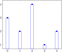
\begin{tikzpicture}
\begin{axis}
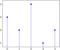
\addplot+[ybar] plot coordinates
{(0,3) (1,2) (2,4) (3,1) (4,2)};
\end{axis}
\end{tikzpicture}
[.tex]
[.pdf]
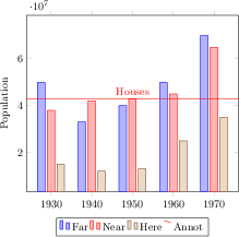
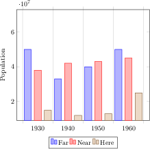
\begin{tikzpicture}
\begin{axis}[
x tick label style={
/pgf/number format/1000 sep=},
ylabel=Population,
enlargelimits=0.15,
legend style={at={(0.5,-0.15)},
anchor=north,legend columns=-1},
ybar,
bar width=7pt,
]
\addplot
coordinates {(1930,50e6) (1940,33e6)
(1950,40e6) (1960,50e6) (1970,70e6)};
\addplot
coordinates {(1930,38e6) (1940,42e6)
(1950,43e6) (1960,45e6) (1970,65e6)};
\addplot
coordinates {(1930,15e6) (1940,12e6)
(1950,13e6) (1960,25e6) (1970,35e6)};
\addplot[red,sharp plot,update limits=false]
coordinates {(1910,4.3e7) (1990,4.3e7)}
node[above] at (axis cs:1950,4.3e7) {Houses};
\legend{Far,Near,Here,Annot}
\end{axis}
\end{tikzpicture}
[.tex]
[.pdf]
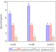
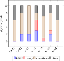
\begin{tikzpicture}
\begin{axis}[
ybar,
enlargelimits=0.15,
legend style={at={(0.5,-0.15)},
anchor=north,legend columns=-1},
ylabel={\#participants},
symbolic x coords={tool8,tool9,tool10},
xtick=data,
nodes near coords,
nodes near coords align={vertical},
]
\addplot coordinates {(tool8,7) (tool9,9) (tool10,4)};
\addplot coordinates {(tool8,4) (tool9,4) (tool10,4)};
\addplot coordinates {(tool8,1) (tool9,1) (tool10,1)};
\legend{used,understood,not understood}
\end{axis}
\end{tikzpicture}
[.tex]
[.pdf]
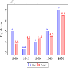
\begin{tikzpicture}
\begin{axis}[
x tick label style={
/pgf/number format/1000 sep=},
ylabel=Population,
enlargelimits=0.15,
legend style={at={(0.5,-0.15)},
anchor=north,legend columns=-1},
ybar=5pt,% configures `bar shift'
bar width=9pt,
nodes near coords,
point meta=y *10^-7 % the displayed number
]
\addplot
coordinates {(1930,50e6) (1940,33e6)
(1950,40e6) (1960,50e6) (1970,70e6)};
\addplot
coordinates {(1930,38e6) (1940,42e6)
(1950,43e6) (1960,45e6) (1970,65e6)};
\legend{Far,Near}
\end{axis}
\end{tikzpicture}
[.tex]
[.pdf]
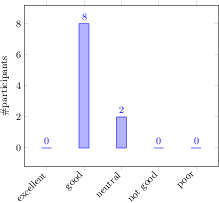
\begin{tikzpicture}
\begin{axis}[
ybar,
enlargelimits=0.15,
legend style={at={(0.5,-0.2)},
anchor=north,legend columns=-1},
ylabel={\#participants},
symbolic x coords={excellent,good,neutral,%
not good,poor},
xtick=data,
nodes near coords,
nodes near coords align={vertical},
x tick label style={rotate=45,anchor=east},
]
\addplot coordinates {(excellent,0) (good,8)
(neutral,2) (not good,0) (poor,0)};
\end{axis}
\end{tikzpicture}

[.tex]
[.pdf]
\begin{tikzpicture}
\begin{axis}
\addplot+[ybar interval] plot coordinates
{(0,2) (0.1,1) (0.3,0.5) (0.35,4) (0.5,3)
(0.6,2) (0.7,1.5) (1,1.5)};
\end{axis}
\end{tikzpicture}
[.tex]
[.pdf]
\begin{tikzpicture}
\begin{axis}[ybar interval,
xtick=data,
xticklabel interval boundaries,
x tick label style=
{rotate=90,anchor=east}
]
\addplot coordinates
{(0,2) (0.1,1) (0.3,0.5) (0.35,4) (0.5,3)
(0.6,2) (0.7,1.5) (1,1.5)};
\end{axis}
\end{tikzpicture}
[.tex]
[.pdf]
\begin{tikzpicture}
\begin{axis}[
x tick label style={
/pgf/number format/1000 sep=},
ylabel=Population,
enlargelimits=0.05,
legend style={at={(0.5,-0.15)},
anchor=north,legend columns=-1},
ybar interval=0.7,
]
\addplot
coordinates {(1930,50e6) (1940,33e6)
(1950,40e6) (1960,50e6) (1970,70e6)};
\addplot
coordinates {(1930,38e6) (1940,42e6)
(1950,43e6) (1960,45e6) (1970,65e6)};
\addplot
coordinates {(1930,15e6) (1940,12e6)
(1950,13e6) (1960,25e6) (1970,35e6)};
\legend{Far,Near,Here}
\end{axis}
\end{tikzpicture}
[.tex]
[.pdf]
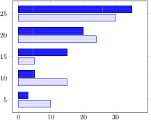
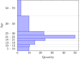
\begin{tikzpicture}
\begin{axis}[
xmin=0,xmax=53,
ylabel=Age,
xlabel=Quantity,
enlargelimits=false,
ytick=data,
yticklabel interval boundaries,
xbar interval,
]
\addplot
coordinates {(10,5) (10.5,10) (15,13)
(24,18) (50,21) (23,25) (10,30)
(3,50) (3,70)};
\end{axis}
\end{tikzpicture}
[.tex]
[.pdf]
\begin{tikzpicture}
\begin{axis}[
ybar interval,
xticklabel=
\pgfmathprintnumber\tick--\pgfmathprintnumber\nexttick
]
\addplot+[hist={bins=3}]
table[row sep=\\,y index=0] {
data\\
1\\ 2\\ 1\\ 5\\ 4\\ 10\\
7\\ 10\\ 9\\ 8\\ 9\\ 9\\
};
\end{axis}
\end{tikzpicture}
[.tex]
[.pdf]
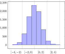
\begin{tikzpicture}
\begin{axis}[
ybar interval,
xtick=,% reset from ybar interval
xticklabel=
{$[\pgfmathprintnumber\tick,%
\pgfmathprintnumber\nexttick)$}
]
% a data file containing 8000 normally distributed
% random numbers of mean 0 and variance 1
\addplot+[hist={data=x}]
file {plotdata/pgfplots.randn.dat};
\end{axis}
\end{tikzpicture}
[.tex]
[.pdf]
\begin{tikzpicture}
\begin{axis}[
tiny,
height=4cm,width=12cm,
ybar interval,
ymin=0,
xmin=0,xmax=1,
axis on top,
extra x ticks={0,1},
extra x tick style={
grid=none,
x tick label as interval=false,
xticklabel=$\pgfmathprintnumber\tick$
},
xticklabel={$[\pgfmathprintnumber[fixed]\tick,\cdot)$}
]
\addplot+[samples=200,hist] {rnd};
\end{axis}
\end{tikzpicture}
[.tex]
[.pdf]
\begin{tikzpicture}
\begin{axis}[
ybar interval,
xtick=,% reset from ybar interval
xticklabel=
{$[\pgfmathprintnumber\tick,
\pgfmathprintnumber\nexttick)$}
]
% a data file containing 8000 normally distributed
% random numbers of mean 0 and variance 1
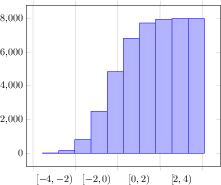
\addplot+[hist={
data=x,
cumulative}]
file {plotdata/pgfplots.randn.dat};
\end{axis}
\end{tikzpicture}
[.tex]
[.pdf]
\begin{tikzpicture}
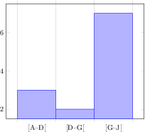
\begin{axis}[
ybar interval,
hist/symbolic coords={A,B,C,D,E,F,G,H,I,J},
xticklabel={[\tick--\nexttick[},
]
\addplot+[hist={bins=3}]
table[row sep=\\,y index=0] {
data\\
A\\ B\\ A\\ D\\ F\\ J\\
G\\ J\\ I\\ H\\ I\\ I\\
};
\end{axis}
\end{tikzpicture}
[.tex]
[.pdf]
\begin{tikzpicture}
\begin{axis}
\addplot+[xcomb] coordinates
{(4,0) (1,1) (2,2)
(5,3) (6,4) (1,5)};
\end{axis}
\end{tikzpicture}
[.tex]
[.pdf]
\begin{tikzpicture}
\begin{axis}
\addplot+[ycomb] plot coordinates
{(0,3) (1,2) (2,4) (3,1) (4,2)};
\end{axis}
\end{tikzpicture}
[.tex]
[.pdf]
\begin{tikzpicture}
\begin{axis}
\addplot[blue,
quiver={u=1,v=2*x},
-stealth,samples=15] {x^2};
\end{axis}
\end{tikzpicture}
[.tex]
[.pdf]
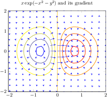
\begin{tikzpicture}
\begin{axis}[
title={$x \exp(-x^2-y^2)$ and its gradient},
domain=-2:2,
view={0}{90},
axis background/.style={fill=white},
]
\addplot3[contour gnuplot={number=9,
labels=false},thick]
{exp(0-x^2-y^2)*x};
\addplot3[blue,
quiver={
u={exp(0-x^2-y^2)*(1-2*x^2)},
v={exp(0-x^2-y^2)*(-2*x*y)},
scale arrows=0.3,
},
-stealth,samples=15]
{exp(0-x^2-y^2)*x};
\end{axis}
\end{tikzpicture}
[.tex]
[.pdf]
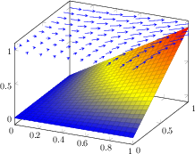
\begin{tikzpicture}
\begin{axis}[
domain=0:1,
xmax=1,
ymax=1,
]
\addplot3[surf] {x*y};
\addplot3[blue,/pgfplots/quiver,
quiver/u=y,
quiver/v=x,
quiver/w=0,
quiver/scale arrows=0.1,
-stealth,samples=10] {1};
\end{axis}
\end{tikzpicture}
[.tex]
[.pdf]
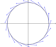
\begin{tikzpicture}
\begin{axis}[axis equal,
axis lines=middle,
axis line style={->},
tick style={color=black},
xtick=\empty,
ytick=\empty
]
\addplot[samples=20, domain=0:2*pi,
% the default choice 'variable=\x' leads to
% unexpected results here!
variable=\t,
quiver={
u={-sin(deg(t))},
v={cos(deg(t))},
scale arrows=0.5},
->,blue]
({cos(deg(t))}, {sin(deg(t))});
\addplot[samples=100, domain=0:2*pi]
({cos(deg(x))}, {sin(deg(x))});
\end{axis}
\end{tikzpicture}
[.tex]
[.pdf]
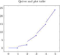
\begin{tikzpicture}
\begin{axis}[title=Quiver and plot table]
\addplot[blue,
quiver={u=\thisrow{u},v=\thisrow{v}},
-stealth]
table
{
x y u v
0 0 1 0
1 1 1 1
2 4 1 4
3 9 1 6
4 16 1 8
};
\end{axis}
\end{tikzpicture}
[.tex]
[.pdf]
\begin{tikzpicture}
\begin{axis}[stack plots=y]
\addplot coordinates
{(0,1) (1,1) (2,2) (3,2)};
\addplot coordinates
{(0,1) (1,1) (2,2) (3,2)};
\addplot coordinates
{(0,1) (1,1) (2,2) (3,2)};
\end{axis}
\end{tikzpicture}
[.tex]
[.pdf]
\begin{tikzpicture}
\begin{axis}[stack plots=y,/tikz/ybar]
\addplot coordinates
{(0,1) (1,1) (2,3) (3,2) (4,1.5)};
\addplot coordinates
{(0,1) (1,1) (2,3) (3,2) (4,1.5)};
\addplot coordinates
{(0,1) (1,1) (2,3) (3,2) (4,1.5)};
\end{axis}
\end{tikzpicture}
[.tex]
[.pdf]
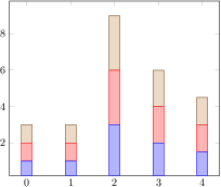
\begin{tikzpicture}
\begin{axis}[ybar stacked]
\addplot coordinates
{(0,1) (1,1) (2,3) (3,2) (4,1.5)};
\addplot coordinates
{(0,1) (1,1) (2,3) (3,2) (4,1.5)};
\addplot coordinates
{(0,1) (1,1) (2,3) (3,2) (4,1.5)};
\end{axis}
\end{tikzpicture}
[.tex]
[.pdf]
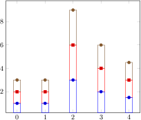
\begin{tikzpicture}
\begin{axis}[
ybar stacked,
enlargelimits=0.15,
legend style={at={(0.5,-0.20)},
anchor=north,legend columns=-1},
ylabel={\#participants},
symbolic x coords={tool1, tool2, tool3, tool4,
tool5, tool6, tool7},
xtick=data,
x tick label style={rotate=45,anchor=east},
]
\addplot+[ybar] plot coordinates {(tool1,0) (tool2,2)
(tool3,2) (tool4,3) (tool5,0) (tool6,2) (tool7,0)};
\addplot+[ybar] plot coordinates {(tool1,0) (tool2,0)
(tool3,0) (tool4,3) (tool5,1) (tool6,1) (tool7,0)};
\addplot+[ybar] plot coordinates {(tool1,6) (tool2,6)
(tool3,8) (tool4,2) (tool5,6) (tool6,5) (tool7,6)};
\addplot+[ybar] plot coordinates {(tool1,4) (tool2,2)
(tool3,0) (tool4,2) (tool5,3) (tool6,2) (tool7,4)};
\legend{never, rarely, sometimes, often}
\end{axis}
\end{tikzpicture}
[.tex]
[.pdf]
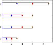
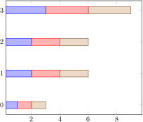
\begin{tikzpicture}
\begin{axis}[stack plots=x,/tikz/xbar]
\addplot coordinates
{(1,0) (2,1) (2,2) (3,3)};
\addplot coordinates
{(1,0) (2,1) (2,2) (3,3)};
\addplot coordinates
{(1,0) (2,1) (2,2) (3,3)};
\end{axis}
\end{tikzpicture}
[.tex]
[.pdf]
\begin{tikzpicture}
\begin{axis}[xbar stacked]
\addplot coordinates
{(1,0) (2,1) (2,2) (3,3)};
\addplot coordinates
{(1,0) (2,1) (2,2) (3,3)};
\addplot coordinates
{(1,0) (2,1) (2,2) (3,3)};
\end{axis}
\end{tikzpicture}

[.tex]
[.pdf]
\begin{tikzpicture}
\begin{axis}[
stack plots=y,
area style,
enlarge x limits=false]
\addplot coordinates
{(0,1) (1,1) (2,2) (3,2)}
\closedcycle;
\addplot coordinates
{(0,1) (1,1) (2,2) (3,2)}
\closedcycle;
\addplot coordinates
{(0,1) (1,1) (2,2) (3,2)}
\closedcycle;
\end{axis}
\end{tikzpicture}
[.tex]
[.pdf]
\begin{tikzpicture}
\begin{axis}[
const plot,
stack plots=y,
area style,
enlarge x limits=false]
\addplot coordinates
{(0,1) (1,1) (2,2) (3,2)}
\closedcycle;
\addplot coordinates
{(0,1) (1,1) (2,2) (3,2)}
\closedcycle;
\addplot coordinates
{(0,1) (1,1) (2,2) (3,2)}
\closedcycle;
\end{axis}
\end{tikzpicture}
[.tex]
[.pdf]
\begin{tikzpicture}
\begin{axis}[
smooth,
stack plots=y,
area style,
enlarge x limits=false]
\addplot coordinates
{(0,1) (1,1) (2,2) (3,2)}
\closedcycle;
\addplot coordinates
{(0,1) (1,1) (2,2) (3,2)}
\closedcycle;
\addplot coordinates
{(0,1) (1,1) (2,2) (3,2)}
\closedcycle;
\end{axis}
\end{tikzpicture}
[.tex]
[.pdf]
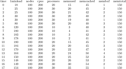
\pgfplotstableread{pgfplots.timeseries.dat}\loadedtable
\pgfplotstabletypeset\loadedtable
[.tex]
[.pdf]
\pgfplotstableread
{pgfplots.timeseries.dat}
{\loadedtable}
\begin{tikzpicture}
\begin{axis}[
ymin=0,
minor tick num=4,
enlarge x limits=false,
axis on top,
every axis plot post/.append style=
{mark=none},
const plot,
legend style={
area legend,
at={(0.5,-0.15)},
anchor=north,
legend columns=-1}]
\addplot[draw=blue,fill=blue!30!white]
table[x=time,y=1minload] from \loadedtable
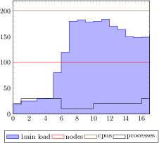
\closedcycle;
\addplot table[x=time,y=nodes] from \loadedtable;
\addplot table[x=time,y=cpus] from \loadedtable;
\addplot table[x=time,y=processes]
from \loadedtable;
\legend{1min load,nodes,cpus,processes}
\end{axis}
\end{tikzpicture}
[.tex]
[.pdf]
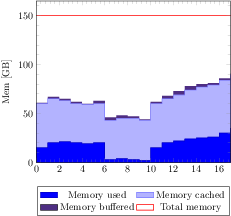
\pgfplotstableread{pgfplots.timeseries.dat}\loadedtable
\begin{tikzpicture}
\begin{axis}[
ymin=0,
minor tick num=4,
enlarge x limits=false,
const plot,
axis on top,
stack plots=y,
cycle list={%
{blue!70!black,fill=blue},%
{blue!60!white,fill=blue!30!white},%
{draw=none,fill={rgb:red,138;green,82;blue,232}},%
{red,thick}%
},
ylabel={Mem [GB]},
legend style={
area legend,
at={(0.5,-0.15)},
anchor=north,
legend columns=2}]
\addplot table[x=time,y=memused] from \loadedtable \closedcycle;
\addplot table[x=time,y=memcached] from \loadedtable \closedcycle;
\addplot table[x=time,y=membuf] from \loadedtable \closedcycle;
\addplot+[stack plots=false]
table[x=time,y=memtotal] from \loadedtable;
\legend{Memory used,Memory cached,Memory buffered,Total memory}
\end{axis}
\end{tikzpicture}
[.tex]
[.pdf]
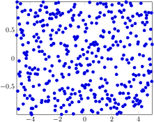
\begin{tikzpicture}
\begin{axis}[enlargelimits=false]
\addplot+[only marks,samples=400]
{rand};
\end{axis}
\end{tikzpicture}
[.tex]
[.pdf]
\begin{tikzpicture}
\begin{axis}
\addplot+[scatter,only marks,
samples=50,scatter src=y]
{x-x^2};
\end{axis}
\end{tikzpicture}
[.tex]
[.pdf]
\begin{tikzpicture}
\begin{axis}
\addplot+[scatter,
samples=50,scatter src=y]
{x^3};
\end{axis}
\end{tikzpicture}
\begin{tikzpicture}
\begin{axis}
% provide color data explicitly using []
% behind coordinates:
\addplot+[scatter,scatter src=explicit]
coordinates {
(0,0) [1.0e10]
(1,2) [1.1e10]
(2,3) [1.2e10]
(3,4) [1.3e10]
% ...
};
% Assumes a datafile.dat like
% xcolname ycolname colordata
% 0 0 0.001
% 1 2 0.3
% 2 2.1 0.4
% 3 3 0.5
% ...
% the file may have more columns.
\addplot+[scatter,scatter src=explicit]
table[x=xcolname,y=ycolname,meta=colordata]
{datafile.dat};
% Same data as last example:
\addplot+[scatter,scatter src=\thisrow{colordata}+\thisrow{ycolname}]
table[x=xcolname,y=ycolname]
{datafile.dat};
% Assumes a datafile.dat like
% 0 0 0.001
% 1 2 0.3
% 2 2.1 0.4
% 3 3 0.5
% ...
% the first three columns will be used here:
\addplot+[scatter,scatter src=explicit]
file {datafile.dat};
\end{axis}
\end{tikzpicture}
[.tex]
[.pdf]
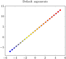
\begin{tikzpicture}
\begin{axis}[title=Default arguments]
\addplot+[scatter,scatter src=y]
{2*x+3};
\end{axis}
\end{tikzpicture}
[.tex]
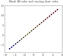
[.pdf]
\begin{tikzpicture}
\begin{axis}[
title=Black fill color and varying draw color,
scatter/use mapped color=
{draw=mapped color,fill=black}]
\addplot+[scatter,scatter src=y]
{2*x+3};
\end{axis}
\end{tikzpicture}
[.tex]
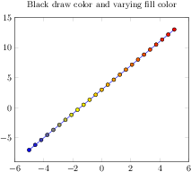
[.pdf]
\begin{tikzpicture}
\begin{axis}[
title=Black draw color and varying fill color,
scatter/use mapped color=
{draw=black,fill=mapped color}]
\addplot+[scatter,scatter src=y]
{2*x+3};
\end{axis}
\end{tikzpicture}
[.tex]
[.pdf]
\begin{tikzpicture}
\begin{axis}[scatter/classes={
a={mark=square*,blue},%
b={mark=triangle*,red},%
c={mark=o,draw=black}}]
% \addplot[] is better than \addplot+[] here:
% it avoids scalings of the cycle list
\addplot[scatter,only marks,
scatter src=explicit symbolic]
coordinates {
(0.1,0.15) [a]
(0.45,0.27) [c]
(0.02,0.17) [a]
(0.06,0.1) [a]
(0.9,0.5) [b]
(0.5,0.3) [c]
(0.85,0.52) [b]
(0.12,0.05) [a]
(0.73,0.45) [b]
(0.53,0.25) [c]
(0.76,0.5) [b]
(0.55,0.32) [c]
};
\end{axis}
\end{tikzpicture}
[.tex]
[.pdf]
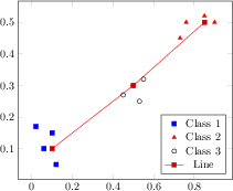
\begin{tikzpicture}
\begin{axis}[legend pos=south east]
% The data file contains:
% x y label
% 0.1 0.15 a
% 0.45 0.27 c
% 0.02 0.17 a
% 0.06 0.1 a
% 0.9 0.5 b
% 0.5 0.3 c
% 0.85 0.52 b
% 0.12 0.05 a
% 0.73 0.45 b
% 0.53 0.25 c
% 0.76 0.5 b
% 0.55 0.32 c
\addplot[
% clickable coords={\thisrow{label}},
scatter/classes={
a={mark=square*,blue},%
b={mark=triangle*,red},%
c={mark=o,draw=black,fill=black}%
},
scatter,only marks,
scatter src=explicit symbolic]
table[x=x,y=y,meta=label]
{plotdata/scattercl.dat};
\addplot coordinates
{(0.1,0.1) (0.5,0.3) (0.85,0.5)};
\legend{Class 1,Class 2,Class 3,Line}
\end{axis}
\end{tikzpicture}
[.tex]
[.pdf]
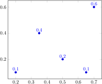
\begin{tikzpicture}
\begin{axis}[nodes near coords]
\addplot+[only marks] coordinates {
(0.5,0.2) (0.2,0.1) (0.7,0.6)
(0.35,0.4) (0.65,0.1)};
\end{axis}
\end{tikzpicture}
[.tex]
[.pdf]
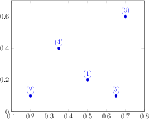
\begin{tikzpicture}
\begin{axis}[nodes near coords,enlargelimits=0.2]
\addplot+[only marks,
point meta=explicit symbolic]
coordinates {
(0.5,0.2) [(1)]
(0.2,0.1) [(2)]
(0.7,0.6) [(3)]
(0.35,0.4) [(4)]
(0.65,0.1) [(5)]
};
\end{axis}
\end{tikzpicture}
[.tex]
[.pdf]
\begin{tikzpicture}
\begin{axis}[enlargelimits=0.2]
\addplot[
scatter,mark=*,only marks,
% we use 'point meta' as color data...
point meta=\thisrow{color},
% ... therefore, we can't use it as argument for nodes near coords ...
nodes near coords*={$(\pgfmathprintnumber[frac]\myvalue)$},
% ... which requires to define a visualization dependency:
visualization depends on={\thisrow{myvalue} \as \myvalue},
]
table {
x y color myvalue
0.5 0.2 1 0.25
0.2 0.1 2 1.5
0.7 0.6 3 0.75
0.35 0.4 4 0.125
0.65 0.1 5 2
};
\end{axis}
\end{tikzpicture}
[.tex]
[.pdf]
\begin{tikzpicture}
% Low-Level scatter plot interface Example:
% use three different marker classes
% 0% - 30% : first class
% 30% - 60% : second class
% 60% - 100% : third class
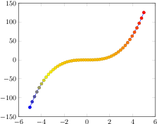
\begin{axis}[
scatter/@pre marker code/.code={%
\ifdim\pgfplotspointmetatransformed pt<300pt
\def\markopts{mark=square*,fill=blue}%
\else
\ifdim\pgfplotspointmetatransformed pt<600pt
\def\markopts{mark=triangle*,fill=orange}%
\else
\def\markopts{mark=pentagon*,fill=red}%
\fi
\fi
\expandafter\scope\expandafter[\markopts]
},%
scatter/@post marker code/.code={%
\endscope
}]
\addplot+[scatter,scatter src=y,
samples=40]
{sin(deg(x))};
\end{axis}
\end{tikzpicture}
[.tex]
[.pdf]
\begin{tikzpicture}
\begin{axis}
\addplot[mesh] {x+sin(deg(x))};
\end{axis}
\end{tikzpicture}
[.tex]
[.pdf]
\begin{tikzpicture}
\begin{axis}
\addplot[mesh,point meta=explicit]
coordinates {
(0,0) [0]
(1,0.1) [1]
(2,0.1) [2]
(3,0.3) [3]
(4,0.3) [4]
};
\end{axis}
\end{tikzpicture}
[.tex]
[.pdf]
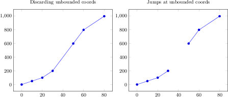
\begin{tikzpicture}
\begin{axis}[
title=Discarding unbounded coords,
unbounded coords=discard]
\addplot coordinates {
(0,0) (10,50) (20,100) (30,200)
(40,inf) (50,600) (60,800) (80,1000)
};
\end{axis}
\end{tikzpicture}
\begin{tikzpicture}
\begin{axis}[
title=Jumps at unbounded coords,
unbounded coords=jump]
\addplot coordinates {
(0,0) (10,50) (20,100) (30,200)
(40,inf) (50,600) (60,800) (80,1000)
};
\end{axis}
\end{tikzpicture}
[.tex]
[.pdf]
\begin{tikzpicture}
\begin{axis}[
unbounded coords=jump,
% A technical filter to cut out
% the x<0 and y<0 edge.
filter point/.code={%
\pgfmathparse
{\pgfkeysvalueof{/data point/x}<0}%
\ifpgfmathfloatcomparison
\pgfmathparse
{\pgfkeysvalueof{/data point/y}<0}%
\ifpgfmathfloatcomparison
\pgfkeyssetvalue{/data point/x}{nan}%
\fi
\fi
},
]
\addplot3[surf] {exp(-sqrt(x^2 + y^2))};
\end{axis}
\end{tikzpicture}
[.tex]
[.pdf]
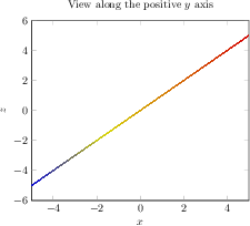
\begin{tikzpicture}
\begin{axis}[view={0}{0},
xlabel=$x$,
zlabel=$z$,
title=View along the positive $y$ axis]
\addplot3[surf] {x};
\end{axis}
\end{tikzpicture}
[.tex]
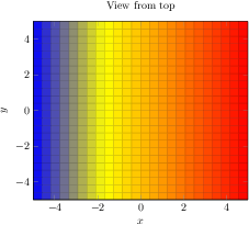
[.pdf]
\begin{tikzpicture}
\begin{axis}[view={0}{90},
xlabel=$x$,
ylabel=$y$,
title=View from top]
\addplot3[surf] {x};
\end{axis}
\end{tikzpicture}

[.tex]
[.pdf]
\begin{tikzpicture}
\begin{axis}[view={-45}{45},
xlabel=$x$,ylabel=$y$,zlabel=$z$]
\addplot3[surf] {x};
\end{axis}
\end{tikzpicture}
[.tex]
[.pdf]
\begin{tikzpicture}
\begin{axis}[view/h=-30]
\addplot3[
surf,
%shader=interp,
shader=flat,
samples=50,
domain=-3:3,y domain=-2:2]
{sin(deg(x+y^2))};
\end{axis}
\end{tikzpicture}
[.tex]
[.pdf]
\begin{tikzpicture}
\begin{axis}[view/h=10]
\addplot3[
surf,
%shader=interp,
shader=flat,
samples=50,
domain=-3:3,y domain=-2:2]
{sin(deg(x+y^2))};
\end{axis}
\end{tikzpicture}
[.tex]
[.pdf]
\begin{tikzpicture}
\begin{axis}[view/h=40,colormap/violet]
\addplot3[
surf,
%shader=interp,
shader=flat,
samples=50,
domain=-3:3,y domain=-2:2]
{sin(deg(x+y^2))};
\end{axis}
\end{tikzpicture}
[.tex]
[.pdf]
\begin{tikzpicture}
\begin{axis}[view/h=70]
\addplot3[
surf,
%shader=interp,
shader=flat,
samples=50,
domain=-3:3,y domain=-2:2]
{sin(deg(x+y^2))};
\end{axis}
\end{tikzpicture}
[.tex]
[.pdf]
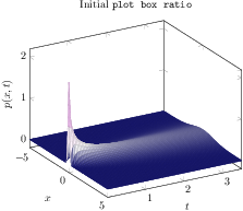
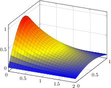
\begin{tikzpicture}
\begin{axis}[
view/h=60,
plot box ratio=1 1 1,
colormap={violet}{[1cm] rgb255(0cm)=(25,25,122)
color(1cm)=(white) rgb255(5cm)=(238,140,238)},
xlabel=$x$,
ylabel=$t$,
zlabel={$p(x,t)$},
shader=faceted,
title=Initial \texttt{plot box ratio},
]
\addplot3[surf,y domain=0.02:3.5,samples=81]
{1/(2*sqrt(pi*y)) * exp(0-x^2/y)};
% the '0' is a work-around for a bug in PGF 2.00
\end{axis}
\end{tikzpicture}
[.tex]
[.pdf]
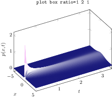
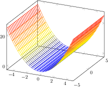
\begin{tikzpicture}
\begin{axis}[
view/h=60,
plot box ratio=1 2 1,
colormap={violet}{[1cm] rgb255(0cm)=(25,25,122)
color(1cm)=(white) rgb255(5cm)=(238,140,238)},
xlabel=$x$,
ylabel=$t$,
zlabel={$p(x,t)$},
shader=flat,
title=\texttt{plot box ratio=1 2 1},
]
\addplot3[surf,y domain=0.02:3.5,samples=81]
{1/(2*sqrt(pi*y)) * exp(0-x^2/y)};
% the '0' is a work-around for a bug in PGF 2.00
\end{axis}
\end{tikzpicture}
[.tex]
[.pdf]
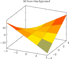
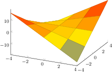
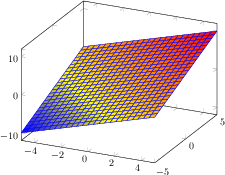
\begin{tikzpicture}
\begin{axis}[
3d box=background,
% pretty printing, but irrelevant:
title={3d box=background},
samples=5,
domain=-4:4,
xtick=data,
ytick=data,
]
\addplot3[surf] {x*y};
\end{axis}
\end{tikzpicture}
[.tex]
[.pdf]
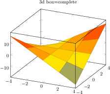
\begin{tikzpicture}
\begin{axis}[
3d box,% same as 3d box=complete
% pretty printing, but irrelevant:
title={3d box=complete},
samples=5,
domain=-4:4,
xtick=data,
ytick=data,
]
\addplot3[surf] {x*y};
\end{axis}
\end{tikzpicture}
[.tex]
[.pdf]
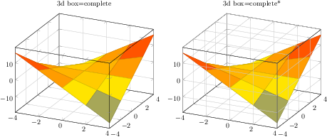
\begin{tikzpicture}
\begin{axis}[
3d box=complete,
grid=major,
title={3d box=complete},
samples=5, domain=-4:4,
xtick=data, ytick=data,
]
\addplot3[surf] {x*y};
\end{axis}
\end{tikzpicture}%
~
\begin{tikzpicture}
\begin{axis}[
3d box=complete*,
grid=major,
title={3d box=complete*},
samples=5, domain=-4:4,
xtick=data, ytick=data,
]
\addplot3[surf] {x*y};
\end{axis}
\end{tikzpicture}
[.tex]
[.pdf]
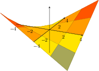
\begin{tikzpicture}
\begin{axis}[
axis lines=center,
axis on top,
samples=5, domain=-4:4,
xtick=data, ytick=data,
ztick=\empty, % no z ticks here
]
\addplot3[surf] {x*y};
\end{axis}
\end{tikzpicture}
[.tex]
[.pdf]
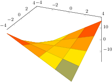
\begin{tikzpicture}
\begin{axis}[
axis lines*=left,
samples=5, domain=-4:4,
xtick=data, ytick=data,
]
\addplot3[surf] {x*y};
\end{axis}
\end{tikzpicture}
[.tex]
[.pdf]
\begin{tikzpicture}
\begin{axis}[
axis lines*=right,
samples=5, domain=-4:4,
xtick=data, ytick=data,
]
\addplot3[surf] {x*y};
\end{axis}
\end{tikzpicture}

[.tex]
[.pdf]
\begin{tikzpicture}
\begin{axis}
% this yields a 3x4 matrix:
\addplot3[surf] coordinates {
(0,0,0) (1,0,0) (2,0,0) (3,0,0)
(0,1,0) (1,1,0.6) (2,1,0.7) (3,1,0.5)
(0,2,0) (1,2,0.7) (2,2,0.8) (3,2,0.5)
};
\end{axis}
\end{tikzpicture}
[.tex]
[.pdf]
\begin{tikzpicture}
\begin{axis}
% We have `plotdata/first3d.dat' with
%---------
% 0 0 0.8
% 1 0 0.56
% 2 0 0.5
% 3 0 0.75
%
% 0 1 0.6
% 1 1 0.3
% 2 1 0.21
% 3 1 0.3
%
% 0 2 0.68
% 1 2 0.22
% 2 2 0.25
% 3 2 0.4
%
% 0 3 0.7
% 1 3 0.5
% 2 3 0.58
% 3 3 0.9
% -> yields a 4x4 matrix:
\addplot3[surf] file {plotdata/first3d.dat};
\end{axis}
\end{tikzpicture}

[.tex]
[.pdf]
\begin{tikzpicture}
\begin{axis}
% this yields also a 3x4 matrix:
\addplot3[surf,mesh/rows=3] coordinates {
(0,0,0) (1,0,0) (2,0,0) (3,0,0)
(0,1,0) (1,1,0.6) (2,1,0.7) (3,1,0.5)
(0,2,0) (1,2,0.7) (2,2,0.8) (3,2,0.5)
};
\end{axis}
\end{tikzpicture}
[.tex]
[.pdf]
\begin{tikzpicture}
\begin{axis}[mesh/ordering=x varies]
% this yields a 3x4 matrix in `x varies'
% ordering:
\addplot3[surf] coordinates {
(0,0,0) (1,0,0) (2,0,0) (3,0,0)
(0,1,0) (1,1,0.6) (2,1,0.7) (3,1,0.5)
(0,2,0) (1,2,0.7) (2,2,0.8) (3,2,0.5)
};
\end{axis}
\end{tikzpicture}

[.tex]
[.pdf]
\begin{tikzpicture}
\begin{axis}[mesh/ordering=y varies]
% this yields a 3x4 matrix in colwise ordering:
\addplot3[surf] coordinates {
(0,0,0) (0,1,0) (0,2,0)
(1,0,0) (1,1,0.6) (1,2,0.7)
(2,0,0) (2,1,0.7) (2,2,0.8)
(3,0,0) (3,1,0.5) (3,2,0.5)
};
\end{axis}
\end{tikzpicture}
[.tex]
[.pdf]
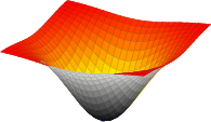
\begin{tikzpicture}
\begin{axis}
\addplot3[surf] {y};
\end{axis}
\end{tikzpicture}
[.tex]
[.pdf]
\begin{tikzpicture}
\begin{axis}[colorbar]
\addplot3
[surf,faceted color=blue,
samples=15,
domain=0:1,y domain=-1:1]
{x^2 - y^2};
\end{axis}
\end{tikzpicture}
[.tex]
[.pdf]
\begin{tikzpicture}
\begin{axis}[xlabel=$x$,ylabel=$y$]
\addplot3 coordinates {(0,0,0) (0,0.5,1) (0,1,0)};
\addplot3 coordinates {(0,1,0) (0.5,1,1) (1,1,0)};
\end{axis}
\end{tikzpicture}

[.tex]
[.pdf]
\begin{tikzpicture}
\begin{axis}[view={60}{30}]
\addplot3+[domain=0:5*pi,samples=60,samples y=0]
({sin(deg(x))},
{cos(deg(x))},
{2*x/(5*pi)});
\end{axis}
\end{tikzpicture}
[.tex]
[.pdf]
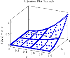
\begin{tikzpicture}
\begin{axis}[
xlabel=$x$,
ylabel=$y$,
zlabel={$f(x,y) = x\cdot y$},
title=A Scatter Plot Example]
% `pgfplotsexample4_grid.dat' contains a
% large sequence of input points of the form
% x_0 x_1 f(x)
% 0 0 0
% 0 0.03125 0
% 0 0.0625 0
% 0 0.09375 0
% 0 0.125 0
% 0 0.15625 0
\addplot3+[only marks] table
{plotdata/pgfplotsexample4_grid.dat};
\end{axis}
\end{tikzpicture}
[.tex]
[.pdf]
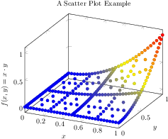
\begin{tikzpicture}
\begin{axis}[
xlabel=$x$,
ylabel=$y$,
zlabel={$f(x,y) = x\cdot y$},
title=A Scatter Plot Example]
\addplot3+[only marks,scatter] table
{plotdata/pgfplotsexample4_grid.dat};
\end{axis}
\end{tikzpicture}
[.tex]
[.pdf]
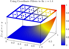
\begin{tikzpicture}
\begin{axis}[
3d box,
zmax=1.4,
colorbar,
xlabel=$x$,
ylabel=$y$,
zlabel={$f(x,y) = x\cdot y$},
title={Using Coordinate Filters to fix $z=1.4$}]
% `pgfplotsexample4.dat' contains similar data as in
% `pgfplotsexample4_grid.dat', but it uses a uniform
% matrix structure (same number of points in every scanline).
% See examples above for extracts.
\addplot3[surf,mesh/ordering=y varies]
table {plotdata/pgfplotsexample4.dat};
\addplot3[scatter,scatter src=\thisrow{f(x)},only marks, z filter/.code={\def\pgfmathresult{1.4}}]
table {plotdata/pgfplotsexample4_grid.dat};
\end{axis}
\end{tikzpicture}
[.tex]
[.pdf]
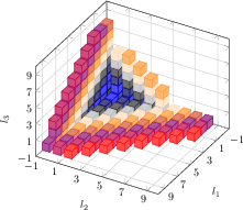
\begin{tikzpicture}
\begin{axis}[
view={120}{40},
width=220pt,
height=220pt,
grid=major,
z buffer=sort,
xmin=-1,xmax=9,
ymin=-1,ymax=9,
zmin=-1,zmax=9,
enlargelimits=upper,
xtick={-1,1,...,19},
ytick={-1,1,...,19},
ztick={-1,1,...,19},
xlabel={$l_1$},
ylabel={$l_2$},
zlabel={$l_3$},
point meta={x+y+z+3},
colormap={summap}{
color=(black); color=(blue);
color=(black); color=(white)
color=(orange) color=(violet)
color=(red)
},
scatter/use mapped color={
draw=mapped color,fill=mapped color!70},
]
% `pgfplots_scatter4.dat' contains a large sequence of
% the form
% l_0 l_1 l_2
% 1 6 -1
% -1 -1 -1
% 0 -1 -1
% -1 0 -1
% -1 -1 0
% 1 -1 -1
% 0 0 -1
% 0 -1 0
\addplot3[only marks,scatter,mark=cube*,mark size=7]
table {plotdata/pgfplots_scatterdata4.dat};
\end{axis}
\end{tikzpicture}
[.tex]
[.pdf]
\begin{tikzpicture}
\begin{axis}
\addplot3[mesh] {x^2};
\end{axis}
\end{tikzpicture}
[.tex]
[.pdf]
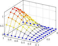
\begin{tikzpicture}
\begin{axis}
\addplot3+[mesh,scatter,samples=10,domain=0:1]
{x*(1-x)*y*(1-y)};
\end{axis}
\end{tikzpicture}
[.tex]
[.pdf]
\begin{tikzpicture}
\begin{axis}[grid=major,view={210}{30}]
\addplot3+[mesh,scatter,samples=10,domain=0:1]
{5*x*sin(2*deg(x)) * y*(1-y)};
\end{axis}
\end{tikzpicture}
[.tex]
[.pdf]
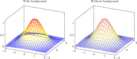
\begin{tikzpicture}
\begin{axis}[title=With background]
\addplot3[mesh,domain=-2:2] {exp(-x^2-y^2)};
\end{axis}
\end{tikzpicture}
\begin{tikzpicture}
\begin{axis}[title=Without background]
\addplot3[surf,fill=white,domain=-2:2] {exp(-x^2-y^2)};
\end{axis}
\end{tikzpicture}
[.tex]
[.pdf]
\begin{tikzpicture}
\begin{axis}[view/az=14]
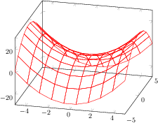
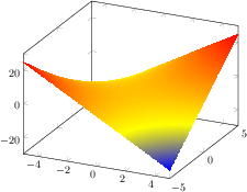
\addplot3[mesh,draw=red,samples=10] {x^2-y^2};
\end{axis}
\end{tikzpicture}
[.tex]
[.pdf]
\begin{tikzpicture}
\begin{axis}
\addplot3[surf,shader=interp] {x*y};
\end{axis}
\end{tikzpicture}
[.tex]
[.pdf]
\begin{tikzpicture}
\begin{axis}[
grid=major,
colormap/greenyellow]
\addplot3[surf,samples=30,domain=0:1]
{5*x*sin(2*deg(x)) * y};
\end{axis}
\end{tikzpicture}
[.tex]
[.pdf]
\begin{tikzpicture}
\begin{axis}
\addplot3[surf,faceted color=blue] {x+y};
\end{axis}
\end{tikzpicture}
[.tex]
[.pdf]
\begin{tikzpicture}
\begin{axis}[colormap/cool]
\addplot3[surf,samples=10,domain=0:1,
shader=interp]
{x*(1-x)*y*(1-y)};
\end{axis}
\end{tikzpicture}
\begin{tikzpicture}
\begin{axis}[colormap/cool]
\addplot3[surf,samples=25,domain=0:1,
shader=flat]
{x*(1-x)*y*(1-y)};
\end{axis}
\end{tikzpicture}

[.tex]
[.pdf]
\begin{tikzpicture}
\begin{axis}[grid=major]
\addplot3[surf,shader=interp,
samples=25,domain=0:2,y domain=0:1]
{exp(-x) * sin(pi*deg(y))};
\end{axis}
\end{tikzpicture}
[.tex]
[.pdf]
\begin{tikzpicture}
\begin{axis}[grid=major]
\addplot3[surf,shader=faceted,
samples=25,domain=0:2,y domain=0:1]
{exp(-x) * sin(pi*deg(y))};
\end{axis}
\end{tikzpicture}
[.tex]
[.pdf]
\begin{tikzpicture}
\begin{axis}
\addplot3[surf,shader=flat,
samples=10,domain=0:1]
{x^2*y};
\end{axis}
\end{tikzpicture}
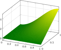
[.tex]
[.pdf]
\begin{tikzpicture}
\begin{axis}
\addplot3[surf,shader=interp,
samples=10,domain=0:1]
{x^2*y};
\end{axis}
\end{tikzpicture}

[.tex]
[.pdf]
\begin{tikzpicture}
\begin{axis}
\addplot3[surf,shader=faceted,
samples=10,domain=0:1]
{x^2*y};
\end{axis}
\end{tikzpicture}
[.tex]
[.pdf]
\begin{tikzpicture}
\begin{axis}
\addplot3[surf,shader=faceted interp,
samples=10,domain=0:1]
{x^2*y};
\end{axis}
\end{tikzpicture}
[.tex]
[.pdf]
\begin{tikzpicture}
\begin{axis}
\addplot3[surf,shader=flat,
draw=black,
samples=10,domain=0:1]
{x^2*y};
\end{axis}
\end{tikzpicture}

[.tex]
[.pdf]
\begin{tikzpicture}
\begin{axis}
\addplot3[surf,shader=faceted,
scatter,mark=*,
samples=10,domain=0:1]
{x^2*y};
\end{axis}
\end{tikzpicture}
[.tex]
[.pdf]
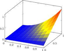
\begin{tikzpicture}
\begin{axis}[
axis lines=center,
axis on top,
xlabel={$x$}, ylabel={$y$}, zlabel={$z$},
domain=0:1,
y domain=0:2*pi,
xmin=-1.5, xmax=1.5,
ymin=-1.5, ymax=1.5, zmin=0.0,
mesh/interior colormap=
{blueblack}{color=(black) color=(blue)},
colormap/blackwhite,
samples=10,
samples y=40,
z buffer=sort,
]
\addplot3[surf]
({x*cos(deg(y))},{x*sin(deg(y))},{x});
\end{axis}
\end{tikzpicture}
[.tex]
[.pdf]
\begin{tikzpicture}
\begin{axis}[
hide axis,
xlabel=$x$,ylabel=$y$,
mesh/interior colormap name=hot,
colormap/blackwhite,
]
\addplot3[domain=-1.5:1.5,surf]
{-exp(-x^2-y^2)};
\end{axis}
\end{tikzpicture}
[.tex]
[.pdf]
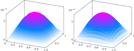
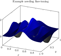
\begin{tikzpicture}
\begin{axis}[
title=Example needing fine-tuning,
xlabel=$x$,
ylabel=$y$]
\addplot3[surf,
mesh/interior colormap=
{blueblack}{color=(black) color=(blue)},
colormap/blackwhite,
domain=0:1]
{sin(deg(8*pi*x))* exp(-20*(y-0.5)^2)
+ exp(-(x-0.5)^2*30
- (y-0.25)^2 - (x-0.5)*(y-0.25))};
\end{axis}
\end{tikzpicture}
[.tex]
[.pdf]
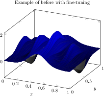
\begin{tikzpicture}
\begin{axis}[
title=Example of before with fine-tuning,
xlabel=$x$,
ylabel=$y$]
\addplot3[surf,
mesh/interior colormap=
{blueblack}{color=(black) color=(blue)},
% slightly increase sampling quality (was 25):
samples=31,
% avoids overshooting corners:
miter limit=1,
% move boundary between inner and outer:
mesh/interior colormap thresh=0.1,
colormap/blackwhite,
domain=0:1]
{sin(deg(8*pi*x))* exp(-20*(y-0.5)^2)
+ exp(-(x-0.5)^2*30
- (y-0.25)^2 - (x-0.5)*(y-0.25))};
\end{axis}
\end{tikzpicture}
[.tex]
[.pdf]
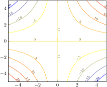
\begin{tikzpicture}
\begin{axis}[view={0}{90}]
\addplot3[contour gnuplot]
{x*y};
\end{axis}
\end{tikzpicture}
[.tex]
[.pdf]
\begin{tikzpicture}
\begin{axis}
\addplot3[contour gnuplot]
{exp(0-x^2-y^2)};
\end{axis}
\end{tikzpicture}

[.tex]
[.pdf]
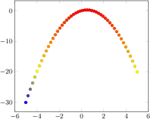
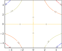
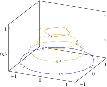
\begin{tikzpicture}
\begin{axis}[
title={$x \exp(-x^2-y^2)$},
domain=-2:2,enlarge x limits,
view={0}{90},
]
\addplot3[contour gnuplot={number=14},thick]
{exp(0-x^2-y^2)*x};
\end{axis}
\end{tikzpicture}
[.tex]
[.pdf]
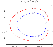
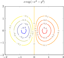
\begin{tikzpicture}
\begin{axis}[
title={$x \exp(-x^2-y^2)$},
domain=-2:2,
enlargelimits,
view={0}{90},
]
\addplot3[
contour gnuplot={levels={-0.1,-0.2,-0.6}},
thick]
{exp(0-x^2-y^2)*x};
\end{axis}
\end{tikzpicture}
[.tex]
[.pdf]
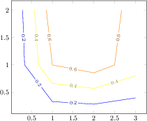
\begin{tikzpicture}
\begin{axis}
\addplot[contour prepared]
table {
2 2 0.8
0.857143 2 0.6
1 1 0.6
2 0.857143 0.6
2.5 1 0.6
2.66667 2 0.6
0.571429 2 0.4
0.666667 1 0.4
1 0.666667 0.4
2 0.571429 0.4
3 0.8 0.4
0.285714 2 0.2
0.333333 1 0.2
1 0.333333 0.2
2 0.285714 0.2
3 0.4 0.2
};
\end{axis}
\end{tikzpicture}
[.tex]
[.pdf]
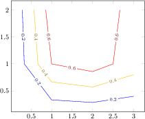
\begin{tikzpicture}
\begin{axis}
\addplot[contour prepared,
contour prepared format=matlab]
table {
% (0.2,5) ==> contour `0.2' (x), 5 points follow (y):
2.0000000e-01 5.0000000e+00
3.0000000e+00 4.0000000e-01
2.0000000e+00 2.8571429e-01
1.0000000e+00 3.3333333e-01
3.3333333e-01 1.0000000e+00
2.8571429e-01 2.0000000e+00
% (0.4,5) ==> contour `0.4', consists of 5 points
4.0000000e-01 5.0000000e+00
3.0000000e+00 8.0000000e-01
2.0000000e+00 5.7142857e-01
1.0000000e+00 6.6666667e-01
6.6666667e-01 1.0000000e+00
5.7142857e-01 2.0000000e+00
% (0.6,6) ==> contour `0.6', has 6 points
6.0000000e-01 6.0000000e+00
2.6666667e+00 2.0000000e+00
2.5000000e+00 1.0000000e+00
2.0000000e+00 8.5714286e-01
1.0000000e+00 1.0000000e+00
1.0000000e+00 1.0000000e+00
8.5714286e-01 2.0000000e+00
};
\end{axis}
\end{tikzpicture}
[.tex]
[.pdf]
\begin{tikzpicture}
\begin{axis}[
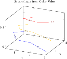
title=Separating $z$ from Color Value,
xlabel=$x$,
ylabel=$y$,
]
\addplot3[contour prepared,
point meta=\thisrow{level}]
table {
x y z level
0.857143 2 0.4 0.6
1 1 0.6 0.6
2 0.857143 0.6 0.6
2.5 1 0.6 0.6
2.66667 2 0.4 0.6
0.571429 2 0.2 0.4
0.666667 1 0.4 0.4
1 0.666667 0.4 0.4
2 0.571429 0.4 0.4
3 0.8 0.2 0.4
0.285714 2 0 0.2
0.333333 1 0.2 0.2
1 0.333333 0.2 0.2
2 0.285714 0.2 0.2
3 0.4 0 0.2
};
\end{axis}
\end{tikzpicture}
[.tex]
[.pdf]
\begin{tikzpicture}
\begin{axis}[
title={$x \exp(-x^2-y^2)$},
domain=-2:2,enlarge x limits,
view={0}{90},
]
\addplot3[
contour gnuplot={
scanline marks=required,
number=14,
contour label style={
/pgf/number format/fixed,
/pgf/number format/precision=1,
},
},thick
]
{exp(0-x^2-y^2)*x};
\end{axis}
\end{tikzpicture}
[.tex]
[.pdf]
\begin{tikzpicture}
\begin{axis}[view={0}{90}]
\addplot3[contour gnuplot={
labels over line,number=9}]
{x*y};
\end{axis}
\end{tikzpicture}
[.tex]
[.pdf]
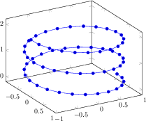
\begin{tikzpicture}
\begin{axis}[view={60}{30}]
\addplot3+[domain=0:5*pi,samples=60,samples y=0]
({sin(deg(x))},
{cos(deg(x))},
{2*x/(5*pi)});
\end{axis}
\end{tikzpicture}
[.tex]
[.pdf]
\begin{tikzpicture}
\begin{axis}[view={60}{30}]
\addplot3[mesh,z buffer=sort,
samples=20,domain=-1:0,y domain=0:2*pi]
({sqrt(1-x^2) * cos(deg(y))},
{sqrt( 1-x^2 ) * sin(deg(y))},
x);
\end{axis}
\end{tikzpicture}
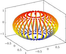
[.tex]
[.pdf]
\begin{tikzpicture}
\begin{axis}[view={60}{30}]
\addplot3[mesh,z buffer=sort,
scatter,only marks,scatter src=z,
samples=30,domain=-1:1,y domain=0:2*pi]
({sqrt(1-x^2) * cos(deg(y))},
{sqrt( 1-x^2 ) * sin(deg(y))},
x);
\end{axis}
\end{tikzpicture}
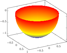
[.tex]
[.pdf]
\begin{tikzpicture}
\begin{axis}[view={60}{30}]
\addplot3[surf,shader=interp,z buffer=sort,
samples=30,domain=-1:0,y domain=0:2*pi]
({sqrt(1-x^2) * cos(deg(y))},
{sqrt( 1-x^2 ) * sin(deg(y))},
x);
\end{axis}
\end{tikzpicture}
[.tex]
[.pdf]
\begin{tikzpicture}
\begin{axis}
\addplot[patch]
table {
x y
0 0
1 1
2 0
% empty lines do not hurt, they are ignored here:
1 1
2 0
3 1
2 0
3 1
4 0
};
\end{axis}
\end{tikzpicture}
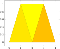
[.tex]
[.pdf]
\begin{tikzpicture}
\begin{axis}
\addplot[patch]
table[point meta=\thisrow{c}] {
x y c
0 0 0.2
1 1 0
2 0 1
1 1 0
2 0 1
3 1 0
2 0 1
3 1 0
4 0 0.5
};
\end{axis}
\end{tikzpicture}
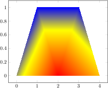
[.tex]
[.pdf]
\begin{tikzpicture}
\begin{axis}
\addplot[patch,shader=interp]
table[point meta=\thisrow{c}] {
x y c
0 0 0.2
1 1 0
2 0 1
1 1 0
2 0 1
3 1 0
2 0 1
3 1 0
4 0 0.5
};
\end{axis}
\end{tikzpicture}
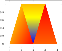
[.tex]
[.pdf]
\begin{tikzpicture}
\begin{axis}
\addplot[patch,shader=interp]
table[point meta=\thisrow{c}] {
x y c
0 0 0.2
1 1 0
2 0 1
1 1 0
2 0 -1
3 1 0
2 0 0.5
3 1 1
4 0 0.5
};
\end{axis}
\end{tikzpicture}
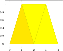
[.tex]
[.pdf]
\begin{tikzpicture}
\begin{axis}
\addplot[patch,table/row sep=\\,patch table={%
0 1 2\\
1 2 3\\
4 3 5\\
}]
table[row sep=\\,point meta=\thisrow{c}] {
x y c \\
0 0 0.2\\% 0
1 1 0 \\% 1
2 0 1 \\% 2
3 1 0 \\% 3
2 0 0.5\\% 4
4 0 0.5\\% 5
};
\end{axis}
\end{tikzpicture}
[.tex]
[.pdf]
\begin{tikzpicture}
\begin{axis}
% this uses per-patch color data:
\addplot[patch,table/row sep=\\,
patch table with point meta={%
0 1 2 100\\
1 2 3 10\\
4 3 5 0\\
}]
table[row sep=\\] {
x y \\
0 0 \\% 0
1 1 \\% 1
2 0 \\% 2
3 1 \\% 3
2 0 \\% 4
4 0 \\% 5
};
\end{axis}
\end{tikzpicture}
[.tex]
[.pdf]
\begin{tikzpicture}
\begin{axis}
% this uses n per-patch color values:
\addplot[patch,shader=interp,
table/row sep=\\,
patch table with individual point meta={%
0 1 2 100 100 100\\% V_0 V_1 V_2 C_0 C_1 C_2
1 2 3 10 0 50\\
4 3 5 0 0 100\\
}]
table[row sep=\\] {
x y \\
0 0 \\% 0
1 1 \\% 1
2 0 \\% 2
3 1 \\% 3
2 0 \\% 4
4 0 \\% 5
};
\end{axis}
\end{tikzpicture}
[.tex]
[.pdf]
\begin{tikzpicture}
\begin{axis}[axis equal]
% FokkerDrI_layer_0.patches.dat contains:
% # each row is one vertex; three consecutive
% # vertices make one triangle (patch)
% 105.577 -19.7332 2.85249
% 88.9233 -21.1254 13.0359
% 89.2104 -22.1547 1.46467
% # end of facet 0
% 105.577 -19.7332 2.85249
% 105.577 -17.2161 12.146
% 88.9233 -21.1254 13.0359
% # end of facet 1
\addplot3[patch]
file
{plotdata/FokkerDrI_layer_0.patches.dat};
\end{axis}
\end{tikzpicture}
[.tex]
[.pdf]
\begin{tikzpicture}
\begin{axis}
% FokkerDrI_layer_0.facetIdx.dat contains:
% # each row makes up one facet; it
% # consists of 0-based indices into
% # the vertex array
% 0 1 2 % triangle of vertices #0,#1 and #2
% 0 3 1 % triangle of vertices #0,#3 and #1
% 3 4 1
% 5 6 7
% 6 8 7
% 8 9 7
% 8 10 9
% ...
% while FokkerDrI_layer_0.vertices.dat contains
% 105.577 -19.7332 2.85249 % vertex #0
% 88.9233 -21.1254 13.0359 % vertex #1
% 89.2104 -22.1547 1.46467 % vertex #2
% 105.577 -17.2161 12.146
% 105.577 -10.6054 18.7567
% 105.577 7.98161 18.7567
% 105.577 14.5923 12.146
% ...
\addplot3[patch,shader=interp,
patch table=
{plotdata/FokkerDrI_layer_0.facetIdx.dat}]
file
{plotdata/FokkerDrI_layer_0.vertices.dat};
\end{axis}
\end{tikzpicture}
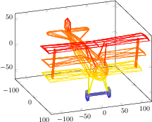
[.tex]
[.pdf]
\begin{tikzpicture}
\begin{axis}[view/h=70]
% FokkerDrI_layer_0.patches.dat contains:
% # each row is one vertex; three consecutive
% # vertices make one triangle (patch)
% 105.577 -19.7332 2.85249
% 88.9233 -21.1254 13.0359
% 89.2104 -22.1547 1.46467
% # end of facet 0
% 105.577 -19.7332 2.85249
% 105.577 -17.2161 12.146
% 88.9233 -21.1254 13.0359
% # end of facet 1
\addplot3[patch,mesh]
file
{plotdata/FokkerDrI_layer_0.patches.dat};
\end{axis}
\end{tikzpicture}
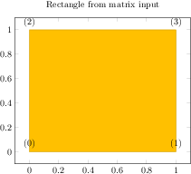
[.tex]
[.pdf]
\begin{tikzpicture}
\begin{axis}[nodes near coords={(\coordindex)},
title=Rectangle from matrix input]
% note that surf implies 'patch type=rectangle'
\addplot[surf,mesh/rows=2,patch type=rectangle]
coordinates {
(0,0) (1,0)
(0,1) (1,1)
};
\end{axis}
\end{tikzpicture}
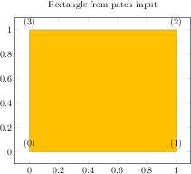
[.tex]
[.pdf]
\begin{tikzpicture}
\begin{axis}[nodes near coords={(\coordindex)},
title=Rectangle from patch input]
\addplot[patch,patch type=rectangle]
coordinates {
(0,0) (1,0) (1,1) (0,1)
};
\end{axis}
\end{tikzpicture}
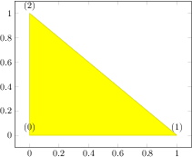
[.tex]
[.pdf]
\begin{tikzpicture}
\begin{axis}[nodes near coords={(\coordindex)}]
\addplot[patch,patch type=triangle]
coordinates {
(0,0) (1,0) (0,1)
};
\end{axis}
\end{tikzpicture}
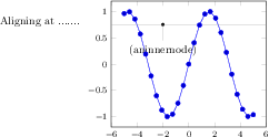
[.tex]
[.pdf]
Aligning at .......
\begin{tikzpicture}[baseline]
\begin{axis}[small,anchor=aninnernode.center]
\addplot {sin(deg(x))};
\node
[pin=-90:(aninnernode),fill=black,circle,scale=0.3]
(aninnernode) at (axis cs:-2,0.75) {};
\draw[help lines] (axis cs:-6,0.75) -- (axis cs:6,0.75);
\end{axis}
\end{tikzpicture}
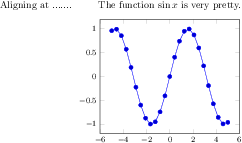
[.tex]
[.pdf]
Aligning at .......
\begin{tikzpicture}[baseline]
\begin{axis}[
small,
title={The function $\sin x$ is very pretty.},
title style={name=MyTitleNode},
anchor=MyTitleNode.base,
]
\addplot {sin(deg(x))};
\end{axis}
\end{tikzpicture}
[.tex]
[.pdf]
% 1. Unaligned:
\pgfplotsset{domain=-1:1}
\begin{tikzpicture}
\begin{axis}[xlabel=A normal sized $x$ label]
\addplot[smooth,blue,mark=*] {x^2};
\end{axis}
\end{tikzpicture}%
\hspace{0.15cm}
\begin{tikzpicture}
\begin{axis}[xlabel={$\displaystyle \sum_{i=0}^N n_i $ }]
\addplot[smooth,blue,mark=*] {x^2};
\end{axis}
\end{tikzpicture}
[.tex]
[.pdf]
% 2. Aligned:
\pgfplotsset{domain=-1:1}
\begin{tikzpicture}[baseline]
\begin{axis}[xlabel=A normal sized $x$ label]
\addplot[smooth,blue,mark=*] {x^2};
\end{axis}
\end{tikzpicture}%
\hspace{0.15cm}
\begin{tikzpicture}[baseline]
\begin{axis}[xlabel={$\displaystyle \sum_{i=0}^N n_i $ }]
\addplot[smooth,blue,mark=*] {x^2};
\end{axis}
\end{tikzpicture}
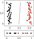
[.tex]
[.pdf]
\begin{tikzpicture}
\pgfplotsset{every axis/.append style={
cycle list={
{red,only marks,mark options={
fill=red,scale=0.8},mark=*},
{black,only marks,mark options={
fill=black,scale=0.8},mark=square*}}}}
\begin{axis}[width=4cm,scale only axis,
name=main plot]
\addplot file
{plotdata/pgfplots_scatterdata1.dat};
\addplot file
{plotdata/pgfplots_scatterdata2.dat};
\addplot[blue] coordinates {
(0.093947, -0.011481)
(0.101957, 0.494273)
(0.109967, 1.000027)};
\end{axis}
\begin{axis}[
at={(main plot.below south west)},yshift=-0.1cm,
anchor=north west,
width=4cm,scale only axis,height=0.8cm,
ytick=\empty]
\addplot file
{plotdata/pgfplots_scatterdata1_latent.dat};
\addplot file
{plotdata/pgfplots_scatterdata2_latent.dat};
\end{axis}
\end{tikzpicture}
[.tex]
[.pdf]
\pgfplotsset{
small,
title=Trimmed bounding boxes
}
\begin{center}
\begin{tabular}{rl}
\begin{tikzpicture}[baseline,trim axis left]
\begin{axis}
\addplot {x};
\end{axis}
\end{tikzpicture}
&
\begin{tikzpicture}[baseline,trim axis right]
\begin{axis}[
ylabel={$f(x)=x^2$},
yticklabel pos=right,
ylabel style={font=\Huge}]
\addplot {x^2};
\end{axis}
\end{tikzpicture}
\\
%
\begin{tikzpicture}[baseline,trim axis left]
\begin{axis}[xlabel=$x$,xlabel style={font=\Huge}]
\addplot {x^3};
\end{axis}
\end{tikzpicture}%
&
\begin{tikzpicture}[baseline,trim axis right]
\begin{axis}[yticklabel pos=right]
\addplot {x^4};
\end{axis}
\end{tikzpicture}%
\\
\end{tabular}%
\end{center}
[.tex]
[.pdf]
\begin{tikzpicture}
\pgfplotsset{small}
\matrix {
\begin{axis}
\addplot {x};
\end{axis}
&
% differently large labels are aligned automatically:
\begin{axis}[ylabel={$f(x)=x^2$},ylabel style={font=\Huge}]
\addplot {x^2};
\end{axis}
\\
%
\begin{axis}[xlabel=$x$,xlabel style={font=\Huge}]
\addplot {x^3};
\end{axis}
&
\begin{axis}
\addplot {x^4};
\end{axis}
\\
};
\end{tikzpicture}
[.tex]
[.pdf]
\begin{tikzpicture}%
\begin{axis}[
title=A title,
ylabel style={overlay},
yticklabel style={overlay},
xlabel={$x$},
ylabel={$y$},
legend style={at={(0.5,0.97)},
anchor=north,legend columns=-1},
domain=-2:2
]
\addplot {x^2};
\addplot {x^3};
\addplot {x^4};
\legend{$x^2$,$x^3$,$x^4$}
\end{axis}
\end{tikzpicture}%
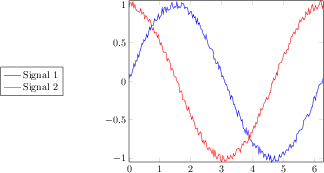
[.tex]
[.pdf]
\begin{tikzpicture}
\begin{axis}[
domain=0:6.2832,samples=200,
legend style={
overlay,
at={(-0.5,0.5)},
anchor=center},
every axis plot post/.append style={mark=none},
enlargelimits=false]
\addplot {sin(deg(x)+3)+rand*0.05};
\addplot {cos(deg(x)+2)+rand*0.05};
\legend{Signal 1,Signal 2}
\end{axis}
\end{tikzpicture}
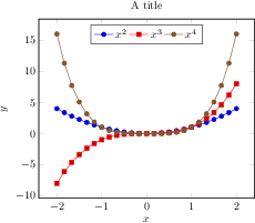
[.tex]
[.pdf]
\setlength{\fboxsep}{0pt}%
\fbox{%
\begin{tikzpicture}%
\begin{axis}[
title=A title,
xlabel={$x$},
ylabel={$y$},
legend style={at={(0.5,0.97)},
anchor=north,legend columns=-1},
domain=-2:2
]
\addplot {x^2};
\addplot {x^3};
\addplot {x^4};
\legend{$x^2$,$x^3$,$x^4$}
\end{axis}
\pgfresetboundingbox
\path
(current axis.south west)
rectangle (current axis.north east);
\end{tikzpicture}%
}%
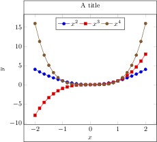
[.tex]
[.pdf]
\setlength{\fboxsep}{0pt}%
\fbox{%
\begin{tikzpicture}%
\begin{pgfinterruptboundingbox}
\begin{axis}[
title=A title,
xlabel={$x$},
ylabel={$y$},
legend style={at={(0.5,0.97)},
anchor=north,legend columns=-1},
domain=-2:2
]
\addplot {x^2};
\addplot {x^3};
\addplot {x^4};
\legend{$x^2$,$x^3$,$x^4$}
\end{axis}
\end{pgfinterruptboundingbox}
\useasboundingbox
(current axis.below south west)
rectangle (current axis.above north east);
\end{tikzpicture}%
}%
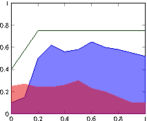
[.tex]
[.pdf]
\begin{tikzpicture}
\begin{axis}[ymin=0,ymax=1,enlargelimits=false]
\addplot
[blue!80!black,fill=blue,fill opacity=0.5]
coordinates
{(0,0.1) (0.1,0.15) (0.2,0.5) (0.3,0.62)
(0.4,0.56) (0.5,0.58) (0.6,0.65) (0.7,0.6)
(0.8,0.58) (0.9,0.55) (1,0.52)}
|- (axis cs:0,0) -- cycle;
\addplot
[red,fill=red!90!black,opacity=0.5]
coordinates
{(0,0.25) (0.1,0.27) (0.2,0.24) (0.3,0.24)
(0.4,0.26) (0.5,0.3) (0.6,0.23) (0.7,0.2)
(0.8,0.15) (0.9,0.1) (1,0.1)}
|- (axis cs:0,0) -- cycle;
\addplot[green!20!black] coordinates
{(0,0.4) (0.2,0.75) (1,0.75)};
\end{axis}
\end{tikzpicture}
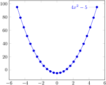
[.tex]
[.pdf]
\begin{tikzpicture}
\begin{axis}
\addplot+[id=parable,domain=-5:5]
gnuplot{4*x**2 - 5}
node[pin=180:{$4x^2-5$}]{};
\end{axis}
\end{tikzpicture}
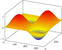
[.tex]
[.pdf]
\begin{tikzpicture}
\begin{axis}
\addplot3[surf,domain=0:360,samples=40]
{sin(x)*sin(y)};
\end{axis}
\end{tikzpicture}
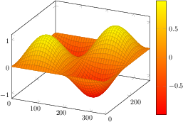
[.tex]
[.pdf]
\begin{tikzpicture}
\begin{axis}[colormap/redyellow,colorbar]
\addplot3[surf,
domain=0:360,samples=40]
{sin(x)*sin(y)};
\end{axis}
\end{tikzpicture}

[.tex]
[.pdf]
\begin{tikzpicture}
\begin{axis}[view={60}{30}]
\addplot3[surf,shader=flat,
samples=20,
domain=-1:0,y domain=0:2*pi,
z buffer=sort]
({sqrt(1-x^2) * cos(deg(y))},
{sqrt( 1-x^2 ) * sin(deg(y))},
x);
\end{axis}
\end{tikzpicture}
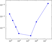
[.tex]
[.pdf]
\begin{tikzpicture}
\begin{loglogaxis}
\addplot coordinates {
(769, 1.6227e-04)
(1793, 4.4425e-05)
(4097, 1.2071e-05)
(9217, 3.2610e-06)
(2.2e5, 2.1E-6)
(1e6, 0.00003341)
(2.3e7, 0.00131415)
};
\end{loglogaxis}
\end{tikzpicture}
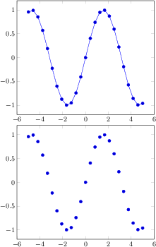
[.tex]
[.pdf]
\begin{tikzpicture}
\begin{axis}
\addplot {sin(deg(x))};
\end{axis}
\end{tikzpicture}
\begin{tikzpicture}
\begin{axis}
\addplot+[only marks] {sin(deg(x))};
\end{axis}
\end{tikzpicture}
[.tex]
[.pdf]
\begin{tikzpicture}
\begin{axis}
\addplot coordinates {
(0,0)
(0.5,1)
(1,2)
};
\end{axis}
\end{tikzpicture}
[.tex]
[.pdf]
\begin{tikzpicture}
\begin{axis}
\addplot+[error bars/.cd,x dir=both,x explicit]
coordinates {
(0,0) +- (0.1,0)
(0.5,1) +- (0.4,0.2)
(1,2)
(2,5) +- (1,0.1)
};
\end{axis}
\end{tikzpicture}
[.tex]
[.pdf]
\begin{tikzpicture}
\begin{axis}
\addplot+[scatter,scatter src=explicit] coordinates {
(900,1e-6) [1]
(2600,5e-7) [2]
(4000,7e-8) [3]
};
\end{axis}
\end{tikzpicture}
\begin{tikzpicture}
\begin{loglogaxis}[
xlabel=Dof,
ylabel=$L_2$ error]
\addplot table[x=dof,y=L2] {datafile.dat};
\end{loglogaxis}
\end{tikzpicture}
\begin{tikzpicture}
\begin{loglogaxis}[
xlabel=Dof,
ylabel=$L_\infty$ error]
\addplot table[x=dof,y=Lmax] {datafile.dat};
\end{loglogaxis}
\end{tikzpicture}
\begin{tikzpicture}
\begin{loglogaxis}[
xlabel=Dof,
ylabel=$L_\infty$ error]
\addplot table[x=dof,y=Lmax] {
dof L2 Lmax maxlevel
5 8.31160034e-02 1.80007647e-01 2
17 2.54685628e-02 3.75580565e-02 3
49 7.40715288e-03 1.49212716e-02 4
129 2.10192154e-03 4.23330523e-03 5
321 5.87352989e-04 1.30668515e-03 6
769 1.62269942e-04 3.88658098e-04 7
1793 4.44248889e-05 1.12651668e-04 8
4097 1.20714122e-05 3.20339285e-05 9
9217 3.26101452e-06 8.97617707e-06 10
};
\end{loglogaxis}
\end{tikzpicture}
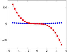
[.tex]
[.pdf]
\begin{tikzpicture}
\begin{axis}
\addplot {x^2 + 4};
\addplot {-5*x^3 - x^2};
\end{axis}
\end{tikzpicture}
[.tex]
[.pdf]
\begin{tikzpicture}
\begin{axis}
\addplot+[domain=0:360]
{sin(x)};
\end{axis}
\end{tikzpicture}
[.tex]
[.pdf]
\begin{tikzpicture}
\begin{axis}
\addplot+[domain=-pi:pi]
{sin(deg(x))};
\end{axis}
\end{tikzpicture}
[.tex]
[.pdf]
\begin{tikzpicture}
\begin{loglogaxis}[
title={$\frac{1}{x^2}$}]
\addplot[blue,domain=1:1e30]
{x^-2};
\end{loglogaxis}
\end{tikzpicture}
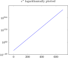
[.tex]
[.pdf]
\begin{tikzpicture}
\begin{semilogyaxis}[
title={$e^x$ logarithmically plotted}]
\addplot[blue,domain=1:700]
{exp(x)};
\end{semilogyaxis}
\end{tikzpicture}
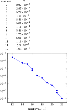
[.tex]
[.pdf]
\pgfplotstabletypeset[columns={maxlevel,L2}]{plotdata/newexperiment1.dat}
\begin{tikzpicture}
\begin{semilogyaxis}[
xlabel=\texttt{maxlevel}$ + 10$
]
\addplot table
[x expr=\thisrow{maxlevel}+10, y=L2]
{plotdata/newexperiment1.dat};
\end{semilogyaxis}
\end{tikzpicture}
[.tex]
[.pdf]
\begin{tikzpicture}
\begin{axis}
\addplot
gnuplot[id=sin]{sin(x)};
\end{axis}
\end{tikzpicture}
[.tex]
[.pdf]
\begin{tikzpicture}
\begin{semilogyaxis}
\addplot gnuplot
[id=exp,domain=0:10]{exp(x)};
\end{semilogyaxis}
\end{tikzpicture}
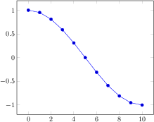
[.tex]
[.pdf]
\begin{tikzpicture}
\begin{axis}
\addplot
shell[prefix=pgfshell_,id=cos]{awk 'BEGIN{
pi=3.14159; N=10;
for(i=0;i<=N;i++) print i,cos(i/N*pi);}'};
\end{axis}
\end{tikzpicture}

[.tex]
[.pdf]
\begin{tikzpicture}
\begin{axis}
\addplot+[prefix=pgfshell_,id=replot]
shell{cat pgfshell_cos.out};
% just reprint the result from above
\end{axis}
\end{tikzpicture}

[.tex]
[.pdf]
\begin{tikzpicture}
\begin{axis}[enlargelimits=false,axis on top]
\addplot graphics
[xmin=-3,xmax=3,ymin=-3,ymax=3]
{external1};
\end{axis}
\end{tikzpicture}
[.tex]
[.pdf]
\begin{tikzpicture}
\begin{axis}[axis on top,title=Graphics Import]
\addplot graphics
[xmin=0,xmax=1,ymin=0,ymax=1,
% trim=left bottom right top
includegraphics={trim=12 9 12 8,clip}]
{external2};
\addplot coordinates {(0,0) (1,1)};
\end{axis}
\end{tikzpicture}
[.tex]
[.pdf]
\begin{tikzpicture}
\begin{axis}[axis on top,title=Graphics Import]
% provide options for the legend:
\addplot[red,only marks,mark=*,mark size=1pt]
graphics
[xmin=0,xmax=1,ymin=0,ymax=1,
% trim=left bottom right top
includegraphics={trim=12 9 12 8,clip}]
{external2};
\addplot coordinates {(0,0) (1,1)};
\legend{Scatter,Line}
\end{axis}
\end{tikzpicture}

[.tex]
[.pdf]
\begin{tikzpicture}
\begin{axis}[axis on top,title=Graphics Import]
\addplot graphics
% instead of the min/max things:
[points={(0,1) (1,0)},
% trim=left bottom right top
includegraphics={trim=12 9 12 8,clip}]
{external2};
\addplot coordinates {(0,0) (1,1)};
\end{axis}
\end{tikzpicture}
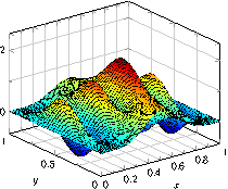
[.tex]
[.pdf]
\begin{tikzpicture}
\begin{axis}[
grid=both,minor tick num=1,
xlabel=$x$,ylabel=$y$,
]
\addplot3 graphics[
points={% important
(0,1,0) => (0,207-112)
(1,0,0) => (446,207-133)
(0.5546,0.5042,1.825) => (236,207)
(0,0,0) => (194,207-202)
}] {plotdata/plotgraphics3dsurf.png};
\end{axis}
\end{tikzpicture}
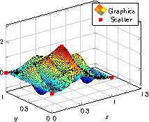
[.tex]
[.pdf]
\begin{tikzpicture}
\begin{axis}[
xmax=1.5,% extra limits
grid=both,minor tick num=1,
xlabel=$x$,ylabel=$y$,
]
\addplot3[surf] % 'surf' is only used for the legend.
graphics[
points={
(0,1,0) => (0,207-112)
(1,0,0) => (446,207-133)
(0.5546,0.5042,1.825) => (236,207)
(0,0,0) => (194,207-202)
}]
{plotdata/plotgraphics3dsurf.png};
\addlegendentry{Graphics}
\addplot3+[only marks] coordinates {
(0,1,0) (1,0,0)
(0.5546,0.5042,1.825) (0,0,0)
};
\addlegendentry{Scatter}
\end{axis}
\end{tikzpicture}
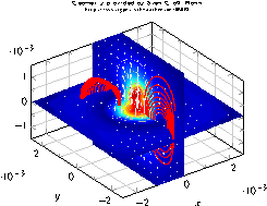
[.tex]
[.pdf]
\begin{tikzpicture}
\begin{axis}[
grid=both,minor tick num=1,
xlabel=$x$,ylabel=$y$,
title={\centering
Geometry provided by Sven Gro\ss, Bonn\\
\url{http://www.igpm.rwth-aachen.de/DROPS}\\},
title style={text width=6cm,font=\tiny},
]
\addplot3 graphics[
points={
(-0.002625,0.002625,0) => (140,234)
(0,0.00263,0.00263) => (230,364)
(0,-0.00263,-0.00263) => (366,81)
(0,-0.00263,0.00263) => (366,276)
(0.002625,0.002625,0.002625)
}
]
{plotdata/risingdrop3d.png};
\end{axis}
\end{tikzpicture}
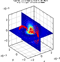
[.tex]
[.pdf]
\begin{tikzpicture}
\begin{axis}[
height=8cm,width=7cm,% improve scaling manually
grid=both,minor tick num=1,
xlabel=$x$,ylabel=$y$,
title={\centering
Geometry provided by Sven Gro\ss, Bonn\\
\url{http://www.igpm.rwth-aachen.de/DROPS}\\},
title style={text width=6cm,font=\tiny},
]
\addplot3 graphics[
points={
(-0.002625,0.002625,0) => (140,234)
(0,0.00263,0.00263) => (230,364)
(0,-0.00263,-0.00263) => (366,81)
(0,-0.00263,0.00263) => (366,276)
(0.002625,0.002625,0.002625)
}
]
{plotdata/risingdrop3d.png};
\end{axis}
\end{tikzpicture}

[.tex]
[.pdf]
\begin{tikzpicture}
\begin{axis}[
grid=both,minor tick num=1,
xlabel=$x$,ylabel=$y$,
3d box,
]
\addplot3 graphics[
points={
(1,1,1) => (205,48)
(10,1,10) => (503,324)
(1,1,4.044)=> (206,102)
(10,10,10) => (390,398)
}
]
{plotdata/plotgraphics3.png};
\end{axis}
\end{tikzpicture}
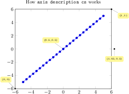
[.tex]
[.pdf]
% [See the TikZ manual if you'd like to learn about nodes and pins]
\begin{tikzpicture}
\tikzset{
every pin/.style={fill=yellow!50!white,rectangle,rounded corners=3pt,font=\tiny},
small dot/.style={fill=black,circle,scale=0.3}
}
\begin{axis}[
clip=false,
title=How \texttt{axis description cs} works
]
\addplot {x};
\node[small dot,pin=120:{$(0,0)$}] at (axis description cs:0,0) {};
\node[small dot,pin=-30:{$(1,1)$}] at (axis description cs:1,1) {};
\node[small dot,pin=-90:{$(1.03,0.5)$}] at (axis description cs:1.03,0.5) {};
\node[small dot,pin=125:{$(0.5,0.5)$}] at (axis description cs:0.5,0.5) {};
\end{axis}
\end{tikzpicture}
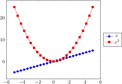
[.tex]
[.pdf]
\begin{tikzpicture}
\begin{axis}[
legend entries={$x$,$x^2$},
legend style={
at={(1.03,0.5)},
anchor=west
}
]
\addplot {x};
\addplot {x^2};
\end{axis}
\end{tikzpicture}
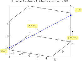
[.tex]
[.pdf]
% the same as above for 3D ...
% [See the TikZ manual if you'd like to learn about nodes and pins]
\begin{tikzpicture}
\tikzset{
every pin/.style={fill=yellow!50!white,rectangle,rounded corners=3pt,font=\tiny},
small dot/.style={fill=black,circle,scale=0.3}
}
\begin{axis}[
clip=false,
title=How \texttt{axis description cs} works in 3D
]
\addplot3 coordinates {(-5,-5,-5) (5,5,5)};
\draw[black!15] (axis description cs:0,0) rectangle (axis description cs:1,1);
\node[small dot,pin=120:{$(0,0)$}] at (axis description cs:0,0) {};
\node[small dot,pin=-30:{$(1,1)$}] at (axis description cs:1,1) {};
\node[small dot,pin=-90:{$(1.03,0.5)$}] at (axis description cs:1.03,0.5) {};
\node[small dot,pin=125:{$(0.5,0.5)$}] at (axis description cs:0.5,0.5) {};
\end{axis}
\end{tikzpicture}
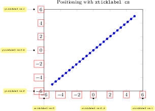
[.tex]
[.pdf]
\tikzset{
every pin/.style={fill=yellow!50!white,rectangle,rounded corners=3pt,font=\tiny},
small dot/.style={fill=black,circle,scale=0.3}
}
\begin{tikzpicture}
\begin{axis}[
clip=false,
ticklabel style={draw=red},
title=Positioning with \texttt{xticklabel cs}]
\addplot {x};
\node[small dot,pin=-90:{\texttt{xticklabel cs:0}}] at (xticklabel cs:0) {};
\node[small dot,pin=-90:{\texttt{xticklabel cs:0.5}}] at (xticklabel cs:0.5) {};
\node[small dot,pin=-90:{\texttt{xticklabel cs:1}}] at (xticklabel cs:1) {};
\node[small dot,pin=180:{\texttt{yticklabel cs:0}}] at (yticklabel cs:0) {};
\node[small dot,pin=180:{\texttt{yticklabel cs:0.5}}] at (yticklabel cs:0.5) {};
\node[small dot,pin=180:{\texttt{yticklabel cs:1}}] at (yticklabel cs:1) {};
\end{axis}
\end{tikzpicture}

[.tex]
[.pdf]
% the same as above for 3D ...
\begin{tikzpicture}
\tikzset{
every pin/.style={fill=yellow!50!white,rectangle,rounded corners=3pt,font=\tiny},
small dot/.style={fill=black,circle,scale=0.3}
}
\begin{axis}[
ticklabel style={draw=red},
clip=false,
title=Positioning with \texttt{ticklabel cs} in 3D
]
\addplot3 coordinates {(-5,-5,-5) (5,5,5)};
\node[small dot,pin=-90:{\texttt{xticklabel cs:0}}] at (xticklabel cs:0) {};
\node[small dot,pin=-90:{\texttt{xticklabel cs:0.5}}] at (xticklabel cs:0.5) {};
\node[small dot,pin=-90:{\texttt{xticklabel cs:1}}] at (xticklabel cs:1) {};
\node[small dot,pin=-45:{\texttt{yticklabel cs:0}}] at (yticklabel cs:0) {};
\node[small dot,pin=-45:{\texttt{yticklabel cs:0.5}}] at (yticklabel cs:0.5) {};
\node[small dot,pin=-45:{\texttt{yticklabel cs:1}}] at (yticklabel cs:1) {};
\node[small dot,pin=180:{\texttt{zticklabel cs:0}}] at (zticklabel cs:0) {};
\node[small dot,pin=180:{\texttt{zticklabel cs:0.5}}] at (zticklabel cs:0.5) {};
\node[small dot,pin=180:{\texttt{zticklabel cs:1}}] at (zticklabel cs:1) {};
\end{axis}
\end{tikzpicture}
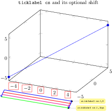
[.tex]
[.pdf]
\tikzset{
every pin/.style={fill=yellow!50!white,rectangle,rounded corners=3pt,font=\tiny},
small dot/.style={fill=black,circle,scale=0.3}
}
\begin{tikzpicture}
\begin{axis}[
xticklabel style={draw=red},
clip=false,
title=\texttt{ticklabel cs} and its optional shift
]
\addplot3 coordinates {(-5,-5,-5) (5,5,5)};
\draw[blue,thick,->] (xticklabel cs:0,0) -- (xticklabel cs:1,0);
\draw[red,thick,->] (xticklabel cs:0,5pt) -- (xticklabel cs:1,5pt);
\draw[magenta,thick,->] (xticklabel cs:0,10pt) -- (xticklabel cs:1,10pt);
\draw[green,thick,->] (xticklabel cs:0,15pt) -- (xticklabel cs:1,15pt);
\node[small dot,pin=0:{\texttt{xticklabel cs:1,0}}] at (xticklabel cs:1,0) {};
\node[small dot,pin=0:{\texttt{xticklabel cs:1,15pt}}] at (xticklabel cs:1,15pt) {};
\draw[blue,thick,->] (xticklabel cs:0,0) -- (xticklabel cs:0,15pt);
\draw[blue,thick,->] (xticklabel cs:1,0) -- (xticklabel cs:1,15pt);
\end{axis}
\end{tikzpicture}
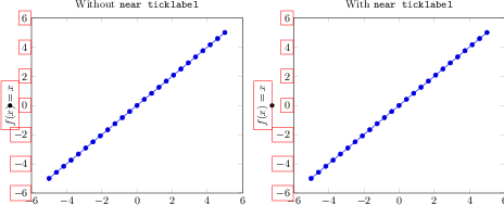
[.tex]
[.pdf]
\begin{tikzpicture}
\begin{axis}[
title=Without \texttt{near ticklabel},
ylabel={$f(x)=x$},
every axis y label/.style=
{at={(ticklabel cs:0.5)},rotate=90,anchor=center},
clip=false,% to display the \path below
ylabel style={draw=red},
yticklabel style={draw=red}
]
\addplot {x};
% visualize the position:
\fill (yticklabel cs:0.5) circle(2pt);
\end{axis}
\end{tikzpicture}%
~
\begin{tikzpicture}
\begin{axis}[
title=With \texttt{near ticklabel},
ylabel={$f(x)=x$},
every axis y label/.style=
{at={(ticklabel cs:0.5)},rotate=90,anchor=near ticklabel},
clip=false,
ylabel style={draw=red},
yticklabel style={draw=red}
]
\addplot {x};
\fill (yticklabel cs:0.5) circle(2pt);
\end{axis}
\end{tikzpicture}

[.tex]
[.pdf]
\begin{tikzpicture}
\begin{axis}[
xlabel=Variable 1,
ylabel=Variable 2,
zlabel=value,
xlabel style={sloped like x axis},
ylabel style={sloped}
]
\addplot3[surf] {y*x*(1-x)};
\end{axis}
\end{tikzpicture}
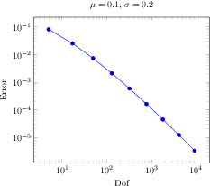
[.tex]
[.pdf]
\begin{tikzpicture}
\begin{loglogaxis}[
xlabel=Dof,ylabel=Error,
title={$\mu=0.1$, $\sigma=0.2$}]
\addplot coordinates {
(5, 8.312e-02)
(17, 2.547e-02)
(49, 7.407e-03)
(129, 2.102e-03)
(321, 5.874e-04)
(769, 1.623e-04)
(1793, 4.442e-05)
(4097, 1.207e-05)
(9217, 3.261e-06)
};
\end{loglogaxis}
\end{tikzpicture}%
[.tex]
[.pdf]
\pgfplotsset{every axis/.append style={
extra description/.code={
\node at (0.5,0.5) {Center!};
}}}
\begin{tikzpicture}
\begin{axis}
\addplot {x^2};
\end{axis}
\end{tikzpicture}
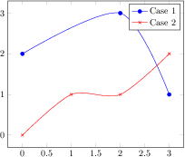
[.tex]
[.pdf]
\begin{tikzpicture}
\begin{axis}
\addplot[smooth,mark=*,blue] coordinates {
(0,2)
(2,3)
(3,1)
};
\addlegendentry{Case 1}
\addplot[smooth,color=red,mark=x]
coordinates {
(0,0)
(1,1)
(2,1)
(3,2)
};
\addlegendentry{Case 2}
\end{axis}
\end{tikzpicture}
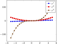
[.tex]
[.pdf]
\begin{tikzpicture}
\begin{axis}
\foreach \p in {1,2,3} {
\addplot {x^\p};
\addlegendentryexpanded{$x^\p$}
}
\end{axis}
\end{tikzpicture}
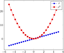
[.tex]
[.pdf]
\begin{tikzpicture}
\begin{axis}[legend entries={$x$,$x^2$}]
\addplot {x};
\addplot {x^2};
\end{axis}
\end{tikzpicture}
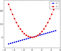
[.tex]
[.pdf]
\begin{tikzpicture}
\begin{axis}[legend entries={$x$,$x^2$}]
\addplot {x};
\addplot {x^2};
\legend{$a$,$b$}% overrides the option
\end{axis}
\end{tikzpicture}

[.tex]
[.pdf]
\begin{tikzpicture}
\begin{axis}[legend entries={$x$,[red]$x^2$,$x^3$}]
\addplot {x};
\addplot {x^2};
\addplot {x^3};
\end{axis}
\end{tikzpicture}
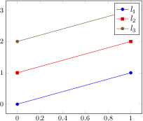
[.tex]
[.pdf]
\begin{tikzpicture}
\begin{axis}[
% this modifies 'every axis legend':
legend style={font=\large}
]
\addplot coordinates {(0,0) (1,1)};
\addplot coordinates {(0,1) (1,2)};
\addplot coordinates {(0,2) (1,3)};
\legend{$l_1$,$l_2$,$l_3$}
\end{axis}
\end{tikzpicture}
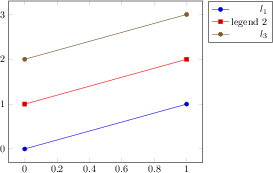
[.tex]
[.pdf]
\begin{tikzpicture}
\begin{axis}[
% align right:
legend style={
cells={anchor=east},
legend pos=outer north east,
}
]
\addplot coordinates {(0,0) (1,1)};
\addplot coordinates {(0,1) (1,2)};
\addplot coordinates {(0,2) (1,3)};
\legend{$l_1$, legend $2$,$l_3$}
\end{axis}
\end{tikzpicture}
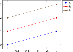
[.tex]
[.pdf]
% similar placement as previous example:
\pgfplotsset{every axis legend/.append style={
at={(1.02,1)},
anchor=north west}}
\begin{tikzpicture}
\begin{axis}
\addplot coordinates {(0,0) (1,1)};
\addplot coordinates {(0,1) (1,2)};
\addplot coordinates {(0,2) (1,3)};
\legend{$l_1$,$l_2$,$l_3$}
\end{axis}
\end{tikzpicture}
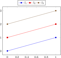
[.tex]
[.pdf]
\begin{tikzpicture}
\pgfplotsset{every axis legend/.append style={
at={(0.5,1.03)},
anchor=south}}
\begin{axis}[legend columns=4]
\addplot coordinates {(0,0) (1,1)};
\addplot coordinates {(0,1) (1,2)};
\addplot coordinates {(0,2) (1,3)};
\legend{$l_1$,$l_2$,$l_3$}
\end{axis}
\end{tikzpicture}
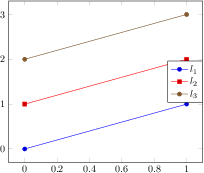
[.tex]
[.pdf]
\begin{tikzpicture}
\begin{axis}[
legend style={
at={(1,0.5)},
anchor=east}]
\addplot coordinates {(0,0) (1,1)};
\addplot coordinates {(0,1) (1,2)};
\addplot coordinates {(0,2) (1,3)};
\legend{$l_1$,$l_2$,$l_3$}
\end{axis}
\end{tikzpicture}

[.tex]
[.pdf]
\begin{tikzpicture}
\begin{axis}[tiny,title=With legend box]
\addplot[blue]{x};
\addplot[red]{2*x};
\legend{$x$,$2x$}
\end{axis}
\end{tikzpicture}

[.tex]
[.pdf]
\begin{tikzpicture}
\begin{axis}[tiny,title=Without legend box,
legend style={draw=none}]
\addplot[blue]{x};
\addplot[red]{2*x};
\legend{$x$,$2x$}
\end{axis}
\end{tikzpicture}
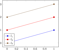
[.tex]
[.pdf]
\begin{tikzpicture}
\begin{axis}[legend pos=south west]
\addplot coordinates {(0,0) (1,1)};
\addplot coordinates {(0,1) (1,2)};
\addplot coordinates {(0,2) (1,3)};
\legend{$l_1$,$l_2$,$l_3$}
\end{axis}
\end{tikzpicture}
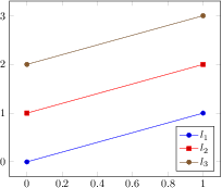
[.tex]
[.pdf]
\begin{tikzpicture}
\begin{axis}[legend pos=south east]
\addplot coordinates {(0,0) (1,1)};
\addplot coordinates {(0,1) (1,2)};
\addplot coordinates {(0,2) (1,3)};
\legend{$l_1$,$l_2$,$l_3$}
\end{axis}
\end{tikzpicture}
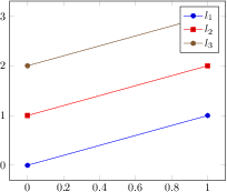
[.tex]
[.pdf]
\begin{tikzpicture}
\begin{axis}[legend pos=north east]
\addplot coordinates {(0,0) (1,1)};
\addplot coordinates {(0,1) (1,2)};
\addplot coordinates {(0,2) (1,3)};
\legend{$l_1$,$l_2$,$l_3$}
\end{axis}
\end{tikzpicture}
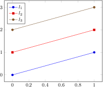
[.tex]
[.pdf]
\begin{tikzpicture}
\begin{axis}[legend pos=north west]
\addplot coordinates {(0,0) (1,1)};
\addplot coordinates {(0,1) (1,2)};
\addplot coordinates {(0,2) (1,3)};
\legend{$l_1$,$l_2$,$l_3$}
\end{axis}
\end{tikzpicture}
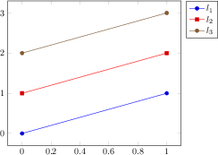
[.tex]
[.pdf]
\begin{tikzpicture}
\begin{axis}[legend pos=outer north east]
\addplot coordinates {(0,0) (1,1)};
\addplot coordinates {(0,1) (1,2)};
\addplot coordinates {(0,2) (1,3)};
\legend{$l_1$,$l_2$,$l_3$}
\end{axis}
\end{tikzpicture}
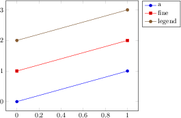
[.tex]
[.pdf]
\begin{tikzpicture}
\begin{axis}[legend cell align=left,
legend pos=outer north east]
\addplot coordinates {(0,0) (1,1)};
\addplot coordinates {(0,1) (1,2)};
\addplot coordinates {(0,2) (1,3)};
\legend{a,fine,legend}
\end{axis}
\end{tikzpicture}
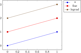
[.tex]
[.pdf]
\begin{tikzpicture}
\begin{axis}[legend cell align=center,
legend pos=outer north east]
\addplot coordinates {(0,0) (1,1)};
\addplot coordinates {(0,1) (1,2)};
\addplot coordinates {(0,2) (1,3)};
\legend{a,fine,legend}
\end{axis}
\end{tikzpicture}
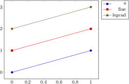
[.tex]
[.pdf]
\begin{tikzpicture}
\begin{axis}[legend cell align=right,
legend pos=outer north east]
\addplot coordinates {(0,0) (1,1)};
\addplot coordinates {(0,1) (1,2)};
\addplot coordinates {(0,2) (1,3)};
\legend{a,fine,legend}
\end{axis}
\end{tikzpicture}
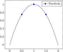
[.tex]
[.pdf]
\begin{tikzpicture}
\begin{axis}[legend image post style={mark=*}]
\addplot+[only marks,forget plot]
coordinates {(0.5,0.75) (1,1) (1.5,0.75)};
\addplot+[mark=none,smooth,domain=0:2]
{-x*(x-2)};
\addlegendentry{Parabola}
\end{axis}
\end{tikzpicture}
[.tex]
[.pdf]
% \usetikzlibrary{patterns}
\begin{tikzpicture}
\begin{axis}[area legend,
axis x line=bottom,
axis y line=left,
domain=0:1,
legend style={at={(0.03,0.97)},
anchor=north west},
axis on top,xmin=0]
\addplot[pattern=crosshatch dots,
pattern color=blue,draw=blue,
samples=500]
{sqrt(x)} \closedcycle;
\addplot[pattern=crosshatch,
pattern color=blue!30!white,
draw=blue!30!white]
{x^2} \closedcycle;
\addplot[red,line legend] coordinates {(0,0) (1,1)};
\legend{$\sqrt x$,$x^2$,$x$}
\end{axis}
\end{tikzpicture}
[.tex]
[.pdf]
\begin{tikzpicture}
\begin{axis}[legend pos=north west]
\addplot {x^3};
\addplot[ybar,fill=red,draw=red!60,
ybar legend,mark=none,samples=5]
{-30*(x +4)};
\legend{first,second}
\end{axis}
\end{tikzpicture}
[.tex]
[.pdf]
\begin{tikzpicture}
\begin{axis}[legend pos=outer north east]
\addplot3[surf,samples=9,domain=0:1]
{(1-abs(2*(x-0.5))) * (1-abs(2*(y-0.5)))};
\addlegendentry{$\phi_x \phi_y$}
\addplot3+[ultra thick] coordinates {(0,0,0) (0.5,0,1) (1,0,0)};
\addlegendentry{$\phi_x $}
\addplot3+[ultra thick] coordinates {(1,0,0) (1,0.5,1) (1,1,0)};
\addlegendentry{$\phi_y $}
\end{axis}
\end{tikzpicture}
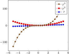
[.tex]
[.pdf]
\begin{tikzpicture}
\begin{axis}[reverse legend]
\addplot {x};
\addlegendentry{$x$}
\addplot {x^2};
\addlegendentry{$x^2$}
\addplot {x^3};
\addlegendentry{$x^3$}
\end{axis}
\end{tikzpicture}
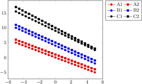
[.tex]
[.pdf]
\begin{tikzpicture}
\begin{axis}[
legend columns=2,
legend pos=outer north east,
cycle multi list={%
color list\nextlist
[2 of]mark list
}]
\addplot {-x}; \addlegendentry{A1}
\addplot {-x+1}; \addlegendentry{A2}
\addplot {-1.2*x + 4}; \addlegendentry{B1}
\addplot {-1.2*x + 5}; \addlegendentry{B2}
\addplot {-1.3*x + 9}; \addlegendentry{C1}
\addplot {-1.4*x + 10}; \addlegendentry{C2}
\end{axis}
\end{tikzpicture}
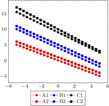
[.tex]
[.pdf]
\begin{tikzpicture}
\begin{axis}[
transpose legend,
legend columns=2,
legend style={at={(0.5,-0.1)},anchor=north},
cycle multi list={%
color list\nextlist
[2 of]mark list
}]
\addplot {-x}; \addlegendentry{A1}
\addplot {-x+1}; \addlegendentry{A2}
\addplot {-1.2*x + 4}; \addlegendentry{B1}
\addplot {-1.2*x + 5}; \addlegendentry{B2}
\addplot {-1.3*x + 9}; \addlegendentry{C1}
\addplot {-1.4*x + 10}; \addlegendentry{C2}
\end{axis}
\end{tikzpicture}
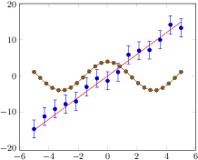
[.tex]
[.pdf]
\begin{tikzpicture}[baseline]
\begin{axis}
\addplot+[only marks,
samples=15,
error bars/y dir=both,
error bars/y fixed=2.5]
{3*x+2.5*rand};
\label{pgfplots:label1}
\addplot+[mark=none] {3*x};
\label{pgfplots:label2}
\addplot {4*cos(deg(x))};
\label{pgfplots:label3}
\end{axis}
\end{tikzpicture}
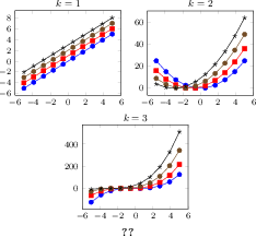
[.tex]
[.pdf]
\pgfplotsset{footnotesize,samples=10}
\begin{center}% note that \centering uses less vspace...
\begin{tikzpicture}
\begin{axis}[
legend columns=-1,
legend entries={$(x+0)^k$;,$(x+1)^k$;,$(x+2)^k$;,$(x+3)^k$},
legend to name=named,
title={$k=1$}]
\addplot {x};
\addplot {x+1};
\addplot {x+2};
\addplot {x+3};
\end{axis}
\end{tikzpicture}
%
\begin{tikzpicture}
\begin{axis}[title={$k=2$}]
\addplot {x^2};
\addplot {(x+1)^2};
\addplot {(x+2)^2};
\addplot {(x+3)^2};
\end{axis}
\end{tikzpicture}
%
\begin{tikzpicture}
\begin{axis}[title={$k=3$}]
\addplot {x^3};
\addplot {(x+1)^3};
\addplot {(x+2)^3};
\addplot {(x+3)^3};
\end{axis}
\end{tikzpicture}
\\
\ref{named}
\end{center}
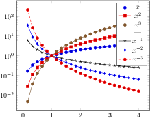
[.tex]
[.pdf]
\begin{tikzpicture}
\begin{semilogyaxis}[
domain=0:4,
]
\addplot {x}; \addlegendentry{$x$}
\addplot {x^2}; \addlegendentry{$x^2$}
\addplot {x^3}; \addlegendentry{$x^3$}
\addlegendimage{empty legend}
\addlegendentry{---}
\addplot {x^(-1)}; \addlegendentry{$x^{-1}$}
\addplot {x^(-2)}; \addlegendentry{$x^{-2}$}
\addplot {x^(-3)}; \addlegendentry{$x^{-3}$}
\end{semilogyaxis}
\end{tikzpicture}

[.tex]
[.pdf]
\begin{tikzpicture}
\begin{semilogyaxis}[
domain=0:4,
]
\addplot {x}; \addlegendentry{$x$}
\addplot {x^2}; \addlegendentry{$x^2$}
\addplot {x^3}; \addlegendentry{$x^3$}
\addlegendimage{empty legend}
\addlegendentry[text width=25pt,text depth=]
{Neg. Sign:}
\addplot {x^(-1)}; \addlegendentry{$x^{-1}$}
\addplot {x^(-2)}; \addlegendentry{$x^{-2}$}
\addplot {x^(-3)}; \addlegendentry{$x^{-3}$}
\end{semilogyaxis}
\end{tikzpicture}
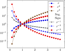
[.tex]
[.pdf]
\begin{tikzpicture}
\begin{semilogyaxis}[
domain=0:4,
legend entries={%
$x$,$x^2$,$x^3$,%
{[text width=25pt,text depth=]Neg. Sign:},%
$x^{-1}$,$x^{-2}$,$x^{-3}$},
% same effect:
% legend style={
% nodes={text width=25pt,text depth=}}
]
\addplot {x};
\addplot {x^2};
\addplot {x^3};
\addlegendimage{empty legend}
\addplot {x^(-1)};
\addplot {x^(-2)};
\addplot {x^(-3)};
\end{semilogyaxis}
\end{tikzpicture}
[.tex]
[.pdf]
\begin{tikzpicture}
\begin{axis}[
xlabel=$x$,ylabel=$\sin x$]
\addplot[blue,mark=none,
domain=-10:0,samples=40]
{sin(deg(x))};
\end{axis}
\end{tikzpicture}
[.tex]
[.pdf]
\begin{tikzpicture}
\begin{axis}[
axis x line=middle,
axis y line=right,
ymax=1.1, ymin=-1.1,
xlabel=$x$,ylabel=$\sin x$
]
\addplot[blue,mark=none,
domain=-10:0,samples=40]
{sin(deg(x))};
\end{axis}
\end{tikzpicture}
[.tex]
[.pdf]
\begin{tikzpicture}
\begin{axis}[
axis x line=bottom,
axis y line=left,
xlabel=$x$,ylabel=$\sqrt{|x|}$
]
\addplot[blue,mark=none,
domain=-4:4,samples=501]
{sqrt(abs(x))};
\end{axis}
\end{tikzpicture}
[.tex]
[.pdf]
\begin{tikzpicture}
\begin{axis}[
minor tick num=3,
axis y line=center,
axis x line=middle,
xlabel=$x$,ylabel=$\sin x$
]
\addplot[smooth,blue,mark=none,
domain=-5:5,samples=40]
{sin(deg(x))};
\end{axis}
\end{tikzpicture}
[.tex]
[.pdf]
\begin{tikzpicture}
\begin{axis}[
minor tick num=3,
axis y line=left,
axis x line=middle,
xlabel=$x$,ylabel=$\sin x$
]
\addplot[smooth,blue,mark=none,
domain=-5:5,samples=40]
{sin(deg(x))};
\end{axis}
\end{tikzpicture}
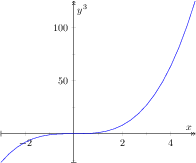
[.tex]
[.pdf]
\begin{tikzpicture}
\begin{axis}[
minor tick num=1,
axis x line=middle,
axis y line=middle,
every inner x axis line/.append style=
{|->>},
every inner y axis line/.append style=
{|->>},
xlabel=$x$,ylabel=$y^3$
]
\addplot[blue,domain=-3:5] {x^3};
\end{axis}
\end{tikzpicture}
[.tex]
[.pdf]
\begin{tikzpicture}
\begin{axis}[
separate axis lines, % important !
every outer x axis line/.append style=
{-stealth},
every outer y axis line/.append style=
{-stealth},
]
\addplot[blue,id=DoG,
samples=100,
domain=-15:15]
gnuplot{1.3*exp(-x**2/10) - exp(-x**2/20)};
\end{axis}
\end{tikzpicture}
[.tex]
[.pdf]
\begin{tikzpicture}
\begin{axis}[
separate axis lines,
every outer x axis line/.append style=
{-stealth,red},
every outer y axis line/.append style=
{-stealth,green!30!black},
]
\addplot[blue,
samples=100,
domain=-15:15]
{1.3*exp(0-x^2/10) - exp(0-x^2/20)};
% Unfortunately, there is a bug in PGF 2.00
% something like exp(-10^2)
% must be written as exp(0-10^2) :-(
\end{axis}
\end{tikzpicture}
[.tex]
[.pdf]
\begin{tikzpicture}
\begin{axis}[
separate axis lines=false,
every outer x axis line/.append style=
{-stealth,red},
every outer y axis line/.append style=
{-stealth,green!30!black},
]
\addplot[blue,id=DoG,
samples=100,
domain=-15:15]
gnuplot{1.3*exp(-x**2/10) - exp(-x**2/20)};
\end{axis}
\end{tikzpicture}
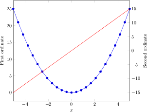
[.tex]
[.pdf]
\begin{tikzpicture}
\begin{axis}[
scale only axis,
xmin=-5,xmax=5,
axis y line*=left,% the '*' avoids arrow heads
xlabel=$x$,
ylabel=First ordinate]
\addplot {x^2};
\end{axis}
\begin{axis}[
scale only axis,
xmin=-5,xmax=5,
axis y line*=right,
axis x line=none,
ylabel=Second ordinate]
\addplot[red] {3*x};
\end{axis}
\end{tikzpicture}
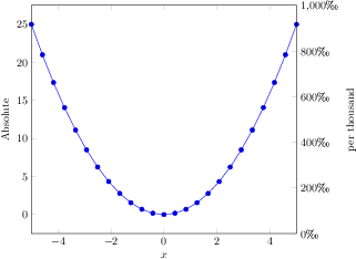
[.tex]
[.pdf]
% \usepackage{textcomp}
\begin{tikzpicture}
\begin{axis}[
scale only axis,
xmin=-5,xmax=5,
axis y line*=left,%'*' avoids arrow heads
xlabel=$x$,
ylabel=Absolute]
\addplot {x^2};
\end{axis}
\begin{axis}[
scale only axis,
xmin=-5,xmax=5,
ymin=0,ymax=1000,
yticklabel=
{$\pgfmathprintnumber{\tick}$\textperthousand},
axis y line*=right,
axis x line=none,
ylabel=per thousand]
\end{axis}
\end{tikzpicture}
[.tex]
[.pdf]
\begin{tikzpicture}
\begin{axis}[
axis x line=bottom,
axis x discontinuity=parallel,
axis y line=left,
xmin=360, xmax=600,
ymin=0, ymax=7,
enlargelimits=false
]
\addplot coordinates {
(420,2)
(500,6)
(590,4)
};
\end{axis}
\end{tikzpicture}
[.tex]
[.pdf]
\begin{tikzpicture}
\begin{axis}[
axis x line=bottom,
axis y line=center,
tick align=outside,
axis y discontinuity=crunch,
ymin=95, enlargelimits=false
]
\addplot[blue,mark=none,
domain=-4:4,samples=20]
{x*x+x+104};
\end{axis}
\end{tikzpicture}
[.tex]
[.pdf]
\begin{tikzpicture}
\begin{axis}[
axis x line=bottom,
axis y line=center,
tick align=outside,
axis y discontinuity=crunch,
xtickmax=3,
ytickmin=110,
ymin=95, enlargelimits=false
]
\addplot[blue,mark=none,
domain=-4:4,samples=20]
{x*x+x+104};
\end{axis}
\end{tikzpicture}
[.tex]
[.pdf]
\begin{tikzpicture}
\begin{axis}[
hide x axis,
hide y axis,
title={$x^2\cos(x)$}]
\addplot {cos(x)*x^2};
\end{axis}
\end{tikzpicture}
[.tex]
[.pdf]
\begin{tikzpicture}
\begin{axis}[
hide x axis,
axis y line=left,
title={$x^2\cos(x)$}]
\addplot {cos(x)*x^2};
\end{axis}
\end{tikzpicture}
[.tex]
[.pdf]
\begin{tikzpicture}
\begin{axis}[colorbar]
\addplot[mesh,ultra thick] {x};
\end{axis}
\end{tikzpicture}
[.tex]
[.pdf]
\begin{tikzpicture}
\begin{axis}[colorbar,colormap/greenyellow]
\addplot[mesh,ultra thick] {x};
\end{axis}
\end{tikzpicture}
[.tex]
[.pdf]
\begin{tikzpicture}
\begin{axis}[colorbar horizontal]
\addplot[mesh,ultra thick] {x};
\end{axis}
\end{tikzpicture}
[.tex]
[.pdf]
\begin{tikzpicture}
\begin{axis}[colorbar right]
\addplot[mesh,thick,samples=150,domain=0.1:3]
{1/x};
\end{axis}
\end{tikzpicture}
[.tex]
[.pdf]
\begin{tikzpicture}
\begin{axis}[colorbar left]
\addplot[mesh,thick,samples=150]
{x*sin(deg(4*x))};
\end{axis}
\end{tikzpicture}
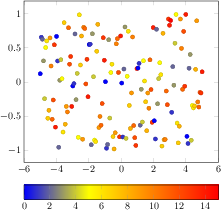
[.tex]
[.pdf]
\begin{tikzpicture}
\begin{axis}[colorbar horizontal]
\addplot[only marks,scatter,
scatter src={mod(\coordindex,15)},samples=150]
{rand};
\end{axis}
\end{tikzpicture}
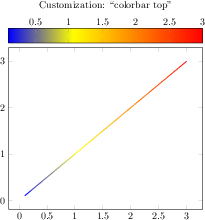
[.tex]
[.pdf]
\begin{tikzpicture}
\begin{axis}[
colorbar horizontal,
colorbar style={
at={(0.5,1.03)},anchor=south,
xticklabel pos=upper
},
title style={yshift=1cm},
title=Customization: ``colorbar top'']
\addplot[mesh,thick,samples=150,domain=0.1:3]
{x};
\end{axis}
\end{tikzpicture}
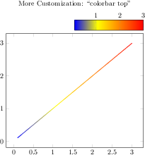
[.tex]
[.pdf]
\begin{tikzpicture}
\begin{axis}[
colorbar horizontal,
colorbar style={
at={(1,1.03)},anchor=south east,
width=0.5*
\pgfkeysvalueof{/pgfplots/parent axis width},
xticklabel pos=upper,
},
title style={yshift=1cm},
title=More Customization: ``colorbar top'']
\addplot[mesh,thick,samples=150,domain=0.1:3]
{x};
\end{axis}
\end{tikzpicture}
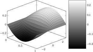
[.tex]
[.pdf]
\begin{tikzpicture}
\begin{axis}[
view/az=45,
colorbar,
colorbar/width=2cm,
colormap/blackwhite]
\addplot3[surf,domain=0:1,y domain=-3:3] {x*(1-x)*tanh(y)};
\end{axis}
\end{tikzpicture}
[.tex]
[.pdf]
\begin{tikzpicture}
\begin{axis}[colorbar sampled]
\addplot[mesh,samples=40] {sin(deg(x))};
\end{axis}
\end{tikzpicture}

[.tex]
[.pdf]
\begin{tikzpicture}
\begin{axis}[colorbar sampled,colorbar style={samples=8}]
\addplot[mesh,samples=40] {sin(deg(x))};
\end{axis}
\end{tikzpicture}

[.tex]
[.pdf]
\begin{tikzpicture}
\begin{axis}[colorbar sampled line]
\addplot+[scatter] {sin(deg(x))};
\end{axis}
\end{tikzpicture}
[.tex]
[.pdf]
\pgfplotsset{footnotesize,samples=10, domain=0:1,point meta min=0, point meta max=1}
\begin{center}% note that \centering uses less vspace...
\begin{tikzpicture}
\begin{axis}[colorbar,colorbar horizontal,colorbar to name={storedcolorbar}]
\addplot[scatter,only marks,mark=*] {rnd};
\end{axis}
\end{tikzpicture}
%
\begin{tikzpicture}
\begin{axis}
\addplot+[domain=0:1,mark=none,mesh] {x^2};
\end{axis}
\end{tikzpicture}
%
\begin{tikzpicture}
\begin{axis}[view={0}{90}]
\addplot3[surf] {x*y};
\end{axis}
\end{tikzpicture}
\\
\ref{storedcolorbar}
\end{center}
[.tex]
[.pdf]
\begin{tikzpicture}
\begin{axis}[normalsize,
title=A ``normalsize'' figure,
xlabel=The $x$ axis,
ylabel=The $y$ axis,
minor tick num=1,
legend entries={Leg}]
\addplot {max(4*x,7*x)};
\end{axis}
\end{tikzpicture}
[.tex]
[.pdf]
\begin{tikzpicture}
\begin{axis}[small,
title=A ``small'' figure,
xlabel=The $x$ axis,
ylabel=The $y$ axis,
minor tick num=1,
legend entries={Leg}]
\addplot {x^2};
\end{axis}
\end{tikzpicture}
[.tex]
[.pdf]
\begin{tikzpicture}
\begin{axis}[footnotesize,
title=A ``footnotesize'' figure,
xlabel=The $x$ axis,
ylabel=The $y$ axis,
minor tick num=1,
legend entries={Leg}]
\addplot+[const plot]
coordinates {
(0,0) (1,1) (3,3) (5,10)
};
\end{axis}
\end{tikzpicture}

[.tex]
[.pdf]
\begin{tikzpicture}
\begin{axis}[tiny,
title=A ``tiny'' figure,
xlabel=The $x$ axis,
ylabel=The $y$ axis,
minor tick num=1,
legend entries={Leg}]
\addplot+[const plot]
coordinates {
(0,0) (1,1) (3,3) (5,10)
};
\end{axis}
\end{tikzpicture}
[.tex]
[.pdf]
\begin{tikzpicture}
\begin{axis}
\addplot {x^2+2} \closedcycle;
\end{axis}
\end{tikzpicture}
[.tex]
[.pdf]
\begin{tikzpicture}
\begin{axis}
\addplot+[fill] {x^2+2} \closedcycle;
\end{axis}
\end{tikzpicture}
[.tex]
[.pdf]
\begin{tikzpicture}
\begin{axis}[stack plots=y]
\addplot+[fill] coordinates
{(0,1) (1,1) (2,2) (3,2)} \closedcycle;
\addplot+[fill] coordinates
{(0,1) (1,1) (2,2) (3,2)} \closedcycle;
\end{axis}
\end{tikzpicture}
[.tex]
[.pdf]
\begin{tikzpicture}
\begin{axis}
\addplot coordinates
{(0,1) (1,2) (0,3) (-1,2)};
\end{axis}
\end{tikzpicture}
[.tex]
[.pdf]
\begin{tikzpicture}
\begin{axis}
\addplot coordinates
{(0,1) (1,2) (0,3) (-1,2)} --cycle;
\end{axis}
\end{tikzpicture}
[.tex]
[.pdf]
\begin{tikzpicture}
\begin{axis}
\addplot+[fill] coordinates
{(0,1) (1,2) (0,3) (-1,2)} --cycle;
\end{axis}
\end{tikzpicture}
[.tex]
[.pdf]
\begin{tikzpicture}
\begin{axis}[x filter/.code=
{\pgfmathadd{#1}{0.5}}]
\addplot coordinates {
(4,0)
(6,1)
};
\end{axis}
\end{tikzpicture}
[.tex]
[.pdf]
\begin{tikzpicture}
\begin{axis}[
samples=20,
x filter/.code={
\ifnum\coordindex>4
\ifnum\coordindex<11
\def\pgfmathresult{}
\fi
\fi
}]
\addplot {x^2};
\end{axis}
\end{tikzpicture}
[.tex]
[.pdf]
\begin{tikzpicture}
\begin{axis}[
samples=20,
skip coords between index={5}{11},
skip coords between index={15}{18}]
\addplot {x^2};
\end{axis}
\end{tikzpicture}
[.tex]
[.pdf]
\begin{tikzpicture}
\begin{axis}[
restrict y to domain=-10:10,
samples=1000,
% some fine-tuning for the display:
width=10cm, height=210pt,
xmin=-4.7124, xmax=4.7124,
xtick={-4.7124,-1.5708,...,10},
xticklabels={$-\frac32 \pi$,$-\pi/2$,$\pi/2$,$\frac32 \pi$},
axis x line=center,
axis y line=center]
\addplot[blue] gnuplot[id=tangens,domain=-1.5*pi:1.5*pi] {tan(x)};
\legend{$\tan(x)$}
\end{axis}
\end{tikzpicture}
[.tex]
[.pdf]
\begin{tikzpicture}
\begin{axis}
\addplot+[error bars/.cd,
y dir=plus,y explicit]
coordinates {
(0,0) +- (0.5,0.1)
(0.1,0.1) +- (0.05,0.2)
(0.2,0.2) +- (0,0.05)
(0.5,0.5) +- (0.1,0.2)
(1,1) +- (0.3,0.1)};
\end{axis}
\end{tikzpicture}
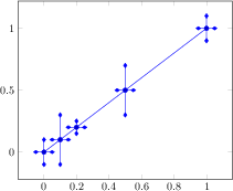
[.tex]
[.pdf]
\begin{tikzpicture}
\begin{axis}
\addplot+[error bars/.cd,
y dir=both,y explicit,
x dir=both,x fixed=0.05,
error mark=diamond*]
coordinates {
(0,0) +- (0.5,0.1)
(0.1,0.1) +- (0.05,0.2)
(0.2,0.2) +- (0,0.05)
(0.5,0.5) +- (0.1,0.2)
(1,1) +- (0.3,0.1)};
\end{axis}
\end{tikzpicture}
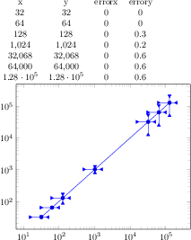
[.tex]
[.pdf]
\pgfplotstabletypeset{pgfplots.testtable2.dat}
\begin{tikzpicture}
\begin{loglogaxis}
\addplot+[error bars/.cd,
x dir=both,x fixed relative=0.5,
y dir=both,y explicit relative,
error mark=triangle*]
table[x=x,y=y,y error=errory]
{pgfplots.testtable2.dat};
\end{loglogaxis}
\end{tikzpicture}
[.tex]
[.pdf]
\begin{tikzpicture}
\begin{axis}[enlargelimits=false]
\addplot[red,mark=*]
plot[error bars/.cd,
y dir=minus,y fixed relative=1,
x dir=minus,x fixed relative=1,
error mark=none,
error bar style={dotted}]
coordinates
{(0,0) (0.1,0.1) (0.2,0.2)
(0.5,0.5) (1,1)};
\end{axis}
\end{tikzpicture}
[.tex]
[.pdf]
\begin{tikzpicture}
\begin{loglogaxis}[
grid=both,
tick align=outside,
tickpos=left]
\addplot coordinates
{(100,1e-4) (500,1e-5) (1000,3e-6)};
\addplot coordinates
{(100,1e-5) (500,4e-6) (1000,2e-6)};
\end{loglogaxis}
\end{tikzpicture}
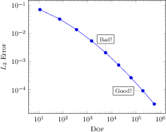
[.tex]
[.pdf]
\tikzstyle{every pin}=[fill=white,
draw=black,
font=\footnotesize]
\begin{tikzpicture}
\begin{loglogaxis}[
xlabel={\textsc{Dof}},
ylabel={$L_2$ Error}]
\addplot coordinates {
(11, 6.887e-02)
(71, 3.177e-02)
(351, 1.341e-02)
(1471, 5.334e-03)
(5503, 2.027e-03)
(18943, 7.415e-04)
(61183, 2.628e-04)
(187903, 9.063e-05)
(553983, 3.053e-05)
};
\node[coordinate,pin=above:{Bad!}]
at (axis cs:5503,2.027e-03) {};
\node[coordinate,pin=left:{Good!}]
at (axis cs:187903,9.063e-05) {};
\end{loglogaxis}
\end{tikzpicture}
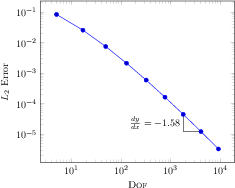
[.tex]
[.pdf]
\begin{tikzpicture}
\begin{loglogaxis}[
xlabel=\textsc{Dof},
ylabel=$L_2$ Error
]
\draw
(axis cs:1793,4.442e-05)
|- (axis cs:4097,1.207e-05)
node[near start,left]
{$\frac{dy}{dx} = -1.58$};
\addplot coordinates {
(5, 8.312e-02)
(17, 2.547e-02)
(49, 7.407e-03)
(129, 2.102e-03)
(321, 5.874e-04)
(769, 1.623e-04)
(1793, 4.442e-05)
(4097, 1.207e-05)
(9217, 3.261e-06)
};
\end{loglogaxis}
\end{tikzpicture}
[.tex]
[.pdf]
\begin{tikzpicture}
\begin{axis}
\draw[red,-stealth]
(axis cs:1000,0)
-- % = line-to
++ % = calculate a vector sum
(axis direction cs:1000,0);
\addplot [only marks,mark=*]
coordinates { (1000,0) (2000,1) };
\end{axis}
\end{tikzpicture}
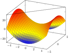
[.tex]
[.pdf]
\begin{tikzpicture}
\begin{axis}
\addplot3[surf] {x^2 - y^2};
\draw (rel axis cs:0,0,1)
-- (rel axis cs:1,1,1);
\end{axis}
\end{tikzpicture}
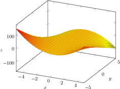
[.tex]
[.pdf]
\begin{tikzpicture}
\begin{axis}[
xlabel=$x$,
ylabel=$y$,
zlabel=$z$,
every axis x label/.style={
at={(rel axis cs:0.5,-0.15,-0.15)}},
every axis y label/.style={
at={(rel axis cs:1.15,0.5,-0.15)}},
every axis z label/.style={
at={(rel axis cs:-0.15,-0.15,0.5)}},
]
\addplot3[surf] {x*(1-x)*y};
\end{axis}
\end{tikzpicture}
[.tex]
[.pdf]
\begin{tikzpicture}
\begin{axis}
\addplot[blue,domain=0:360] {sin(x)}
[yshift=8pt]
node[pos=0] {$0$}
node[pos=0.25] {$\pi/2$}
node[pos=0.5] {$\pi$}
node[pos=0.75] {$3/2\pi$}
node[pos=1] {$2\pi$}
;
\end{axis}
\end{tikzpicture}
[.tex]
[.pdf]
\begin{tikzpicture}
\begin{axis}[title=Snap to nearest for scatter plots]
\addplot+[only marks]
coordinates {(0,0) (1,1) (2,2) (3,3)}
node[pos=0, pin=0 :0 ] {}
node[pos=0.1, pin=90 :0.1 ] {}
node[pos=0.2, pin=200:0.2 ] {}
node[pos=0.3, pin=135:0.3 ] {}
node[pos=0.4, pin=0 :0.4 ] {}
node[pos=0.5, pin=60 :0.5 ] {}
node[pos=0.75,pin=180:0.75] {}
node[pos=1, pin=90 :1 ] {}
;
\end{axis}
\end{tikzpicture}
[.tex]
[.pdf]
\begin{tikzpicture}
\begin{axis}
\addplot[blue,domain=0:360,samples=31] {sin(x)}
[every node/.style={yshift=8pt},sloped]
node[pos=0] {$0$}
node[pos=0.25] {$\pi/2$}
node[pos=0.5] {$\pi$}
node[pos=0.75] {$3/2\pi$}
node[pos=1] {$2\pi$}
;
\end{axis}
\end{tikzpicture}
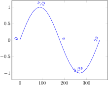
[.tex]
[.pdf]
% same as above with different number of samples
\begin{tikzpicture}
\begin{axis}
\addplot[blue,domain=0:360,samples=25] {sin(x)}
[every node/.style={yshift=8pt},sloped]
node[pos=0] {$0$}
node[pos=0.25] {$\pi/2$}
node[pos=0.5] {$\pi$}
node[pos=0.75] {$3/2\pi$}
node[pos=1] {$2\pi$}
;
\end{axis}
\end{tikzpicture}

[.tex]
[.pdf]
\begin{tikzpicture}
\begin{axis}[tiny]
\addplot coordinates {
(0,0) (1,0)
(1,1) (2,1)}
[pos segment=0,yshift=7pt,font=\footnotesize]
node[pos=0] {0}
node[pos=0.5] {0.5}
node[pos=1] {1};
\end{axis}
\end{tikzpicture}
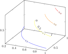
[.tex]
[.pdf]
\begin{tikzpicture}
\begin{axis}
\addplot3[contour gnuplot,domain=0:1] {x*y}
[sloped,
allow upside down,
pos segment=2,
every node/.style={yshift=7pt}]
node[pos=0] {0}
node[pos=0.5] {0.5}
node[pos=1] {1}
;
\end{axis}
\end{tikzpicture}
[.tex]
[.pdf]
\begin{tikzpicture}
\begin{axis}
\addplot {x}
[left,/pgf/number format/relative=0]
node[pos=0.5] {%
\pgfplotspointplotattime
$(\pgfmathprintnumber
{\pgfkeysvalueof{/data point/x}},
\pgfmathprintnumber
{\pgfkeysvalueof{/data point/y}})$
}
node[pos=0.25] {%
\pgfplotspointplotattime
$(\pgfmathprintnumber
{\pgfkeysvalueof{/data point/x}},
\pgfmathprintnumber
{\pgfkeysvalueof{/data point/y}})$
}
node[pos=0.7,pin=180:{%
\pgfplotspointplotattime{0.7}
$(\pgfmathprintnumber
{\pgfkeysvalueof{/data point/x}},
\pgfmathprintnumber
{\pgfkeysvalueof{/data point/y}})$
}] {}
;
\end{axis}
\end{tikzpicture}
[.tex]
[.pdf]
\begin{tikzpicture}
\begin{axis}[symbolic x coords={A,B,C,D}]
\addplot coordinates {(A,0) (B,1) (C,1) (D,2)}
[left]
node[pos=0.3] {%
\pgfplotspointplotattime
$(\pgfkeysvalueof{/data point/x},
\pgfmathprintnumber
{\pgfkeysvalueof{/data point/y}})$
}
node[pos=0.7,pin=180:{%
\pgfplotspointplotattime{0.7}
$(\pgfkeysvalueof{/data point/x},
\pgfmathprintnumber
{\pgfkeysvalueof{/data point/y}})$
}] {}
;
\end{axis}
\end{tikzpicture}
[.tex]
[.pdf]
\begin{tikzpicture}[]
% An undecorated graphics with a lot of
% pretty-printing styles:
\begin{axis}[
axis lines=middle,
title=Undecorated Graphics,
xmin=-2, xmax=2, ymin=-2, ymax=2,
xtick={-1,1}, ytick={-1,1},
% this disables the standard
% tick label *text* (but not the line)
yticklabel=\ ,
extra description/.code={
% this generates custom y labels to implement
% individual styles for every tick:
\node[below left] at (axis cs:0,-1) {$-1$};
\node[above left] at (axis cs:0,1) {$1$};
},
axis line style={->},
]
\addplot[blue,samples=100,domain=0:2*pi]
({sin(deg(2*x))}, {sin(deg(x))});
\end{axis}
\end{tikzpicture}
[.tex]
[.pdf]
% requires \usetikzlibrary{decorations.markings}
\begin{tikzpicture}[]
% Same as in previous example, but with decorations:
\begin{axis}[axis lines=middle,
title=Decorated Graphics,
xmin=-2, xmax=2, ymin=-2, ymax=2,
xtick={-1,1}, ytick={-1,1},
% this disables the standard
% tick label *text* (but not the line)
yticklabel=\ ,
extra description/.code={
% this generates custom y labels to implement
% individual styles for every tick:
\node[below left] at (axis cs:0,-1) {$-1$};
\node[above left] at (axis cs:0,1) {$1$};
},
axis line style={->},
]
\addplot[blue,samples=100,domain=0:2*pi,
postaction={decorate},% ------
decoration={markings, % ------
mark=at position 0.25 with {\arrow{stealth}},
mark=at position 0.5 with {\arrow{stealth}},
mark=at position 0.75 with {\arrow{stealth}}}
]
({sin(deg(2*x))}, {sin(deg(x))});
\end{axis}
\end{tikzpicture}
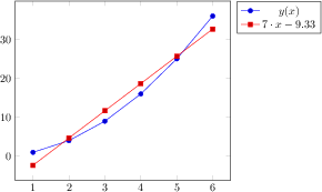
[.tex]
[.pdf]
\begin{tikzpicture}
\begin{axis}[legend pos=outer north east]
\addplot table {% plot X versus Y. This is original data.
X Y
1 1
2 4
3 9
4 16
5 25
6 36
};
\addplot table[
y={create col/linear regression={y=Y}}] % compute a linear regression from the input table
{
X Y
1 1
2 4
3 9
4 16
5 25
6 36
};
%\xdef\slope{\pgfplotstableregressiona} %<-- might be handy occasionally
\addlegendentry{$y(x)$}
\addlegendentry{%
$\pgfmathprintnumber{\pgfplotstableregressiona} \cdot x
\pgfmathprintnumber[print sign]{\pgfplotstableregressionb}$}
\end{axis}
\end{tikzpicture}
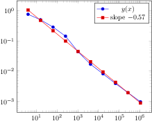
[.tex]
[.pdf]
\begin{tikzpicture}
\begin{loglogaxis}
\addplot table[x=dof,y=error2]
{pgfplotstable.example1.dat};
\addlegendentry{$y(x)$}
\addplot table[
x=dof,
y={create col/linear regression={y=error2}}]
{pgfplotstable.example1.dat};
% might be handy occasionally:
%\xdef\slope{\pgfplotstableregressiona}
\addlegendentry{slope
$\pgfmathprintnumber{\pgfplotstableregressiona}$}
\end{loglogaxis}
\end{tikzpicture}
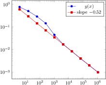
[.tex]
[.pdf]
\begin{tikzpicture}
\begin{loglogaxis}
\addplot table[x=dof,y=error2]
{pgfplotstable.example1.dat};
\addlegendentry{$y(x)$}
\addplot table[
x=dof,
y={create col/linear regression={
y=error2,
variance list={1000,800,600,500,400}}
}
]
{pgfplotstable.example1.dat};
\addlegendentry{slope
$\pgfmathprintnumber{\pgfplotstableregressiona}$}
\end{loglogaxis}
\end{tikzpicture}
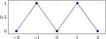
[.tex]
[.pdf]
\begin{tikzpicture}
\begin{axis}[y=2cm]
\addplot coordinates
{(-2,0) (-1,1) (0,0) (1,1) (2,0)};
\end{axis}
\end{tikzpicture}
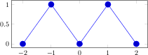
[.tex]
[.pdf]
\tikzset{every mark/.append style={scale=2}}
\begin{tikzpicture}
\begin{axis}[y=2cm]
\addplot coordinates
{(-2,0) (-1,1) (0,0) (1,1) (2,0)};
\end{axis}
\end{tikzpicture}
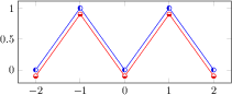
[.tex]
[.pdf]
\begin{tikzpicture}
\begin{axis}[y=2cm]
\addplot+[
mark=halfcircle*,
every mark/.append style={rotate=90}]
coordinates
{(-2,0) (-1,1) (0,0) (1,1) (2,0)};
\addplot+[
mark=halfcircle*,
every mark/.append style={rotate=180}]
coordinates
{(-2,-0.1) (-1,0.9) (0,-0.1) (1,0.9) (2,-0.1)};
\end{axis}
\end{tikzpicture}
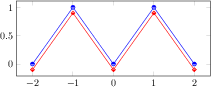
[.tex]
[.pdf]
\begin{tikzpicture}
\begin{axis}[y=2cm]
\addplot[
blue,mark color=blue!50!white,
mark=halfcircle*]
coordinates
{(-2,0) (-1,1) (0,0) (1,1) (2,0)};
\addplot[
red,mark color=red!50!white,
mark=halfsquare*]
coordinates
{(-2,-0.1) (-1,0.9) (0,-0.1) (1,0.9) (2,-0.1)};
\end{axis}
\end{tikzpicture}
[.tex]
[.pdf]
% Overwrite any cycle list:
\pgfplotsset{
every axis plot post/.append style={
mark=triangle,
every mark/.append style={rotate=90}}}
\begin{tikzpicture}
\begin{axis}[y=2cm]
\addplot coordinates
{(-2,0) (-1,1) (0,0) (1,1) (2,0)};
\end{axis}
\end{tikzpicture}
[.tex]
[.pdf]
% requires \usetikzlibrary{spy}
\begin{tikzpicture}[spy using outlines=
{circle, magnification=6, connect spies}]
\begin{axis}[no markers,grid=major,
every axis plot post/.append style={thick}]
\addplot coordinates
{(0, 0.0) (0, 0.9) (1, 0.9) (2, 1) (3, 0.9) (80, 0)};
\addplot +[line join=round] coordinates
{(0, 0.0) (0, 0.9) (2, 0.9) (3, 1) (4, 0.9) (80, 0)};
\addplot +[line join=bevel] coordinates
{(0, 0.0) (0, 0.9) (3, 0.9) (4, 1) (5, 0.9) (80, 0)};
\addplot +[miter limit=5] coordinates
{(0, 0.0) (0, 0.9) (4, 0.9) (5, 1) (6, 0.9) (80, 0)};
\coordinate (spypoint) at (axis cs:3,1);
\coordinate (magnifyglass) at (axis cs:60,0.7);
\end{axis}
\spy [blue, size=2.5cm] on (spypoint)
in node[fill=white] at (magnifyglass);
\end{tikzpicture}
[.tex]
[.pdf]
\begin{tikzpicture}
\begin{axis}[enlarge x limits=false]
\addplot[red,samples=500] {sin(deg(x))};
\addplot[orange,samples=7] {sin(deg(x))};
\addplot[teal,const plot,
samples=14] {sin(deg(x))};
\end{axis}
\end{tikzpicture}
[.tex]
[.pdf]
\begin{tikzpicture}
\begin{axis}[
colormap={bw}{gray(0cm)=(0); gray(1cm)=(1)}]
\addplot+[scatter,only marks,
domain=0:8,samples=100]
{exp(x)};
\end{axis}
\end{tikzpicture}
[.tex]
[.pdf]
\begin{tikzpicture}
\begin{axis}[colormap/bluered]
\addplot+[scatter,
scatter src=x,samples=50]
{sin(deg(x))};
\end{axis}
\end{tikzpicture}
[.tex]
[.pdf]
\begin{tikzpicture}
\begin{axis}[
stack plots=y,stack dir=minus,
cycle list name=color]
\addplot coordinates {(0,1) (0.5,1) (1,1)};
\addplot coordinates {(0,1) (0.5,1) (1,1)};
\addplot coordinates {(0,1) (0.5,1) (1,1)};
\addplot coordinates {(0,1) (0.5,1) (1,1)};
\addplot coordinates {(0,1) (0.5,1) (1,1)};
\addplot coordinates {(0,1) (0.5,1) (1,1)};
\addplot coordinates {(0,1) (0.5,1) (1,1)};
\addplot coordinates {(0,1) (0.5,1) (1,1)};
\addplot coordinates {(0,1) (0.5,1) (1,1)};
\addplot coordinates {(0,1) (0.5,1) (1,1)};
\addplot coordinates {(0,1) (0.5,1) (1,1)};
\addplot coordinates {(0,1) (0.5,1) (1,1)};
\addplot coordinates {(0,1) (0.5,1) (1,1)};
\end{axis}
\end{tikzpicture}
[.tex]
[.pdf]
\begin{tikzpicture}
\begin{axis}[
stack plots=y,stack dir=minus,
cycle list name=exotic]
\addplot coordinates {(0,1) (0.5,1) (1,1)};
\addplot coordinates {(0,1) (0.5,1) (1,1)};
\addplot coordinates {(0,1) (0.5,1) (1,1)};
\addplot coordinates {(0,1) (0.5,1) (1,1)};
\addplot coordinates {(0,1) (0.5,1) (1,1)};
\addplot coordinates {(0,1) (0.5,1) (1,1)};
\addplot coordinates {(0,1) (0.5,1) (1,1)};
\addplot coordinates {(0,1) (0.5,1) (1,1)};
\addplot coordinates {(0,1) (0.5,1) (1,1)};
\addplot coordinates {(0,1) (0.5,1) (1,1)};
\addplot coordinates {(0,1) (0.5,1) (1,1)};
\addplot coordinates {(0,1) (0.5,1) (1,1)};
\addplot coordinates {(0,1) (0.5,1) (1,1)};
\end{axis}
\end{tikzpicture}
[.tex]
[.pdf]
\begin{tikzpicture}
\begin{axis}[
stack plots=y,stack dir=minus,
cycle list name=black white]
\addplot coordinates {(0,1) (0.5,1) (1,1)};
\addplot coordinates {(0,1) (0.5,1) (1,1)};
\addplot coordinates {(0,1) (0.5,1) (1,1)};
\addplot coordinates {(0,1) (0.5,1) (1,1)};
\addplot coordinates {(0,1) (0.5,1) (1,1)};
\addplot coordinates {(0,1) (0.5,1) (1,1)};
\addplot coordinates {(0,1) (0.5,1) (1,1)};
\addplot coordinates {(0,1) (0.5,1) (1,1)};
\addplot coordinates {(0,1) (0.5,1) (1,1)};
\addplot coordinates {(0,1) (0.5,1) (1,1)};
\addplot coordinates {(0,1) (0.5,1) (1,1)};
\addplot coordinates {(0,1) (0.5,1) (1,1)};
\addplot coordinates {(0,1) (0.5,1) (1,1)};
\end{axis}
\end{tikzpicture}

[.tex]
[.pdf]
\begin{tikzpicture}
\begin{axis}[
stack plots=y,stack dir=minus,
cycle list name=mark list]
\addplot+[blue] coordinates {(0,1) (0.5,1) (1,1)};
\addplot+[blue] coordinates {(0,1) (0.5,1) (1,1)};
\addplot+[blue] coordinates {(0,1) (0.5,1) (1,1)};
\addplot+[blue] coordinates {(0,1) (0.5,1) (1,1)};
\addplot+[blue] coordinates {(0,1) (0.5,1) (1,1)};
\addplot+[blue] coordinates {(0,1) (0.5,1) (1,1)};
\addplot+[blue] coordinates {(0,1) (0.5,1) (1,1)};
\addplot+[blue] coordinates {(0,1) (0.5,1) (1,1)};
\addplot+[blue] coordinates {(0,1) (0.5,1) (1,1)};
\addplot+[blue] coordinates {(0,1) (0.5,1) (1,1)};
\addplot+[blue] coordinates {(0,1) (0.5,1) (1,1)};
\addplot+[blue] coordinates {(0,1) (0.5,1) (1,1)};
\addplot+[blue] coordinates {(0,1) (0.5,1) (1,1)};
\end{axis}
\end{tikzpicture}
[.tex]
[.pdf]
\begin{tikzpicture}
\begin{axis}[
stack plots=y,stack dir=minus,
cycle list name=mark list*]
\addplot+[blue] coordinates {(0,1) (0.5,1) (1,1)};
\addplot+[blue] coordinates {(0,1) (0.5,1) (1,1)};
\addplot+[blue] coordinates {(0,1) (0.5,1) (1,1)};
\addplot+[blue] coordinates {(0,1) (0.5,1) (1,1)};
\addplot+[blue] coordinates {(0,1) (0.5,1) (1,1)};
\addplot+[blue] coordinates {(0,1) (0.5,1) (1,1)};
\addplot+[blue] coordinates {(0,1) (0.5,1) (1,1)};
\addplot+[blue] coordinates {(0,1) (0.5,1) (1,1)};
\addplot+[blue] coordinates {(0,1) (0.5,1) (1,1)};
\addplot+[blue] coordinates {(0,1) (0.5,1) (1,1)};
\addplot+[blue] coordinates {(0,1) (0.5,1) (1,1)};
\addplot+[blue] coordinates {(0,1) (0.5,1) (1,1)};
\addplot+[blue] coordinates {(0,1) (0.5,1) (1,1)};
\end{axis}
\end{tikzpicture}
[.tex]
[.pdf]
\begin{tikzpicture}
\begin{axis}[
stack plots=y,stack dir=minus,
cycle list name=color list]
\addplot coordinates {(0,1) (0.5,1) (1,1)};
\addplot coordinates {(0,1) (0.5,1) (1,1)};
\addplot coordinates {(0,1) (0.5,1) (1,1)};
\addplot coordinates {(0,1) (0.5,1) (1,1)};
\addplot coordinates {(0,1) (0.5,1) (1,1)};
\addplot coordinates {(0,1) (0.5,1) (1,1)};
\addplot coordinates {(0,1) (0.5,1) (1,1)};
\addplot coordinates {(0,1) (0.5,1) (1,1)};
\addplot coordinates {(0,1) (0.5,1) (1,1)};
\addplot coordinates {(0,1) (0.5,1) (1,1)};
\addplot coordinates {(0,1) (0.5,1) (1,1)};
\addplot coordinates {(0,1) (0.5,1) (1,1)};
\addplot coordinates {(0,1) (0.5,1) (1,1)};
\end{axis}
\end{tikzpicture}
[.tex]
[.pdf]
\begin{tikzpicture}
\begin{axis}[
stack plots=y,stack dir=minus,
cycle list name=linestyles]
\addplot coordinates {(0,1) (0.5,1) (1,1)};
\addplot coordinates {(0,1) (0.5,1) (1,1)};
\addplot coordinates {(0,1) (0.5,1) (1,1)};
\addplot coordinates {(0,1) (0.5,1) (1,1)};
\addplot coordinates {(0,1) (0.5,1) (1,1)};
\addplot coordinates {(0,1) (0.5,1) (1,1)};
\addplot coordinates {(0,1) (0.5,1) (1,1)};
\addplot coordinates {(0,1) (0.5,1) (1,1)};
\addplot coordinates {(0,1) (0.5,1) (1,1)};
\addplot coordinates {(0,1) (0.5,1) (1,1)};
\addplot coordinates {(0,1) (0.5,1) (1,1)};
\addplot coordinates {(0,1) (0.5,1) (1,1)};
\addplot coordinates {(0,1) (0.5,1) (1,1)};
\end{axis}
\end{tikzpicture}
[.tex]
[.pdf]
\begin{tikzpicture}
\begin{axis}[
stack plots=y,stack dir=minus,
cycle list name=linestyles*]
\addplot coordinates {(0,1) (0.5,1) (1,1)};
\addplot coordinates {(0,1) (0.5,1) (1,1)};
\addplot coordinates {(0,1) (0.5,1) (1,1)};
\addplot coordinates {(0,1) (0.5,1) (1,1)};
\addplot coordinates {(0,1) (0.5,1) (1,1)};
\addplot coordinates {(0,1) (0.5,1) (1,1)};
\addplot coordinates {(0,1) (0.5,1) (1,1)};
\addplot coordinates {(0,1) (0.5,1) (1,1)};
\addplot coordinates {(0,1) (0.5,1) (1,1)};
\addplot coordinates {(0,1) (0.5,1) (1,1)};
\addplot coordinates {(0,1) (0.5,1) (1,1)};
\addplot coordinates {(0,1) (0.5,1) (1,1)};
\addplot coordinates {(0,1) (0.5,1) (1,1)};
\end{axis}
\end{tikzpicture}
[.tex]
[.pdf]
\begin{tikzpicture}
\begin{axis}[
cycle multi list={
red,blue\nextlist
solid,{dotted,mark options={solid}}\nextlist
mark=*,mark=x,mark=o
},
samples=3,
legend entries={0,...,20},
legend pos=outer north east
]
\addplot {x};
\addplot {x-1};
\addplot {x-2};
\addplot {x-3};
\addplot {x-4};
\addplot {x-5};
\addplot {x-6};
\addplot {x-7};
\addplot {x-8};
\addplot {x-9};
\addplot {x-10};
\addplot {x-11};
\end{axis}
\end{tikzpicture}
[.tex]
[.pdf]
\begin{tikzpicture}
\begin{axis}[
title={Cycle color between successive plots, then marks},
cycle multi list={
mark list\nextlist
blue,red%
},
samples=3,
legend entries={0,...,20},
legend pos=outer north east
]
\addplot {x};
\addplot {x-1};
\addplot {x-2};
\addplot {x-3};
\addplot {x-4};
\addplot {x-5};
\addplot {x-6};
\addplot {x-7};
\addplot {x-8};
\addplot {x-9};
\addplot {x-10};
\addplot {x-11};
\end{axis}
\end{tikzpicture}
[.tex]
[.pdf]
\begin{tikzpicture}
\begin{axis}[
title={Cycle 2 marks between successive plots, then colors},
cycle multi list={%
color list\nextlist
[2 of]mark list
},
samples=3,
legend entries={0,...,20},
legend pos=outer north east
]
\addplot {x};
\addplot {x-1};
\addplot {x-2};
\addplot {x-3};
\addplot {x-4};
\addplot {x-5};
\addplot {x-6};
\addplot {x-7};
\addplot {x-8};
\addplot {x-9};
\addplot {x-10};
\addplot {x-11};
\end{axis}
\end{tikzpicture}
[.tex]
[.pdf]
\begin{tikzpicture}
\begin{axis}[
axis background/.style={fill=blue!10}]
\addplot3[surf,y domain=0:1]
{sin(deg(x)) * y*(1-y)};
\end{axis}
\end{tikzpicture}
[.tex]
[.pdf]
\begin{tikzpicture}
\begin{semilogyaxis}[
axis background/.style={
shade,top color=gray,bottom color=white},
legend style={fill=white}]
\addplot {exp(-x)};
\addplot {exp(-4*x)};
\legend{$e^{-x}$,$e^{-4x}$}
\end{semilogyaxis}
\end{tikzpicture}

[.tex]
[.pdf]
\begin{tikzpicture}
\begin{axis}[colorbar]
\addplot[mesh,point meta=y,thick] {x^2};
\end{axis}
\end{tikzpicture}
[.tex]
[.pdf]
\begin{tikzpicture}
\begin{axis}[
title=Axis wide color mapping,
colorbar,
samples=50,point meta rel=axis wide,
point meta=y]
\addplot[mesh,thick] {sin(deg(x))};
\addplot[mesh,thick] {3*tanh(x)};
\end{axis}
\end{tikzpicture}
~
\begin{tikzpicture}
\begin{axis}[
title=Per Plot color mapping,
colorbar,
samples=50,
point meta rel=per plot,
point meta=y]
\addplot[mesh,thick] {sin(deg(x))};
\addplot[mesh,thick] {3*tanh(x)};
\end{axis}
\end{tikzpicture}
[.tex]
[.pdf]
% requires \usepackage[pdftex]{ocg}
\begin{tikzpicture}
\begin{axis}[
title=Dynamic PDF Layer Support (see Acrobat Layers),
view={110}{35}]
\addplot3+[
execute at begin plot visualization=\begin{ocg}{First Layer}{FirstLayer}{0},
execute at end plot visualization=\end{ocg},
]
coordinates {(0,0,12) (0,1,2) (1,0,6) (0,0,12)};
\addplot3+[
execute at begin plot visualization=\begin{ocg}{Second Layer}{SecondLayer}{0},
execute at end plot visualization=\end{ocg},
]
coordinates {(0,0,9) (0,1,8) (1,0,4) (0,0,9)};
\addplot3+[
execute at begin plot visualization=\begin{ocg}{Third Layer}{ThirdLayer}{0},
execute at end plot visualization=\end{ocg},
]
coordinates {(0,0,1) (0,1,7) (1,0,3) (0,0,1)};
\end{axis}
\end{tikzpicture}
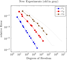
[.tex]
[.pdf]
\begin{tikzpicture}
\begin{loglogaxis}[
% some descriptions:
table/x=Basis,
table/y={L2/r},
xlabel=Degrees of Freedom,
ylabel=relative Error,
title=New Experiments (old in gray),
legend entries={$e_1$,$e_2$,$e_3$}
]
\addplot[black!15,forget plot]
table {plotdata/oldexperiment1.dat};
\addplot[black!15,forget plot]
table {plotdata/oldexperiment2.dat};
\addplot[black!15,forget plot]
table {plotdata/oldexperiment3.dat};
\addplot table {plotdata/newexperiment1.dat};
\addplot table {plotdata/newexperiment2.dat};
\addplot table {plotdata/newexperiment3.dat};
\end{loglogaxis}
\end{tikzpicture}
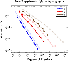
[.tex]
[.pdf]
\begin{tikzpicture}
\begin{loglogaxis}[
forget plot style={opacity=0.2},
% same as above:
table/x=Basis,
table/y={L2/r},
xlabel=Degrees of Freedom,
ylabel=relative Error,
title=New Experiments (old in transparent),
legend entries={$e_1$,$e_2$,$e_3$},
]
\foreach \exp in {1,2,3} {
\addplot+[forget plot]
table {plotdata/oldexperiment\exp.dat};
\addplot table {plotdata/newexperiment\exp.dat};
}
\end{loglogaxis}
\end{tikzpicture}
[.tex]
[.pdf]
\pgfplotsset{every axis/.append style={
before end axis/.code={
\fill[red] (axis cs:1,10) circle(5pt);
\node at (axis cs:-4,10)
{\large This text has been inserted
using \texttt{before end axis}.};
}}}
\begin{tikzpicture}
\begin{axis}
\addplot {x^2};
\end{axis}
\end{tikzpicture}
[.tex]
[.pdf]
\pgfplotsset{every axis/.append style={
after end axis/.code={
\fill[red] (axis cs:1,10) circle(5pt);
\node at (axis cs:-4,10)
{\large This text has been inserted using \texttt{after end axis}.};
}}}
\begin{tikzpicture}
\begin{axis}
\addplot {x^2};
\end{axis}
\end{tikzpicture}
[.tex]
[.pdf]
\begin{tikzpicture}
\begin{axis}[
axis on top=true,
axis x line=middle,
axis y line=middle]
\addplot+[fill] {x^3} \closedcycle;
\end{axis}
\end{tikzpicture}
[.tex]
[.pdf]
\begin{tikzpicture}
\begin{axis}[
axis on top=false,
axis x line=middle,
axis y line=middle]
\addplot+[fill] {x^3} \closedcycle;
\end{axis}
\end{tikzpicture}
[.tex]
[.pdf]
\begin{tikzpicture}
\begin{axis}
\addplot+[
scatter,
scatter src=y,
samples=40,
visualization depends on=
{5*cos(deg(x)) \as \perpointmarksize},
scatter/@pre marker code/.append style=
{/tikz/mark size=\perpointmarksize}
]
{sin(deg(x))};
\end{axis}
\end{tikzpicture}
[.tex]
[.pdf]
\begin{tikzpicture}
\begin{semilogyaxis}[log ticks with fixed point]
\addplot+[domain=0:10] {exp(x)};
\end{semilogyaxis}
\end{tikzpicture}
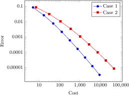
[.tex]
[.pdf]
\begin{tikzpicture}
\begin{loglogaxis}[
log ticks with fixed point,
xlabel=Cost,ylabel=Error]
\addplot coordinates {
(5, 8.31160034e-02)
(17, 2.54685628e-02)
(49, 7.40715288e-03)
(129, 2.10192154e-03)
(321, 5.87352989e-04)
(769, 1.62269942e-04)
(1793, 4.44248889e-05)
(4097, 1.20714122e-05)
(9217, 3.26101452e-06)
};
\addplot coordinates {
(7, 8.47178381e-02)
(31, 3.04409349e-02)
(111, 1.02214539e-02)
(351, 3.30346265e-03)
(1023, 1.03886535e-03)
(2815, 3.19646457e-04)
(7423, 9.65789766e-05)
(18943, 2.87339125e-05)
(47103, 8.43749881e-06)
};
\legend{Case 1,Case 2}
\end{loglogaxis}
\end{tikzpicture}
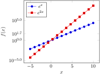
[.tex]
[.pdf]
\pgfplotsset{
samples=15,
width=7cm,
xlabel=$x$,
ylabel=$f(x)$,
extra y ticks={45},
legend style={at={(0.03,0.97)},
anchor=north west}}
\begin{tikzpicture}
\begin{semilogyaxis}[
log plot exponent style/.style={
/pgf/number format/fixed zerofill,
/pgf/number format/precision=1},
domain=-5:10]
\addplot {exp(x)};
\addplot {exp(2*x)};
\legend{$e^x$,$e^{2x}$}
\end{semilogyaxis}
\end{tikzpicture}
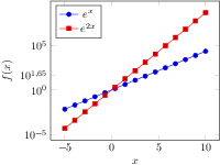
[.tex]
[.pdf]
\pgfplotsset{
samples=15,
width=7cm,
xlabel=$x$,
ylabel=$f(x)$,
extra y ticks={45},
legend style={at={(0.03,0.97)},
anchor=north west}}
\begin{tikzpicture}
\begin{semilogyaxis}[
log plot exponent style/.style={
/pgf/number format/fixed,
/pgf/number format/use comma,
/pgf/number format/precision=2},
domain=-5:10]
\addplot {exp(x)};
\addplot {exp(2*x)};
\legend{$e^x$,$e^{2x}$}
\end{semilogyaxis}
\end{tikzpicture}
[.tex]
[.pdf]
\begin{tikzpicture}%
\begin{loglogaxis}
[title=Standard options,
width=6cm]
\addplot coordinates {
(1e-2,10)
(3e-2,100)
(6e-2,200)
};
\end{loglogaxis}
\end{tikzpicture}%
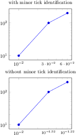
[.tex]
[.pdf]
\pgfplotsset{every axis/.append style={%
width=6cm,
xmin=7e-3,xmax=7e-2,
extra x ticks={3e-2,6e-2},
extra x tick style={major tick length=0pt,font=\footnotesize}
}}%
\begin{tikzpicture}%
\begin{loglogaxis}[
xtick={1e-2},
title=with minor tick identification,
extra x tick style={
log identify minor tick positions=true}]
\addplot coordinates {
(1e-2,10)
(3e-2,100)
(6e-2,200)
};
\end{loglogaxis}
\end{tikzpicture}%
\begin{tikzpicture}%
\begin{loglogaxis}[
xtick={1e-2},
title=without minor tick identification,
extra x tick style={
log identify minor tick positions=false}]
\addplot coordinates {
(1e-2,10)
(3e-2,100)
(6e-2,200)
};
\end{loglogaxis}%
\end{tikzpicture}%
\begin{tikzpicture}
\begin{axis}
% keys valid for single plots:
\addplot ...; % uses the "cycle list" to determine keys
\addplot[key=value,key2=value2] ... ; % uses the provided keys (not the "cycle list")
\addplot+[key=value,key2=value2] ... ; % appends something to the "cycle list"
\end{axis}
\end{tikzpicture}
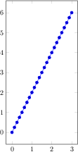
[.tex]
[.pdf]
\begin{tikzpicture}
\begin{axis}[x=1cm,y=1cm]
\addplot expression[domain=0:3] {2*x};
\end{axis}
\end{tikzpicture}
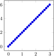
[.tex]
[.pdf]
\begin{tikzpicture}
\begin{axis}[x=1cm,y=0.5cm,y dir=reverse]
\addplot expression[domain=0:3] {2*x};
\end{axis}
\end{tikzpicture}
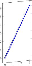
[.tex]
[.pdf]
\begin{tikzpicture}
\begin{axis}[x={(1cm,0.1cm)},y=1cm]
\addplot expression[domain=0:3] {2*x};
\end{axis}
\end{tikzpicture}
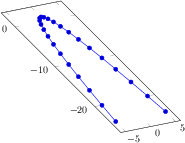
[.tex]
[.pdf]
\begin{tikzpicture}
\begin{axis}[
x={(5pt,1pt)},
y={(-4pt,4pt)}]
\addplot {1-x^2};
\end{axis}
\end{tikzpicture}
[.tex]
[.pdf]
\begin{tikzpicture}
\begin{axis}[
x={(1cm,-0.5cm)},
y=1cm,
z=0cm,
axis on top,
scale mode=scale uniformly,
]
\addplot3[surf,shader=interp] {x*y};
\end{axis}
\end{tikzpicture}
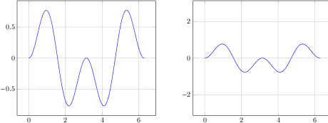
[.tex]
[.pdf]
\begin{tikzpicture}
\begin{axis}[axis equal=false,grid=major]
\addplot[blue] expression[domain=0:2*pi,samples=300] {sin(deg(x))*sin(2*deg(x))};
\end{axis}
\end{tikzpicture}
\hspace{1cm}
\begin{tikzpicture}
\begin{axis}[axis equal=true,grid=major]
\addplot[blue] expression[domain=0:2*pi,samples=300] {sin(deg(x))*sin(2*deg(x))};
\end{axis}
\end{tikzpicture}
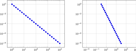
[.tex]
[.pdf]
\begin{tikzpicture}
\begin{loglogaxis}[axis equal=false,grid=major]
\addplot expression[domain=1:10000] {x^-2};
\end{loglogaxis}
\end{tikzpicture}
\hspace{1cm}
\begin{tikzpicture}
\begin{loglogaxis}[axis equal=true,grid=major]
\addplot expression[domain=1:10000] {x^-2};
\end{loglogaxis}
\end{tikzpicture}
[.tex]
[.pdf]
\begin{tikzpicture}
\begin{axis}[axis equal image=false,grid=major]
\addplot[blue] expression[domain=0:2*pi,samples=300] {sin(deg(x))*sin(2*deg(x))};
\end{axis}
\end{tikzpicture}
\hspace{1cm}
\begin{tikzpicture}
\begin{axis}[axis equal image=true,grid=major]
\addplot[blue] expression[domain=0:2*pi,samples=300] {sin(deg(x))*sin(2*deg(x))};
\end{axis}
\end{tikzpicture}
[.tex]
[.pdf]
\begin{tikzpicture}
\begin{loglogaxis}[axis equal image=false,grid=major]
\addplot expression[domain=1:10000] {x^-2};
\end{loglogaxis}
\end{tikzpicture}
\hspace{1cm}
\begin{tikzpicture}
\begin{loglogaxis}[axis equal image=true,grid=major]
\addplot expression[domain=1:10000] {x^-2};
\end{loglogaxis}
\end{tikzpicture}
[.tex]
[.pdf]
\begin{tikzpicture}
\begin{axis}[unit vector ratio=2 1,small]
\addplot coordinates {(0,0) (1,1)};
\addplot table[row sep=\\,col sep=&] {
x & y \\
0 & 1 \\
1 & 0 \\
};
\end{axis}
\end{tikzpicture}
[.tex]
[.pdf]
\begin{tikzpicture}
\begin{axis}[footnotesize,xlabel=$x$,ylabel=$y$,unit vector ratio=]
\addplot3[surf,samples=10,domain=0:1] {(1-x)*y};
\end{axis}
\end{tikzpicture}
\begin{tikzpicture}
\begin{axis}[footnotesize,xlabel=$x$,ylabel=$y$,unit vector ratio=1 1 1]
\addplot3[surf,samples=10,domain=0:1] {(1-x)*y};
\end{axis}
\end{tikzpicture}
\begin{tikzpicture}
\begin{axis}[footnotesize,xlabel=$x$,ylabel=$y$,unit vector ratio=0.25 0.5]
\addplot3[surf,samples=10,domain=0:1] {(1-x)*y};
\end{axis}
\end{tikzpicture}
[.tex]
[.pdf]
\begin{tikzpicture}
\begin{axis}[footnotesize,xlabel=$x$,ylabel=$y$,unit vector ratio=]
\addplot3[surf,samples=10,domain=0:1] {(1-x)*y};
\end{axis}
\end{tikzpicture}
\begin{tikzpicture}
\begin{axis}[footnotesize,xlabel=$x$,ylabel=$y$,
unit rescale keep size=false,
unit vector ratio=1 1 1]
\addplot3[surf,samples=10,domain=0:1] {(1-x)*y};
\end{axis}
\end{tikzpicture}
\begin{tikzpicture}
\begin{axis}[footnotesize,xlabel=$x$,ylabel=$y$,
unit vector ratio*=0.25 0.5, % the '*' implies 'unit rescale keep size=false'
]
\addplot3[surf,samples=10,domain=0:1] {(1-x)*y};
\end{axis}
\end{tikzpicture}
[.tex]
[.pdf]
\begin{tikzpicture}
\begin{axis}[y post scale=1]
\addplot {x};
\end{axis}
\end{tikzpicture}
\begin{tikzpicture}
\begin{axis}[y post scale=2]
\addplot {x};
\end{axis}
\end{tikzpicture}
[.tex]
[.pdf]
\begin{tikzpicture}
\begin{axis}[z post scale=1]
\addplot3[surf] {x*y};
\end{axis}
\end{tikzpicture}
\begin{tikzpicture}
\begin{axis}[z post scale=2]
\addplot3[surf] {x*y};
\end{axis}
\end{tikzpicture}
[.tex]
[.pdf]
\begin{tikzpicture}
\begin{axis}[title=Auto Limits]
\addplot {x^2};
\end{axis}
\end{tikzpicture}
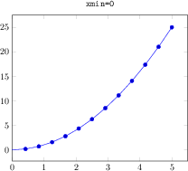
[.tex]
[.pdf]
\begin{tikzpicture}
\begin{axis}[title={\texttt{xmin=0}},xmin=0]
\addplot {x^2};
\end{axis}
\end{tikzpicture}
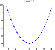
[.tex]
[.pdf]
\begin{tikzpicture}
\begin{axis}[title={\texttt{ymax=10}},ymax=10]
\addplot {x^2};
\end{axis}
\end{tikzpicture}
[.tex]
[.pdf]
\begin{tikzpicture}
\begin{axis}[
% Show (automatically) computed limits:
title={
Axis limits are
$
[\pgfmathprintnumber{\pgfkeysvalueof{/pgfplots/xmin}}
:\pgfmathprintnumber{\pgfkeysvalueof{/pgfplots/xmax}}
] \times
[\pgfmathprintnumber{\pgfkeysvalueof{/pgfplots/ymin}}
:\pgfmathprintnumber{\pgfkeysvalueof{/pgfplots/ymax}}
]$ },
]
\addplot {x^2};
\end{axis}
\end{tikzpicture}
[.tex]
[.pdf]
\begin{tikzpicture}
\begin{axis}[
xlabel=$x$ \emph{decreasing} $\to$,
x dir=reverse]
\addplot {x+rand*0.3};
\end{axis}
\end{tikzpicture}
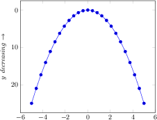
[.tex]
[.pdf]
\begin{tikzpicture}
\begin{axis}[
ylabel=$y$ \emph{decreasing} $\to$,
y dir=reverse]
\addplot {x^2};
\end{axis}
\end{tikzpicture}
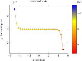
[.tex]
[.pdf]
\begin{tikzpicture}
\begin{axis}[
ylabel=$y$ \emph{decreasing} $\to$,
xlabel=$x$ normal,
title=reversed axis,
y dir=reverse,
colorbar,
colorbar style={y dir=reverse}]
\addplot+[mesh,scatter] {x^15};
\end{axis}
\end{tikzpicture}
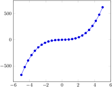
[.tex]
[.pdf]
\begin{tikzpicture}
\begin{axis}
\addplot {5 * x^3 - x^2 + 4*x -2};
\end{axis}
\end{tikzpicture}
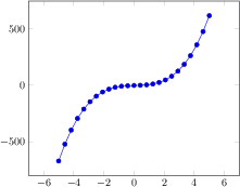
[.tex]
[.pdf]
\begin{tikzpicture}
\begin{axis}[enlarge x limits=0.2]
\addplot {5 * x^3 - x^2 + 4*x -2};
\end{axis}
\end{tikzpicture}
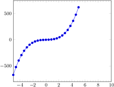
[.tex]
[.pdf]
\begin{tikzpicture}
\begin{axis}[minor x tick num=4,
enlarge x limits={rel=0.5,upper}
]
\addplot {5 * x^3 - x^2 + 4*x -2};
\end{axis}
\end{tikzpicture}
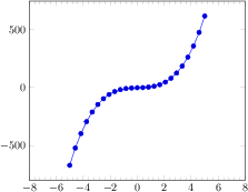
[.tex]
[.pdf]
\begin{tikzpicture}
\begin{axis}[minor x tick num=4,
enlarge x limits={abs=3}
]
\addplot {5 * x^3 - x^2 + 4*x -2};
\end{axis}
\end{tikzpicture}
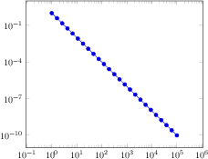
[.tex]
[.pdf]
\begin{tikzpicture}
\begin{loglogaxis}[enlarge x limits={abs=11}]
\addplot+[domain=1:100000] {x^-2};
\end{loglogaxis}
\end{tikzpicture}

[.tex]
[.pdf]
\begin{tikzpicture}
\pgfplotsset{
every axis plot post/.append style=
{mark=none}}
\begin{axis}[
legend style={
at={(0.03,0.97)},anchor=north west},
domain=0:1]
\addplot {x^2};
\addplot {exp(x)};
\legend{$x^2$,$e^x$}
\end{axis}
\end{tikzpicture}
[.tex]
[.pdf]
\pgfplotsset{my personal style/.style=
{grid=major,font=\large}}
\begin{tikzpicture}
\begin{axis}[my personal style]
\addplot coordinates {(0,0) (1,1)};
\end{axis}
\end{tikzpicture}
[.tex]
[.pdf]
\begin{tikzpicture}
\begin{axis}[symbolic x coords={a,b,c,d,e,f,g,h,i}]
\addplot+[smooth] coordinates {
(a,42)
(b,50)
(c,80)
(f,60)
(g,62)
(i,90)};
\end{axis}
\end{tikzpicture}
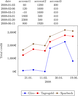
[.tex]
[.pdf]
% requires \usepgfplotslibrary{dateplot} !
\pgfplotstabletypeset[string type]{plotdata/accounts.dat}
\begin{tikzpicture}
\begin{axis}[
date coordinates in=x,
xticklabel={\day.\month.},
xlabel={2008},
stack plots=y,
yticklabel={\pgfmathprintnumber{\tick}\EUR{}}, % <- requires \usepackage{eurosym}
ylabel=Total credit,
ylabel style={yshift=10pt},
legend style={
at={(0.5,-0.3)},anchor=north,legend columns=-1}]
\addplot table[x=date,y=account1] {plotdata/accounts.dat};
\addplot table[x=date,y=account2] {plotdata/accounts.dat};
\addplot table[x=date,y=account3] {plotdata/accounts.dat};
\legend{Giro,Tagesgeld,Sparbuch}
\end{axis}
\end{tikzpicture}
[.tex]
[.pdf]
% requires \usepgfplotslibrary{dateplot} !
\begin{tikzpicture}
\begin{axis}[
date coordinates in=x,
xtick=data,
xticklabel style=
{rotate=90,anchor=near xticklabel},
xticklabel=\day. \hour:\minute,
date ZERO=2009-08-18,% <- improves precision!
]
\addplot coordinates {
(2009-08-18 09:00, 050)
(2009-08-18 12:00, 100)
(2009-08-18 15:00, 100)
(2009-08-18 18:35, 100)
(2009-08-18 21:30, 040)
(2009-08-19, 020)
(2009-08-19 3:00, 000)
(2009-08-19 6:0, 035)
};
\end{axis}
\end{tikzpicture}

[.tex]
[.pdf]
\begin{tikzpicture}
\begin{axis}[symbolic x coords={a,b,c,d,e,f,g,h,i}]
\addplot+[smooth] coordinates {
(a,42)
(b,50)
(c,80)
(f,60)
(g,62)
(i,90)};
\end{axis}
\end{tikzpicture}

[.tex]
[.pdf]
% requires \usepgfplotslibrary{dateplot} !
\pgfplotstabletypeset[string type]{plotdata/accounts.dat}
\begin{tikzpicture}
\begin{axis}[
date coordinates in=x,
xticklabel={\day.\month.},
xlabel={2008},
stack plots=y,
yticklabel={\pgfmathprintnumber{\tick}\EUR{}}, % <- requires \usepackage{eurosym}
ylabel=Total credit,
ylabel style={yshift=10pt},
legend style={
at={(0.5,-0.3)},anchor=north,legend columns=-1}]
\addplot table[x=date,y=account1] {plotdata/accounts.dat};
\addplot table[x=date,y=account2] {plotdata/accounts.dat};
\addplot table[x=date,y=account3] {plotdata/accounts.dat};
\legend{Giro,Tagesgeld,Sparbuch}
\end{axis}
\end{tikzpicture}

[.tex]
[.pdf]
% requires \usepgfplotslibrary{dateplot} !
\begin{tikzpicture}
\begin{axis}[
date coordinates in=x,
xtick=data,
xticklabel style=
{rotate=90,anchor=near xticklabel},
xticklabel=\day. \hour:\minute,
date ZERO=2009-08-18,% <- improves precision!
]
\addplot coordinates {
(2009-08-18 09:00, 050)
(2009-08-18 12:00, 100)
(2009-08-18 15:00, 100)
(2009-08-18 18:35, 100)
(2009-08-18 21:30, 040)
(2009-08-19, 020)
(2009-08-19 3:00, 000)
(2009-08-19 6:0, 035)
};
\end{axis}
\end{tikzpicture}
[.tex]
[.pdf]
\begin{tikzpicture}
\begin{axis}[
xtick=\empty,
ytick={-2,0.3,3,3.7,4.5}]
\addplot+[smooth] coordinates {
(-2,3) (-1.5,2) (-0.3,-0.2)
(1,1.2) (2,2) (3,5)};
\end{axis}
\end{tikzpicture}
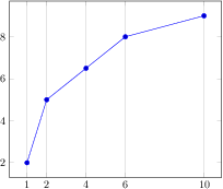
[.tex]
[.pdf]
\begin{tikzpicture}
\begin{axis}[xtick=data,xmajorgrids]
\addplot coordinates {
(1,2)
(2,5)
(4,6.5)
(6,8)
(10,9)
};
\end{axis}
\end{tikzpicture}
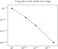
[.tex]
[.pdf]
\begin{tikzpicture}
\begin{loglogaxis}[
title=A log plot with small axis range]
\addplot coordinates {
(10,1e-4)
(17,8.3176e-05)
(25,7.0794e-05)
(50,5e-5)
};
\end{loglogaxis}
\end{tikzpicture}
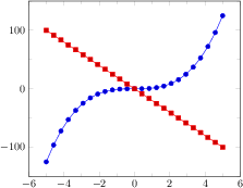
[.tex]
[.pdf]
\begin{tikzpicture}
\begin{axis}[minor tick num=1]
\addplot {x^3};
\addplot {-20*x};
\end{axis}
\end{tikzpicture}
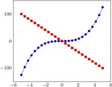
[.tex]
[.pdf]
\begin{tikzpicture}
\begin{axis}[minor tick num=3]
\addplot {x^3};
\addplot {-20*x};
\end{axis}
\end{tikzpicture}

[.tex]
[.pdf]
\begin{tikzpicture}
\begin{axis}[minor x tick num=1,
minor y tick num=3]
\addplot {x^3};
\addplot {-20*x};
\end{axis}
\end{tikzpicture}
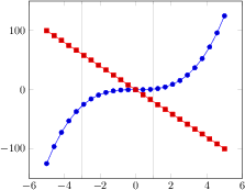
[.tex]
[.pdf]
\begin{tikzpicture}
\begin{axis}[minor xtick={-3,1},grid=minor]
\addplot {x^3};
\addplot {-20*x};
\end{axis}
\end{tikzpicture}
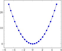
[.tex]
[.pdf]
\begin{tikzpicture}
\begin{axis}[minor ytick=data]
\addplot {x^2};
\end{axis}
\end{tikzpicture}
[.tex]
[.pdf]
\begin{tikzpicture}
\begin{axis}[
xmin=0,xmax=3,ymin=0,ymax=15,
extra y ticks={2.71828},
extra y tick labels={$e$},
extra x ticks={2.2},
extra x tick style={grid=major,
tick label style={
rotate=90,anchor=east}},
extra x tick labels={Cut},
]
\addplot {exp(x)};
\addlegendentry{$e^x$}
\end{axis}
\end{tikzpicture}
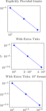
[.tex]
[.pdf]
\pgfplotsset{every axis/.append style={width=5.3cm}}
\begin{tikzpicture}
\begin{loglogaxis}[
title=Explicitly Provided Limits,
xtickten={1,2},
ytickten={-5,-6}]
\addplot coordinates
{(10,1e-5) (20,5e-6) (40,2.5e-6)};
\end{loglogaxis}
\end{tikzpicture}
\begin{tikzpicture}
\begin{loglogaxis}[
title=With Extra Ticks,
xtickten={1,2},
ytickten={-5,-6},
extra x ticks={20,40},
extra y ticks={5e-6,2.5e-6}]
\addplot coordinates
{(10,1e-5) (20,5e-6) (40,2.5e-6)};
\end{loglogaxis}
\end{tikzpicture}
\begin{tikzpicture}
\begin{loglogaxis}[
title=With Extra Ticks; $10^e$ format,
extra tick style={log identify minor tick positions=false},
xtickten={1,2},
ytickten={-5,-6},
extra x ticks={20,40},
extra y ticks={5e-6,2.5e-6}]
\addplot coordinates
{(10,1e-5) (20,5e-6) (40,2.5e-6)};
\end{loglogaxis}
\end{tikzpicture}
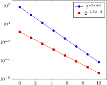
[.tex]
[.pdf]
\begin{tikzpicture}
\begin{semilogyaxis}[
samples=8,
ytickten={-6,-4,...,4},
domain=0:10]
\addplot {2^(-2*x + 6)};
\addlegendentry{$2^{-2x + 6}$}
% or invoke gnuplot to generate coordinates:
\addplot gnuplot[id=pow2]
{2**(-1.5*x -3)};
\addlegendentry{$2^{-1.5x -3}$}
\end{semilogyaxis}
\end{tikzpicture}
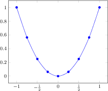
[.tex]
[.pdf]
\begin{tikzpicture}
\begin{axis}[
xtick={-1.5,-1,...,1.5},
xticklabels={%
$-1\frac 12$,
$-1$,
$-\frac 12$,
$0$,
$\frac 12$,
$1$},
% note: \frac can be done automatically:
% xticklabel style={/pgf/number format/frac},
]
\addplot[smooth,blue,mark=*]
coordinates {
(-1, 1)
(-0.75, 0.5625)
(-0.5, 0.25)
(-0.25, 0.0625)
(0, 0)
(0.25, 0.0625)
(0.5, 0.25)
(0.75, 0.5625)
(1, 1)
};
\end{axis}
\end{tikzpicture}
[.tex]
[.pdf]
\begin{tikzpicture}
\begin{semilogyaxis}[
ytickten={-2,-1,0,1,2},
yticklabels={$\frac{1}{100}$,%
$\frac{1}{10}$,%
1,10,100},
]
\addplot {exp(x)};
\end{semilogyaxis}
\end{tikzpicture}
[.tex]
[.pdf]
\begin{tikzpicture}
\begin{semilogyaxis}[
yticklabel style={/pgf/number format/fixed},
% changes tick labels to a number instead
% of exponential notation:
yticklabel={%
\pgfmathfloatparsenumber{\tick}%
\pgfmathfloatexp{\pgfmathresult}%
\pgfmathprintnumber{\pgfmathresult}%
},
]
\addplot {exp(x)};
\end{semilogyaxis}
\end{tikzpicture}
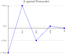
[.tex]
[.pdf]
% \usepackage{nicefrace}% required
\begin{tikzpicture}
\begin{axis}[
% x ticks explicitly formatted:
xtick={0,1,0.5,0.25,0.75},
xticklabels={$0$,$1$,$\frac12$,$\frac14$,$\frac34$},
% y ticks automatically by some code fragment:
ytick=data,
yticklabel={%
\scriptsize
\ifdim\tick pt<0pt % a TeX \if -- see TeX Book
\pgfmathparse{-10*\tick}%
$-\nicefrac{\pgfmathprintnumber{\pgfmathresult}}{10}$%
\else
\ifdim\tick pt=0pt
\else
\pgfmathparse{10*\tick}%
$\nicefrac{\pgfmathprintnumber{\pgfmathresult}}{10}$%
\fi
\fi
},
% NOTE: this here does the same:
% yticklabel style={/pgf/number format/.cd,frac,
% frac TeX=\nicefrac,frac whole=false,frac denom=10},
ymajorgrids,
title=A special Prewavelet,
axis x line=center,
axis y line=left,
]
\addplot coordinates {(0,-1.2) (0.25,1.1)
(0.5,-0.6) (0.75,0.1) (1,0)};
\end{axis}
\end{tikzpicture}
[.tex]
[.pdf]
\begin{tikzpicture}
\begin{axis}[x tick label as interval]
\addplot {3*x};
\end{axis}
\end{tikzpicture}
[.tex]
[.pdf]
\begin{tikzpicture}
\begin{axis}[
ybar interval=0.9,
x tick label as interval,
xmin=2003,xmax=2030,
ymin=0,ymax=140,
xticklabel={
$\pgfmathprintnumber{\tick}$
-- $\pgfmathprintnumber{\nexttick}$},
xtick=data,
x tick label style={
rotate=90,anchor=east,
/pgf/number format/1000 sep=}
]
\addplot[draw=blue,fill=blue!40!white]
coordinates
{(2003,40) (2005,100) (2006,15)
(2010,90) (2020,120) (2030,3)};
\end{axis}
\end{tikzpicture}

[.tex]
[.pdf]
\begin{tikzpicture}
\begin{axis}[
xtick=data,ytick=data,
xtick align=center]
\addplot coordinates
{(-3,0) (-2,0.1) (-1,-0.6)
(0,1)
(1,-0.6) (2,0.1) (3,0)};
\end{axis}
\end{tikzpicture}
[.tex]
[.pdf]
\begin{tikzpicture}
\begin{axis}[
xtick=data,ytick=data,
ytick align=outside]
\addplot coordinates
{(-3,0) (-2,0.1) (-1,-0.6)
(0,1)
(1,-0.6) (2,0.1) (3,0)};
\end{axis}
\end{tikzpicture}
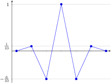
[.tex]
[.pdf]
\begin{tikzpicture}
\begin{axis}[
xtick=data,
axis x line=center,
xticklabels={,,},
ytick={-0.6,0,0.1,1},
yticklabels={
$-\frac{6}{10}$,,
$\frac{1}{10}$,$1$},
ymajorgrids,
axis y line=left,
enlargelimits=0.05]
\addplot coordinates
{(-3,0) (-2,0.1) (-1,-0.6)
(0,1)
(1,-0.6) (2,0.1) (3,0)};
\end{axis}
\end{tikzpicture}
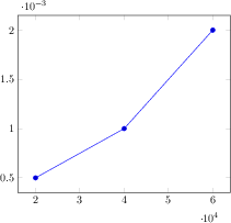
[.tex]
[.pdf]
\begin{tikzpicture}
\begin{axis}[scaled ticks=true]
\addplot coordinates {
(20000,0.0005)
(40000,0.0010)
(60000,0.0020)
};
\end{axis}
\end{tikzpicture}%

[.tex]
[.pdf]
\begin{tikzpicture}
\begin{axis}[scaled ticks=false]
\addplot coordinates {
(20000,0.0005)
(40000,0.0010)
(60000,0.0020)
};
\end{axis}
\end{tikzpicture}
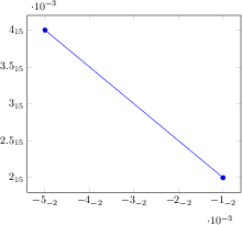
[.tex]
[.pdf]
\begin{tikzpicture}
\begin{axis}[scaled ticks=base 10:3,
/pgf/number format/sci subscript]
\addplot coordinates
{(-0.00001,2e12) (-0.00005,4e12) };
\end{axis}
\end{tikzpicture}
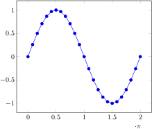
[.tex]
[.pdf]
\begin{tikzpicture}
\begin{axis}[
xtick={0,1.5708,...,10},
domain=0:2*pi,
scaled x ticks={real:3.1415},
xtick scale label code/.code={$\cdot \pi$}]
\addplot {sin(deg(x))};
\end{axis}
\end{tikzpicture}
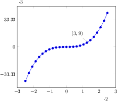
[.tex]
[.pdf]
\begin{tikzpicture}
\begin{axis}[
scaled x ticks=real:2,
scaled y ticks=real:3]
\addplot {x^3};
\node[pin=135:{$(3,9)$}] at (axis cs:3,9) {};
\end{axis}
\end{tikzpicture}
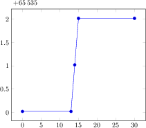
[.tex]
[.pdf]
\begin{tikzpicture}
\begin{axis}[
% warning: the '%' signs are necessary (?)
scaled y ticks=manual:{$+65\,535$}{%
\pgfmathparse{#1-65535}%
},
yticklabel style={
/pgf/number format/fixed,
/pgf/number format/precision=1},
]
\addplot coordinates {
(0, 65535)
(13, 65535)
(14, 65536)
(15, 65537)
(30, 65537)
};
\end{axis}
\end{tikzpicture}
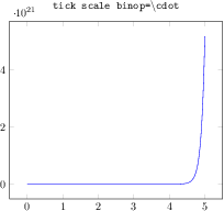
[.tex]
[.pdf]
\begin{tikzpicture}
\begin{axis}[
title=\texttt{tick scale
binop=\textbackslash cdot}]
\addplot
[mark=none,blue,samples=250,
domain=0:5]
{exp(10*x)};
\end{axis}
\end{tikzpicture}
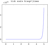
[.tex]
[.pdf]
\begin{tikzpicture}
\begin{axis}[
title=\texttt{tick scale
binop=\textbackslash times},
tick scale binop=\times]
\addplot
[mark=none,blue,samples=250,
domain=0:5]
{exp(10*x)};
\end{axis}
\end{tikzpicture}
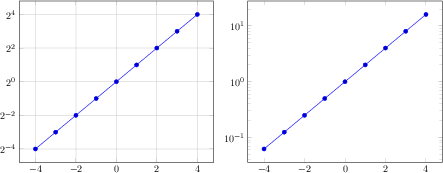
[.tex]
[.pdf]
\begin{tikzpicture}
\begin{semilogyaxis}[log basis y=2,grid=major,samples at={-4,...,4}]
\addplot {2^x};
\end{semilogyaxis}
\end{tikzpicture}
~
\begin{tikzpicture}
\begin{semilogyaxis}[log basis y=10,samples at={-4,...,4}]
\addplot {2^x};
\end{semilogyaxis}
\end{tikzpicture}
[.tex]
[.pdf]
% requires \usepgfplotslibrary{patchplots}
\begin{tikzpicture}
\begin{axis}[
% tell pgfplots to "grab" the axis at its internal (0,0) coord:
anchor=origin,
% tell pgfplots to place its anchor at (0,0):
% (This is actually the default and can be omitted)
at={(0pt,0pt)},
% tell pgfplots to use the "natural" dimensions:
disabledatascaling,
% tell pgfplots to use the same unit vectors as tikz:
x=1cm,y=1cm,
%
hide axis,
]
\addplot[patch,patch type=coons,
shader=interp,point meta=explicit]
coordinates {
(0,0) [0] % first corner
(1,-1) [0] % bezier control point between (0) and (3)
(4,0.7) [0] % bezier control point between (0) and (3)
%
(3,2) [1] % second corner
(4,3.5) [1] % bezier control point between (3) and (6)
(7,2) [1] % bezier control point between (3) and (6)
%
(7,1) [2] % third corner
(6,0.6) [2] % bezier control point between (6) and (9)
(4.5,-0.5) [2] % bezier control point between (6) and (9)
%
(5,-2) [3] % fourth corner
(4,-2.5) [3] % bezier control point between (9) and (0)
(-1,-2) [3] % bezier control point between (9) and (0)
};
\end{axis}
% this requires pgf 2.10
\begin{scope}[every node/.style={circle,inner sep=2pt,fill=black}]
\node[pin=140:first] at (0,0) {};
\node[pin=second] at (3,2) {};
\node[pin=45:third] at (7,1) {};
\node[pin=0:fourth] at (5,-2) {};
\end{scope}
\end{tikzpicture}
[.tex]
[.pdf]
\begin{tikzpicture}
\begin{axis}
\addplot+[data cs=polar,domain=0:360] (\x,1);
\end{axis}
\end{tikzpicture}
[.tex]
[.pdf]
\begin{tikzpicture}
\begin{axis}
\addplot+[data cs=polarrad,domain=0:2*pi] (\x,1);
\end{axis}
\end{tikzpicture}
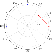
[.tex]
[.pdf]
% requires \usepgfplotslibrary{polar}
\begin{tikzpicture}
\begin{polaraxis}
\addplot coordinates {(90,1) (180,1)};
\addplot+[data cs=cart]
coordinates {(1,0) (0.5,0.5)};
\end{polaraxis}
\end{tikzpicture}
[.tex]
[.pdf]
\begin{tikzpicture}
\begin{axis}[
enlargelimits=0.01,
title style={yshift=5pt},
title=Scatter plot with $2250$ points]
\addplot[blue,
mark=*,only marks,mark options={scale=0.3}]
file[skip first]
{plotdata/pgfplots_scatterdata3.dat};
\end{axis}
\end{tikzpicture}
[.tex]
[.pdf]
\begin{tikzpicture}
\begin{axis}[
enlarge x limits=0.03,
title=Ornstein-Uhlenbeck sample
($13000$ time steps),
xlabel=$t$]
\addplot[blue] file {plotdata/ou.dat};
\end{axis}
\end{tikzpicture}

[.tex]
[.pdf]
\begin{tikzpicture}
\begin{axis}[
title=$120 \times 120$ Smooth Surface,
xlabel=$x$,
ylabel=$y$]
\addplot3[surf,samples=120,shader=interp,domain=0:1]
{sin(deg(8*pi*x))* exp(-20*(y-0.5)^2)
+ exp(-(x-0.5)^2*30
- (y-0.25)^2 - (x-0.5)*(y-0.25))};
\end{axis}
\end{tikzpicture}

[.tex]
[.pdf]
\pgfplotstabletypeset[sci zerofill]{
a b
5000 1.234e5
6000 1.631e5
7000 2.1013e5
9000 1000000
}

[.tex]
[.pdf]
\pgfplotstabletypeset{pgfplotstable.example1.dat}
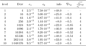
[.tex]
[.pdf]
\pgfplotstableset{% global config, for example in the preamble
% these columns//.style={} things define a style
% which applies to only.
columns/dof/.style={int detect,column type=r,column name=\textsc{Dof}},
columns/error1/.style={
sci,sci zerofill,sci sep align,precision=1,sci superscript,
column name=$e_1$,
},
columns/error2/.style={
sci,sci zerofill,sci sep align,precision=2,sci 10e,
column name=$e_2$,
},
columns/{grad(log(dof),log(error2))}/.style={
string replace={0}{}, % erase '0'
column name={$\nabla e_2$},
dec sep align,
},
columns/{quot(error1)}/.style={
string replace={0}{}, % erase '0'
column name={$\frac{e_1^{(n)}}{e_1^{(n-1)}}$}
},
empty cells with={--}, % replace empty cells with '--'
every head row/.style={before row=\toprule,after row=\midrule},
every last row/.style={after row=\bottomrule}
}
\pgfplotstabletypeset[ % local config, applies only for this table
1000 sep={\,},
columns/info/.style={
fixed,fixed zerofill,precision=1,showpos,
column type=r,
}
]
{pgfplotstable.example1.dat}
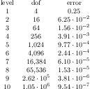
[.tex]
[.pdf]
\pgfplotstabletypeset
[col sep=&,row sep=\\,sci zerofill]
{
level & dof & error \\
1 & 4 & 2.50000000e-01 \\
2 & 16 & 6.25000000e-02 \\
3 & 64 & 1.56250000e-02 \\
4 & 256 & 3.90625000e-03 \\
5 & 1024 & 9.76562500e-04 \\
6 & 4096 & 2.44140625e-04 \\
7 & 16384 & 6.10351562e-05 \\
8 & 65536 & 1.52587891e-05 \\
9 & 262144 & 3.81469727e-06 \\
10 & 1048576 &9.53674316e-07 \\
}
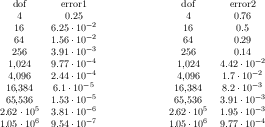
[.tex]
[.pdf]
\pgfplotstableread{pgfplotstable.example1.dat}\loadedtable
\pgfplotstabletypeset[columns={dof,error1}]\loadedtable
\hspace{2cm}
\pgfplotstabletypeset[columns={dof,error2}]\loadedtable
% Alternative: inline table data:
\pgfplotstableread{
level dof error1 error2 info grad(log(dof),log(error2)) quot(error1)
1 4 2.50000000e-01 7.57858283e-01 48 0 0
2 16 6.25000000e-02 5.00000000e-01 25 -3.00000000e-01 4
3 64 1.56250000e-02 2.87174589e-01 41 -3.99999999e-01 4
4 256 3.90625000e-03 1.43587294e-01 8 -5.00000003e-01 4
5 1024 9.76562500e-04 4.41941738e-02 22 -8.49999999e-01 4
6 4096 2.44140625e-04 1.69802322e-02 46 -6.90000001e-01 4
7 16384 6.10351562e-05 8.20091159e-03 40 -5.24999999e-01 4
8 65536 1.52587891e-05 3.90625000e-03 48 -5.35000000e-01 3.99999999e+00
9 262144 3.81469727e-06 1.95312500e-03 33 -5.00000000e-01 4.00000001e+00
10 1048576 9.53674316e-07 9.76562500e-04 2 -5.00000000e-01 4.00000001e+00
}\loadedtable
% can be used as above:
\pgfplotstabletypeset[columns={dof,error1}]\loadedtable
\hspace{2cm}
\pgfplotstabletypeset[columns={dof,error2}]\loadedtable
[.tex]
[.pdf]
\pgfplotstabletypeset[col sep=comma]{pgfplotstable.example1.csv}

[.tex]
[.pdf]
\pgfplotstabletypeset
[col sep=comma,ignore chars={(,),\ ,\#}]
{pgfplotstable.example5.dat}

[.tex]
[.pdf]
\pgfplotstabletypeset[comment chars=!]{
! Some comments
1 0
2 -10
! another comment line
3 0
}

[.tex]
[.pdf]
\pgfplotstabletypeset[skip first n=4]{%<- this '%' is important. Otherwise, the
%newline here would delimit an (empty) row.
XYZ Format,
Version 1.234
Date 2010-09-01
@author Mustermann
A B C
1 2 3
4 5 6
}
[.tex]
[.pdf]
\pgfplotstabletypeset[columns={dof,level,[index]4}]{pgfplotstable.example1.dat}

[.tex]
[.pdf]
% in preamble:
\pgfplotstableset{
alias/newname/.initial=b,
}
% in document:
\pgfplotstabletypeset[
columns={a,newname},% access to `newname' is the same as to `b'
]{
a b
1 2
3 4
5 6
}%
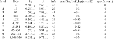
[.tex]
[.pdf]
\pgfplotstabletypeset[
columns/error1/.style={
column name=$L_2$,
sci,sci zerofill,sci subscript,
precision=3},
columns/error2/.style={
column name=$A$,
sci,sci zerofill,sci subscript,
precision=2},
columns/dof/.style={
int detect,
column name=\textsc{Dof}
}
]
{pgfplotstable.example1.dat}
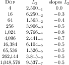
[.tex]
[.pdf]
\pgfplotstabletypeset[
columns={dof,error1,{grad(log(dof),log(error2))}},
columns/error1/.style={
column name=$L_2$,
sci,sci zerofill,sci subscript,
precision=3},
columns/dof/.style={
int detect,
column name=\textsc{Dof}},
columns/{grad(log(dof),log(error2))}/.style={
column name=slopes $L_2$,
fixed,fixed zerofill,
precision=1}
]
{pgfplotstable.example1.dat}
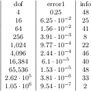
[.tex]
[.pdf]
\pgfplotstabletypeset[
columns={dof,error1,info},
column type/.add={|}{}% results in '|c'
]
{pgfplotstable.example1.dat}
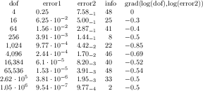
[.tex]
[.pdf]
% requires \usepackage{array}
\pgfplotstabletypeset[
columns={dof,error1,error2,info,{grad(log(dof),log(error2))}},
columns/error1/.style={dec sep align},
columns/error2/.style={sci,sci subscript,sci zerofill,dec sep align},
columns/info/.style={fixed,dec sep align},
columns/{grad(log(dof),log(error2))}/.style={fixed,dec sep align}
]
{pgfplotstable.example1.dat}
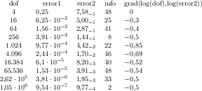
[.tex]
[.pdf]
% requires \usepackage{array}
\pgfplotstabletypeset[
use comma,
columns={dof,error1,error2,info,{grad(log(dof),log(error2))}},
columns/error1/.style={dec sep align},
columns/error2/.style={sci,sci subscript,sci zerofill,dec sep align},
columns/info/.style={fixed,dec sep align},
columns/{grad(log(dof),log(error2))}/.style={fixed,dec sep align}
]
{pgfplotstable.example1.dat}
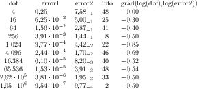
[.tex]
[.pdf]
% requires \usepackage{array}
\pgfplotstabletypeset[
use comma,
columns={dof,error1,error2,info,{grad(log(dof),log(error2))}},
columns/error1/.style={dec sep align,sci zerofill},
columns/error2/.style={sci,sci subscript,sci zerofill,dec sep align},
columns/info/.style={fixed,dec sep align},
columns/{grad(log(dof),log(error2))}/.style={fixed,dec sep align,fixed zerofill}
]
{pgfplotstable.example1.dat}
[.tex]
[.pdf]
\pgfplotstabletypeset[
sort,sort key=error2,
columns={dof,error1,error2},
columns/error1/.style={sci,sci subscript,sci zerofill,dec sep align},
columns/error2/.style={sci,sci subscript,sci zerofill,dec sep align},
]
{pgfplotstable.example1.dat}
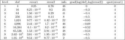
[.tex]
[.pdf]
\pgfplotstabletypeset[
every head row/.style={before row=\hline,after row=\hline\hline},
every last row/.style={after row=\hline},
every first column/.style={
column type/.add={|}{}
},
every last column/.style={
column type/.add={}{|}
}]
{pgfplotstable.example1.dat}
[.tex]
[.pdf]
% requires \usepackage{colortbl}
\pgfplotstabletypeset[
every even column/.style={
column type/.add={>{\columncolor[gray]{.8}}}{}
}]
{pgfplotstable.example1.dat}
[.tex]
[.pdf]
% \usepackage{booktabs}
\pgfplotstabletypeset[
column type=l,
every head row/.style={
before row={%
\toprule
& \multicolumn{2}{c}{Singular} & \multicolumn{2}{c}{Plural}\\
},
after row=\midrule,
},
every last row/.style={
after row=\bottomrule},
columns/person/.style ={column name=},
columns/singGaeilge/.style ={column name=Gaeilge},
columns/pluralGaeilge/.style={column name=Gaeilge},
columns/singEnglish/.style ={column name=English},
columns/pluralEnglish/.style={column name=English},
col sep=&,row sep=\\,
string type,
]{
person & singEnglish & singGaeilge & pluralEnglish & pluralGaeilge\\
1st & at me & agam & at us & againn\\
2st & at you & agat & at you & agaibh\\
3st & at him & aige & at them & acu\\
& at her & aici & &\\
}
[.tex]
[.pdf]
\newcolumntype{C}{>{\centering\arraybackslash}p{6mm}}% a centered fixed-width-column
\pgfplotstabletypeset[
col sep=&,
row sep=\\,
every head row/.style={
% as in the previous example, this patches the first row:
before row={
\hline
\rowcolor{lightgray}
\multicolumn{3}{|>{\columncolor{lightgray}}c|}{Quantenzahlen} & Term--\\
\rowcolor{lightgray}
},
after row=\hline,
},
every last row/.style={
after row=\hline},
% define column-specific styles:
columns/n/.style={column type=|C,column name=$n$},
columns/l/.style={column type=|C,column name=$\ell$},
columns/lambda/.style={column type=|C,column name=$\lambda$},
columns/text/.style={column type=|c|,column name=bezeichnung,
string type % <-it contains formatted data
},
]
{
n & l & lambda & text\\
1 & 0 & 0 & $1 s\sigma$ \\
2 & 0 & 0 & $2 s\sigma$ \\
2 & 1 & 0 & $2 p\sigma$ \\
2 & 1 & 1 & $2 p \pi $\\
3 & 2 & 0 & $3 d\sigma$ \\
3 & 2 & 2 & $3 d\delta$ \\
}
[.tex]
[.pdf]
% requires \usepackage{booktabs}
\pgfplotstabletypeset[
every head row/.style={
before row=\toprule,after row=\midrule},
every last row/.style={
after row=\bottomrule},
]
{pgfplotstable.example1.dat}
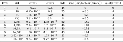
[.tex]
[.pdf]
% requires \usepackage{booktabs,colortbl}
\pgfplotstabletypeset[
every even row/.style={
before row={\rowcolor[gray]{0.9}}},
every head row/.style={
before row=\toprule,after row=\midrule},
every last row/.style={
after row=\bottomrule},
]
{pgfplotstable.example1.dat}

[.tex]
[.pdf]
\pgfplotstabletypeset[
% suppress the leading row 'col1 col2 col3':
every head row/.style={output empty row},
col sep=comma,
columns/col1/.style={string type,column type=r},
columns/col2/.style={string type,column type=l},
columns/col3/.style={string type,column type=l},
]
{
col1,col2,col3
Col A,B,C
The first column,E,F
}
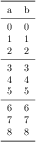
[.tex]
[.pdf]
\pgfplotstabletypeset[
every nth row={3}{before row=\midrule},
every head row/.style={
before row=\toprule,after row=\midrule},
every last row/.style={
after row=\bottomrule},
]{
a b
0 0
1 1
2 2
3 3
4 4
5 5
6 6
7 7
8 8
}

[.tex]
[.pdf]
\pgfplotstabletypeset[
every nth row={3[+1]}{before row=\midrule},
]{
a b
0 0
1 1
2 2
3 3
4 4
5 5
6 6
7 7
8 8
9 9
10 10
}

[.tex]
[.pdf]
\pgfplotstabletypeset[
col sep=&,row sep=\\]{
colA & colB & colC \\
11 & 12 & 13 \\
21 & 22 & 23 \\
}

[.tex]
[.pdf]
\pgfplotstabletypeset[
every row 1 column 2/.style={/pgf/number format/sci},
every row 0 column 0/.style={postproc cell content/.style={@cell content=\textbf{##1}}},
col sep=&,row sep=\\]{
colA & colB & colC \\
11 & 12 & 13 \\
21 & 22 & 23 \\
}

[.tex]
[.pdf]
\pgfplotstabletypeset[
every row 1 column colB/.style={string replace*={2}{4}},
every row 0 column colA/.style={preproc/expr={##1*8}},
col sep=&,row sep=\\]{
colA & colB & colC \\
11 & 12 & 13 \\
21 & 22 & 23 \\
}
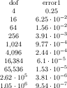
[.tex]
[.pdf]
\pgfplotstabletypeset[
columns={dof,error1},
outfile=pgfplotstable.example1.out.tex]
{pgfplotstable.example1.dat}
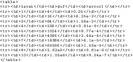
[.tex]
[.pdf]
\pgfplotstabletypeset[
begin table={
},
typeset cell/.style={
/pgfplots/table/@cell content={
#1 | }
},
before row=
,after row=
,
skip coltypes, typeset=false,
verbatim,% configures number printer
TeX comment=,
columns={level,dof,error1},
outfile=pgfplotstable.example1.out.html,
]{pgfplotstable.example1.dat}
\lstinputlisting
[basicstyle=\ttfamily\footnotesize]
{pgfplotstable.example1.out.html}
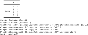
[.tex]
[.pdf]
% An example how to use
% \usepackage{multirow} and
% \usepackage{booktabs}:
\pgfplotstabletypeset[
columns/Z/.style={
column name={},
assign cell content/.code={% use \multirow for Z column:
\ifnum\pgfplotstablerow=0
\pgfkeyssetvalue{/pgfplots/table/@cell content}
{\multirow{4}{*}{##1}}%
\else
\pgfkeyssetvalue{/pgfplots/table/@cell content}{}%
\fi
},
},
% use \booktabs as well (compare examples above):
every head row/.style={before row=\toprule,after row=\midrule},
every last row/.style={after row=\bottomrule},
row sep=\\,col sep=&,
outfile=pgfplotstable.multirow.out,% write it to file
]{% here: inline data in tabular format:
Z & a & b \\
data & 1 & 2 \\
& 3 & 4 \\
& 5 & 6 \\
& 7 & 8 \\
}
% ... and show the generated file:
\lstinputlisting[basicstyle=\footnotesize\ttfamily]{pgfplotstable.multirow.out}
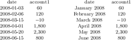
[.tex]
[.pdf]
% Requires
% \usepackage{pgfcalendar}
\pgfplotstableset{columns={date,account1}}
% plotdata/accounts.dat contains:
%
% date account1 account2 account3
% 2008-01-03 60 1200 400
% 2008-02-06 120 1600 410
% 2008-03-15 -10 1600 410
% 2008-04-01 1800 500 410
% 2008-05-20 2300 500 410
% 2008-06-15 800 1920 410
% Show the contents in `string type':
\pgfplotstabletypeset[
columns/date/.style={string type}
]{plotdata/accounts.dat}
\hspace{1cm}
% Show the contents in `date type':
\pgfplotstabletypeset[
columns/date/.style={date type={\monthname\ \year}}
]{plotdata/accounts.dat}
[.tex]
[.pdf]
\pgfplotstabletypeset[columns={level,dof}]
{pgfplotstable.example1.dat}
\pgfplotstabletypeset[
columns={level,dof},
columns/level/.style={string replace={A}{B}}, % does nothing because there is no cell 'A'
columns/dof/.style={string replace={256}{-42}}] % replace cell '256' with '-42'
{pgfplotstable.example1.dat}

[.tex]
[.pdf]
\pgfplotstabletypeset[
string replace*={2}{6},
col sep=&,row sep=\\]{
colA & colB & colC \\
11 & 12 & 13 \\
21 & 22 & 23 \\
}
[.tex]
[.pdf]
\pgfplotstabletypeset[
columns={level},
columns/level/.style={
column name={$2\cdot \text{level}+4$},
preproc/expr={2*##1 + 4}
}
]
{pgfplotstable.example1.dat}
[.tex]
[.pdf]
\pgfplotstableset{
columns={error1,sqrterror1},
create on use/sqrterror1/.style={create col/copy=error1},
columns/error1/.style={column name=$\epsilon$},
columns/sqrterror1/.style={sqrt,column name=$\sqrt \epsilon$},
sci,sci 10e,precision=3,sci zerofill
}
\pgfplotstabletypeset{pgfplotstable.example1.dat}
[.tex]
[.pdf]
\pgfplotstableset{
columns={dof,error2,slopes2},
columns/error2/.style={sci,sci zerofill},
columns/slopes2/.style={dec sep align,empty cells with={\ensuremath{-}}},
create on use/slopes2/.style=
{create col/gradient loglog={dof}{error2}}}
\pgfplotstabletypeset{pgfplotstable.example1.dat}
\pgfplotstabletypeset[columns/slopes2/.append style={multiply -1}]
{pgfplotstable.example1.dat}
[.tex]
[.pdf]
% requires \usepackage{booktabs}
\pgfplotstabletypeset[
every head row/.style={
before row=\toprule,after row=\midrule},
every last row/.style={
after row=\bottomrule},
row predicate/.code={%
\ifnum#1>4\relax
\ifnum#1<8\relax
\pgfplotstableuserowfalse
\fi
\fi}
]
{pgfplotstable.example1.dat}
[.tex]
[.pdf]
% requires \usepackage{booktabs}
\pgfplotstabletypeset[
every head row/.style={
before row=\toprule,after row=\midrule},
every last row/.style={
after row=\bottomrule},
skip rows between index={2}{4},
skip rows between index={7}{9}
]
{pgfplotstable.example1.dat}
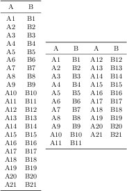
[.tex]
[.pdf]
% requires \usepackage{booktabs}
\pgfplotstableset{
every head row/.style={before row=\toprule,after row=\midrule},
every last row/.style={after row=\bottomrule}}
\pgfplotstabletypeset[string type]{pgfplotstable.example2.dat}%
~
\pgfplotstabletypeset[
columns={A,B,A,B},
display columns/0/.style={select equal part entry of={0}{2},string type},% first part of `A'
display columns/1/.style={select equal part entry of={0}{2},string type},% first part of `B'
display columns/2/.style={select equal part entry of={1}{2},string type},% second part of `A'
display columns/3/.style={select equal part entry of={1}{2},string type},% second part of `B'
]
{pgfplotstable.example2.dat}

[.tex]
[.pdf]
% requires \usepackage{eurosym}
\pgfplotstabletypeset[
column type=r,
columns={dof,info},
columns/info/.style={
% stupid example for multiple postprocessors:
postproc cell content/.append style={
/pgfplots/table/@cell content/.add={$\bf}{$},
},
postproc cell content/.append style={
/pgfplots/table/@cell content/.add={}{\EUR{}},
}
}]
{pgfplotstable.example1.dat}
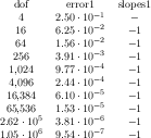
[.tex]
[.pdf]
\pgfplotstableset{
create on use/slopes1/.style=
{create col/gradient loglog={dof}{error1}}}
\pgfplotstabletypeset[
columns={dof,error1,slopes1},
columns/error1/.style={sci,sci zerofill},
columns/slopes1/.style={
postproc cell content/.append code={%
\ifnum\pgfplotstablerow=0
\pgfkeyssetvalue{/pgfplots/table/@cell content}{\ensuremath{-}}%
\fi
}%
}]
{pgfplotstable.example1.dat}
[.tex]
[.pdf]
% Requires
% \usepackage{pgfcalendar}
% plotdata/accounts.dat contains:
%
% date account1 account2 account3
% 2008-01-03 60 1200 400
% 2008-02-06 120 1600 410
% 2008-03-15 -10 1600 410
% 2008-04-01 1800 500 410
% 2008-05-20 2300 500 410
% 2008-06-15 800 1920 410
\pgfplotstabletypeset[
columns={date,account1},
column type=r,
columns/date/.style={date type={\monthname\ \year}},
columns/account1/.style={fonts by sign={}{\color{red}}}
]
{plotdata/accounts.dat}

[.tex]
[.pdf]
% this key setting could be provided in the document's preamble:
\pgfplotstableset{
% define how the 'new' column shall be filled:
create on use/new/.style={create col/set list={4,5,6,7,...,10}}}
% create a new table with 11 rows and column 'new':
\pgfplotstablenew[columns={new}]{11}\loadedtable
% show it:
\pgfplotstabletypeset[empty cells with={---}]\loadedtable
[.tex]
[.pdf]
% create a new table with 11 rows and column 'new':
\pgfplotstablenew[
% define how the 'new' column shall be filled:
create on use/new/.style={create col/expr={factorial(15+\pgfplotstablerow)}},
columns={new}]
{11}
\loadedtable
% show it:
\pgfplotstabletypeset\loadedtable
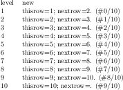
[.tex]
[.pdf]
\pgfplotstableread{pgfplotstable.example1.dat}\loadedtable
\pgfplotstablecreatecol[
create col/assign/.code={%
\getthisrow{level}\entry
\getnextrow{level}\nextentry
\edef\entry{thisrow=\entry; nextrow=\nextentry.
(\#\pgfplotstablerow/\pgfplotstablerows)}%
\pgfkeyslet{/pgfplots/table/create col/next content}\entry
}]
{new}\loadedtable
\pgfplotstabletypeset[
column type=l,
columns={level,new},
columns/new/.style={string type}
]\loadedtable
[.tex]
[.pdf]
% requires \usepackage{array}
\pgfplotstableset{% could be used in preamble
create on use/quot1/.style=
{create col/quotient={error1}}}
\pgfplotstabletypeset[
columns={error1,quot1},
columns/error1/.style={sci,sci zerofill},
columns/quot1/.style={dec sep align}]
{pgfplotstable.example1.dat}
[.tex]
[.pdf]
\pgfplotstableset{
create on use/my new col/.style={create col/set={--empty--}},
columns/my new col/.style={string type}
}
\pgfplotstabletypeset[
columns={level,my new col},
]{pgfplotstable.example1.dat}
[.tex]
[.pdf]
\pgfplotstableset{
create on use/my new col/.style={
create col/set list={A,B,C,4,50,55,...,100}},
columns/my new col/.style={string type}
}
\pgfplotstabletypeset[
columns={level,my new col},
]{pgfplotstable.example1.dat}
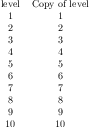
[.tex]
[.pdf]
\pgfplotstableset{
create on use/new/.style={create col/copy={level}}
}
\pgfplotstabletypeset[
columns={level,new},
columns/new/.style={column name=Copy of level}
]{pgfplotstable.example1.dat}
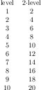
[.tex]
[.pdf]
\pgfplotstableset{
create on use/new/.style={
create col/expr={\thisrow{level}*2}}
}
\pgfplotstabletypeset[
columns={level,new},
columns/new/.style={column name=$2\cdot $level}
]{pgfplotstable.example1.dat}
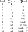
[.tex]
[.pdf]
\pgfplotstableset{
create on use/new/.style={
create col/expr={\pgfmathaccuma + \thisrow{level}}},
create on use/new2/.style={
create col/expr accum={\pgfmathaccuma * \thisrow{level}}{1}%<- start with `1'
}
}
\pgfplotstabletypeset[
columns={level,new,new2},
columns/new/.style={column name=$\sum$level},
columns/new2/.style={column name=$\prod$level}
]{pgfplotstable.example1.dat}
[.tex]
[.pdf]
% requires \usepackage{array}
\pgfplotstableset{% configuration, for example, in preamble:
create on use/quot1/.style={create col/quotient=error1},
create on use/quot2/.style={create col/quotient=error2},
columns={error1,error2,quot1,quot2},
%
% display styles:
columns/error1/.style={sci,sci zerofill},
columns/error2/.style={sci,sci zerofill},
columns/quot1/.style={dec sep align},
columns/quot2/.style={dec sep align}
}
\pgfplotstabletypeset{pgfplotstable.example1.dat}
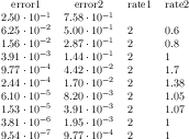
[.tex]
[.pdf]
% requires \usepackage{array}
\pgfplotstabletypeset[% here, configuration options apply only to this single statement:
create on use/rate1/.style={create col/dyadic refinement rate={error1}},
create on use/rate2/.style={create col/dyadic refinement rate={error2}},
columns={error1,error2,rate1,rate2},
columns/error1/.style={sci,sci zerofill},
columns/error2/.style={sci,sci zerofill},
columns/rate1/.style={dec sep align},
columns/rate2/.style={dec sep align}]
{pgfplotstable.example1.dat}
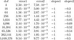
[.tex]
[.pdf]
% requires \usepackage{array}
\pgfplotstableset{% configuration, for example in preamble:
create on use/slopes1/.style={create col/gradient loglog={dof}{error1}},
create on use/slopes2/.style={create col/gradient loglog={dof}{error2}},
columns={dof,error1,error2,slopes1,slopes2},
% display styles:
columns/dof/.style={int detect},
columns/error1/.style={sci,sci zerofill},
columns/error2/.style={sci,sci zerofill},
columns/slopes1/.style={dec sep align},
columns/slopes2/.style={dec sep align}
}
\pgfplotstabletypeset{pgfplotstable.example1.dat}
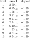
[.tex]
[.pdf]
% requires \usepackage{array}
\pgfplotstableset{% configuration, for example in preamble:
create on use/slopes1/.style={create col/gradient semilogy={level}{error1}},
columns={level,error1,slopes1},
% display styles:
columns/level/.style={int detect},
columns/error1/.style={sci,sci zerofill,sci subscript},
columns/slopes1/.style={dec sep align}
}
\pgfplotstabletypeset{pgfplotstable.example1.dat}

[.tex]
[.pdf]
% load table from somewhere:
\pgfplotstableread{
x y
1 1
2 4
3 9
4 16
5 25
6 36
}\loadedtbl
% create the `regression' column:
\pgfplotstablecreatecol[linear regression]
{regression}
{\loadedtbl}
% store slope
\xdef\slope{\pgfplotstableregressiona}
\pgfplotstabletypeset\loadedtbl\\
The slope is `\slope'.
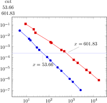
[.tex]
[.pdf]
\pgfplotstablenew[
create on use/cut/.style={create col/function graph cut y=
{2.5e-4} % search for fixed L2 = 2.5e-4
{x=Basis,y=L2,ymode=log,xmode=log} % double log, each function is L2(Basis)
% now, provide each single function f_i(Basis):
{{table=plotdata/newexperiment1.dat},{table=plotdata/newexperiment2.dat}}
},
columns={cut}]
{2}
\loadedtable
% Show the data:
\pgfplotstabletypeset{\loadedtable}
\begin{tikzpicture}
\begin{loglogaxis}
\addplot table[x=Basis,y=L2] {plotdata/newexperiment1.dat};
\addplot table[x=Basis,y=L2] {plotdata/newexperiment2.dat};
\draw[blue!30!white] (axis cs:1,2.5e-4) -- (axis cs:1e5,2.5e-4);
\node[pin=-90:{$x=53.66$}] at (axis cs:53.66,2.5e-4) {};
\node[pin=45:{$x=601.83$}] at (axis cs:601.83,2.5e-4) {};
\end{loglogaxis}
\end{tikzpicture}

[.tex]
[.pdf]
\pgfplotstablenew[
% same as above...
create on use/cut/.style={create col/function graph cut y=
{2.5e-4}% search for fixed L2 = 2.5e-4
{x=Basis,y=L2,ymode=log,xmode=log,
foreach={\i in {1,2}}{plotdata/newexperiment\i.dat}}%
{}% just leave this empty.
},
columns={cut}]
{2}
\loadedtable
% Show the data:
\pgfplotstabletypeset{\loadedtable}
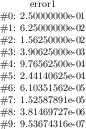
[.tex]
[.pdf]
\pgfplotstableread{pgfplotstable.example1.dat}\loadedtable
\pgfplotstablemodifyeachcolumnelement{error1}\of\loadedtable\as\cell{%
\edef\cell{\#\pgfplotstablerow: \cell}%
}
\pgfplotstabletypeset[columns=error1,string type]{\loadedtable}

[.tex]
[.pdf]
\pgfplotstabletypeset[string type]{pgfplotstable.example3.dat}
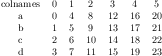
[.tex]
[.pdf]
\pgfplotstabletranspose\loadedtable{pgfplotstable.example3.dat}
\pgfplotstabletypeset[string type]\loadedtable
[.tex]
[.pdf]
\pgfplotstabletranspose[colnames from=c]\loadedtable{pgfplotstable.example3.dat}
\pgfplotstabletypeset[string type]\loadedtable
[.tex]
[.pdf]
\pgfplotstabletranspose[input colnames to=Input]\loadedtable{pgfplotstable.example3.dat}
\pgfplotstabletypeset[string type]\loadedtable
[.tex]
[.pdf]
\pgfplotstabletranspose[input colnames to=]\loadedtable{pgfplotstable.example3.dat}
\pgfplotstabletypeset[string type]\loadedtable
[.tex]
[.pdf]
\pgfplotstabletranspose[columns={a,b}]\loadedtable{pgfplotstable.example3.dat}
\pgfplotstabletypeset[string type]\loadedtable
[.tex]
[.pdf]
\pgfplotstablesort\result{%
a b c
19 2 [a]
-6 -14 [b]
4 -14 [c]
-11 -9 [d]
11 14 [e]
-9 -9 [f]
1 13 [g]
8 -10 [h]
16 18 [i]
19 -6 [j]
}
\pgfplotstabletypeset[columns/c/.style={string type}]{\result}%
[.tex]
[.pdf]
\pgfplotstablesort[sort cmp=string <]\result{% 'Header' is the column name:
Header
the
quick
brown
fox
jumps
over
the
lazy
dog
}
\pgfplotstabletypeset[string type]{\result}%