HISTORY:
UNSTABLE:
- repaired linux file permissions in release artifact
1.18
- new feature: 'contour lua', implemented and contributed by Francesco Poli
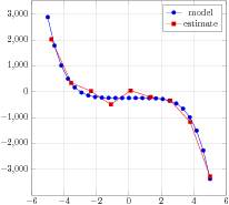
- new feature: ignore empty coordinates when computing regression lines
- new feature: improve log-regression fitting of exponential functions (using variance format=linear)
- fixed bug #390: image plots in log mode failed to work. Also fixed issues with mesh/ordering=y varies
- fixed bug #219: handle NaN in stacked plots
1.17
- fixed bug: restore compatibility with pgf/tikz circle syntax inside of pgfplots
- new feature #62: 'coordinate style' which allows to associate options with individual coordinates.
- new feature pgfplotstable: added 'text indicator'
- new feature pgfplotstable: added 'percent is letter' to allow comment chars
within string-based tables
1.16:
- fixed bug #111 [fillbetween] strange behavior when `soft clip` is used and one of the paths touches the axis border
- fixed bug #183: Nan in the first line of a numeric table was interpreted as column name
- fixed bug #187 Wrong output from mod in axis
- fixed bug #109 `visualization depends on` doesn't work with table from pgfplotstable is now fixed for numeric values
- fixed bug: \pgfplotstablenew was unable to create tables with 0 or 1 rows.
- fixed bug: 114 fillbetween suffered from inaccuracy (produced invisible segments)
- fixed bug #139 [fillbetween] numerical issues with dense points
- fixed bug #153: \begin{tikzpicture}[scale=...] combined with fill between or
'set layers' resulted in a wrong bounding box
- \addplot gnuplot: autodetected unbounded coordinates
- new feature: parse tick positions using math parser (tracker #69)
- new feature: programmatic access to axis coordinates for given canvas coordinates (\pgfplotspointgetcoordinates, tracker 68)
- new feature: 'x filter/.append expression', a stackable variant of 'x filter/.expression'
1.15: bugfix release
- fixed regression: fpu caused forest library to fail as soon as one loads pgfplots
- fixed bug #149 : \edef{...\to...} was wrong and caused \pgfplotstablevertcat to fail
- usability: added support for \plotnum during \addplot
- fixed bug 134 [statistics] Histogram with custom `symbolic coords`
- fixed bug 140 (pgfplotstable read does not process empty rows anymore)
- fixed bug 150 Usage of \pgfkeysvalueof in xtick leads to 'Dimension too large'
- fixed bug 105 [manual] `xticklabel pos=upper` is not documented
in fact, some of the documented positions for 'xtick pos' where
unavailable.
- fixed bug 155 [groupplots] `scaled ticks` does not recognize `ticklabels at`
- fixed bug 160 `xticklabels` also used for `extra x tick labels` if they are not given explicitely
- implemented partial solution for bug 154 [log mode] sampling in 2D and 3D different
- fixed bug 163 [bar-chart] bars dissapear when values are >xmax/ymax
- fixed bug 81 cannot use dollar sign as 'comment char'
- fixed bug 91 Hashes in data
- fixed bug 165 [minor ticks] minor tick drawn after the last xtick
- fixed bug 176: 2d plot expression in 3d axis fails for lualatex
1.14
- new feature: 'contour filled' (compat=1.14)
- new feature: building colormaps from other colormaps (see "Building Colormaps based on other Colormaps" in the manual)
- new feature: non-uniform colormaps (compat=1.14)
- new feature: colormaps defined on position of arbitrary magnitude
- new feature: colorbar as legend
- new feature: 'colorbar style={xtick=data}' positions tick labels at colormap positions
- fixed bug: pgfplots now handles incompatible changes of luatex
loading \usepackage{pgfplots} _before_ pgf also allows makes older
PGF versions compatible with luatex
- fixed bug: incompatibility between units + groupplots (bug 119)
- fixed bug: 'axis line shift' did not respect labels
- fixed bug: layers for axis lines were not respected
- fixed bug: two axes with fillbetween in the same picture failed due to clip paths on layers
- fixed bug: quiver plots with 'every arrow' failed to evaluate arrow tip length arguments
- fixed bug: \usepgfplotslibrary{colorbrewer}: colormap 'PuOr' was defined in reverse order
1.13:
- fixed bug: incompatiblity between fillbetween and babel
- fixed bug: 'compat=1.9' (or newer) failed to work with log bar plots
- fixed bug: javascript incompatibility between Acrobat reader DC and clickable lib
- fixed bug in polar axes: repaired default axis label positions
- fixed bug in polar axes: repaired support for sloped descriptions
- fixed bug: 'axis line style={draw=none}' had no effect unless one had 2d boxed axes
- fixed bug: point meta expressions with '=' inside of them which caused compilation errors
- fixed bug: compat=1.12 combined with interrupted plots (by empty line) failed to work
- fixed bug: compat=1.12 combined with lualatex evaluated relational operations (<, ==) with the wrong operator precedence
- fixed bug: fixed floor and ceil functions
- fixed bug: 'set layers' broke alignment features with different manifestations
('set layers' together with fill between in group plots, together with at={} key, together with anchor)
- fixed bug: fill between and group plots: fill-between graphics was missing (list of layers was lost)
- fixed bug: \addplot graphics {\newFile{P.pdf}}; failed to properly expand the file name
- fixed bug: fill between + error bars resulted in compilation error
- fixed bug: stacked plots occasionally used a wrong coordinate mapping
- fixed bug: provided suitable default legends for xbar and xbar stacked
- fixed bug: 'dateplot' now computes missing 'date ZERO' automatically. 'date ZERO' is managed automatically.
- new feature: Added support for search paths to find data files (table/search path)
- new feature: 'xtick distance' allows to define tick positions by distance
- new feature: "axis line shift=10pt" shifts axis lines together with all their descriptions
- new feature: 'matrix plot' (alias 'imagesc') which allows cell-based matrix plots
- new feature: unbounded point meta in mesh plots will be treated like an invisible patch
- new feature: added high quality colormap 'viridis' (use 'colormap name=viridis' to activate it)
- new feature: ensured that 'shader=flat' returns the same result for every choice of 'z buffer' (starting with compat=1.13)
- new feature: utility function \pgfplotsforeachungrouped: added support for \breakforeach
- new feature: compat=1.13: activates sampling routine with less rounding errors
- new feature: cycle multiindex list (uses the 'ith' element for every provided sub-list)
- new feature: 'color of colormap=<value>' or 'color of colormap=<value> of <colormap name>'
- new feature: 'index of colormap=<value>' or 'index of colormap=<value> of <colormap name>'
- new feature: cycle list={[of colormap]}
- new feature: cycle list={[colors of colormap={0,100,500,100} of viridis]}
- new feature: cycle list={[indices of colormap={0,1,2,3} of hot]}
- new feature: added support for 'stack negative=on previous|separate' which allows separate plots for '+' and '-' (useful for bar plots)
- new feature: added support for 'colormap access=direct' combined with 'shader=flat mean' and 'shader=interp':
it previously used to interpolate indices instead of colors
- new feature: \closedcycle now produces useful results for 3d line plots
- new feature: added \usetikzlibrary{colorbrewer} and \usepgfplotslibrary{colorbrewer}
- new feature: added 'colormap access=piecewise constant'
- new feature: added rudimentary support for "Filled Contours" (based on 'colormap access=piecewise constant')
- new feature: added methods to build colormaps based on other colormaps using
"color of colormap", "index of colormap", "colors of colormap", "samples of colormap", and "indices of colormap"
1.12.1: minor bugfix release
- fixed bug: incompatibility of 1.12 with unicode-math
- fixed bug: lua backend failed to work with table input and dependency on \coordindex
- fixed bug: lua backend failed with 'forget plot'
1.12: scalability + performance
- scalability: reduced TeX memory consumption for huge inline tables
- scalability: lualatex allows bigger 3d graphics
- scalability: lualatex now reduces compilation time for huge 3d graphics
(requires \pgfplotsset{compat=newest} at the time of this writing)
surf shader=faceted: time reduced to 61% of pdflatex
(\addplot3[surf,samples=70] {exp(-x^2-y^2 +x*y)})
surf shader=interp: time reduced to 25% of pdflatex
(\addplot3[surf,shader=interp,samples=70] {exp(-x^2-y^2 +x*y)})
surf shader=interp, parametric: time reduced to 36% of pdflatex
(\addplot3[surf,shader=interp,z buffer=sort, samples=50,domain=-1:0,y domain=0:2*pi] ({sqrt(1-x^2) * cos(deg(y))}, {sqrt( 1-x^2 ) * sin(deg(y))}, x);)
surf shader=faceted, parametric: time reduced to 40% of pdflatex
(\addplot3[surf,z buffer=sort, samples=50,domain=-1:0,y domain=0:2*pi] ({sqrt(1-x^2) * cos(deg(y))}, {sqrt( 1-x^2 ) * sin(deg(y))}, x);)
- scalability: lualated now reduces compilation time for boxplots.
10000 input points from table: time reduced to 23% of pdflatex
- fixed bug: 3d axes where all axes used log scale produced compile failure
- fixed bug: axis equal did not respect "disabledatascaling"
- fixed bug: mesh legend was confused by color input=explicit
- fixed bug: colorbar style did not reset zmin/zmax
- fixed bug: memory allocation in FPU consumed too much memory
- fixed bug: boxplots: removed compilation error due to spurious spaces in options list
- fixed bug: boxplots: now uses standard quantile estimators: has all 9 estimators of R and uses the same as in Excel as default (as of compat=1.12)
- fixed bug: boxplots: sometimes failed to compute boxplot statistics for special inputs
- fixed bug: boxplots: now, it sets 'mark=*' for outliers if there is no mark (compat=1.12)
- fixed regression: compat=1.11 broke arcs inside of axis
- new feature: ensured that arcs inside of axis make use of 'axis cs' and 'axis direction cs' automatically
- new feature: ensured that (0:1) is evaluated with axis cs
- fixed bug: precision of transformation cartesian to polar was too low (added atan2 to fpu)
- fixed bug: z buffer caused 'mesh legend' to produce a compile error
- new feature: added 'y filter/.expression={y==3 ? nan : y}' to simplify coordinate filters
1.11: usability + bug fixes.
- new feature: "hide obscured x ticks=false" to disable the feature which hides ticks
- simplified UI for symbolic coords: now, it accepts unexpandable
dictionary entries including umlauts, undefined macros, math mode, ...
- simplified UI for symbolic coords: added magic prefix
[normalized]<number> to allow something like xmin={[normalized]0.7}
- simplified UI for custom annotations: one does not need to say "axis cs" any longer;
coordinates like (1,2) are now automatically interpreted as (axis cs:1,2)
- new feature: 'type ticklabels with struts' improves baseline alignment of tick labels
- new feature: 'trig format plots=rad' allows to use radians in trigonometric evaluations
- simplified 'external lib': added driver auto-detection for pdflatex, lualatex, xelatex, dvips
(\usepgfplotslibrary{external}, or, with the next PGF release, \usetikzlibrary{external})
- simplified UI for \addplot coordinates: now, it expands macros as it goes.
- new feature: 'intersection segments' now accepts negative indices to count from the last backwards
- simplified UI: 'intersection segments' now accepts new syntax with 1-based indices (old 0-based are still supported)
- fixed bug: fillbetween has had a problem with pins on input paths
- fixed bug: now, 'stacked ignores zero' is no longer applied to error bars.
- fixed bug: tick lines were drawn incorrectly for centered axis lines in 3d
- fixed bug: variable=u failed to work in some contexts
- fixed bug: fill between implicitly activated layers, but did not install the
correct layers for grid lines etc.
- fixed bug: z grid style was applied to y grid style
- fixed bug: using 'x=1cm' failed to work in axis descriptions (legends)
- fixed bug: mesh legend failed to work with 'shader=interp'
- fixed bug: bounding box of shader=interp was wrong if there were transformations.
- fixed bug: added support for \addplot graphics in ConTeXt
- fixed bug: external lib failed to work with dvips (since PGF 3.0.0 I suppose); now it produces correct bounding boxes
- fixed bug: \pgfplotstablenew can now overwrite existing tables.
- fixed bug: extra ticks near intersections of axis lines were hidden
- fixed bug: 'intersection segments' did not work with '--cycle'
- fixed bug: 'intersection segments' did not update the last tikz point
- fixed bug: tick lines/grid lines have been clipped when they were near the boundary
- fixed bug: soft clip decoration failed to apply the transformation matrix
- fixed bug: polar axes and units library resulted in broken bounding box
- fixed bug: \addplot[stack plots=false] used to work up to 1.8, but failed until now. Fixed.
- fixed bug: hist/density was broken since some time
1.10:
- new feature: fill between plots (library fillbetween)
- new feature: concatenate intersection segments (library fillbetween)
- fixed bug: xelatex failed to run contour external
- fixed incompatibility with \label and \usepackage{mcaption}
- fixed bug: histograms produced wrong point meta
- fixed bug: histograms reported the wrong 'plot name' and confused shifts of bar plots
1.9:
- new feature: asymmetric error bars
- new feature: activated math parser for axis limit arguments, arguments in axis cs, and domain argument in log plots
- new feature: stacked bar plots place their 'nodes near coords' correctly in the middle and print the increment (compat=1.9)
- new feature: stacked bar plots suppress empty increments (compat=1.9).
- new feature: 'scatter/position=relative|absolute' allow to position 'nodes near coords' absolutely.
use-case: bar plots + nodes near coords which are at, say, y=0 rather than their y value
- new feature: integration of smooth shadings & auto-CMYK conversion
\usepackage[cmyk]{xcolor} or \selectcolormodel{cmyk} will reconfigure pgfplots to use CMYK (document-wide)
- new feature (advanced audience only): programmatic access to data coordinates during the visualization phase
-> allows much more customization for error bars, stacked plots, nodes near coords.
- wrote beginner tutorials
- fixed bug: error bars and point meta did not work together
- fixed bug: stacked plots did not respect 'visualization depends on'
- fixed bug: luatex 0.76 is not backwards compatible; added version switch
- fixed bug: ternary library precision has been improved
- fixed bug: problem with axis limits very close to 0
- fixed bug: colormap specification limit case produced out of bounds exception
1.8:
- new feature: tight bounding box even if the axis is no box and bb excludes clip path
- new feature: mesh/color input=explicit
- new feature: shader=interp now has drivers for both dvipdfmx and xetex
- new feature: support for more color spaces in colormap definitions
- new feature: shader=interp and device-level gray colorspaces
- new feature: 'contour/contour dir=[xyz]' to draw contours in different directions
- new feature: statistics library with boxplot handler (both boxplot prepared and automatic computation)
- fixed bug: 3d centered axis lines and label placement (requires compat=1.8 or higher)
- fixed bug: axis lines and placement of labels, tick scale labels, and reversed axes
(requires compat=1.8 or higher)
- fixed bug: filtering out coords from a mesh plot failed
- fixed bug: every legend image post was not respected inside of \ref{plotlabel}
- fixed bug: high-order patches computed the shader=flat mean in a wrong way.
- fixed bug: remember picture inside of pgfplots axes failed (due to cell picture)
- fixed bug: now, the tick scale label will be omitted if there are no ticks
- fixed bug: axis box path was not closed
- fixed bug: the bounding box was non-empty even if the axis was hidden.
- fixed bug: auto-alignment of nodes near coords failed for xbar plots
- fixed bug: providing bar width / bar shift in terms of axis units did
not work with [xy]bar and nodes near coords
- fixed bug: transformation 'data cs=cart' -> polar is more robust now
- fixed bug: code did not compile against pgf 2.00
- fixed bug: patch plot lib and shader=interp,patch type=biquadratic
- fixed bug: context path searching issue (pgfplots.lua)
- fixed bug: shader=interp and dvips driver
- fixed bug: error bars with explicit relative input failed
1.7
- added feature: 'bar shift' and 'bar width' can now be expressed in terms of axis units (compat=1.7 or higher)
- fixed incompatibility regression pgfplots 1.6.1 pgf 2.10: layers
- fixed incompatibility pgfplots and imakeidx
- added feature: 'enlargelimits={abs=1cm}', i.e. enlarge by dimension rather than unit
- patchplots lib: added patch type=bicubic
- patchplots lib: added support for global paths (fillable)
- patchplots lib: added patch type sampling feature
- patchplots lib: improved usability (documentation and improvements)
- fixed path issues in context: moved lua input file to tex/generic
- fixed bug: \ref{legendimage} inside of legend text was wrong.
1.6.1:
- fixed incompatibility lualatex,shader=interp, and german package (introduced in 1.6)
1.6:
- added support for layered graphics (main use case: multiple axes and layers)
- added support for second colormap in mesh plots (mesh/interior colormap name)
- added support for scopes inside of axes
- contour plots: added ability to provide list of discrete labels (mesh/levels)
- empty lines are interpreted as interruptions in data plots (was undocumented since 1.4)
- added more scaling options to 'scale mode=scale uniformly' (affects axis equal in 3d
and \addplot3 graphics)
- fixed wrong implementation of 'axis equal' and 'unit vector ratio' in 3d
(backwards compatible for 2d, but not for 3d - the 3d implementation was plain wrong)
- fixed incompatibility of lualatex and shader=interp
- fixed bugs/added features around \addplot3 graphics
- fixed bug: colorbar did not support ymode=log
- fixed a couple of minor bugs
- fixed bounding box computation for clip=false,axis lines=none
1.5.1:
- more operations for FPU library (==, !=,<=,>=,?)
- fixed bug in usage of decorations in \addplot
- bugfix for contour prepared format=matlab
- added 'const plot mark mid' and 'jump mark mid' plot handlers
- nodes on a plot (\addplot ... node[pos=<fraction>] {};)
- 'trim axis group left' and 'trim axis group right'
- bugfixes for polar axes and log+stacked plots
- added style 'log ticks with fixed point'
- introduced patched tikz paths to simplify circles and ellipses within an axis
- patchplots lib: patch type=polygon
- some more bugfixes
1.5:
- Contour plots,
- Histograms,
- Quiver plots,
- patch plots (library)
- Triangle Meshes
- Bilinear Elements
- Quadratic Triangles
- Biquadratic Quadrilaterals
- Coons Patches
- Discrete colorbars,
- Table sorting,
- Linear regression,
- Ternary diagrams,
- Tieline Plots
- Smith Charts
- Polar axes,
- Empty lines in input files result in interrupted plots,
- PDF user defined coordinate mouse popups
- CMYK colormaps and shadings,
- new markers and cycle lists
- access to axis limits,
- \addplot3 graphics: pgfplots draws an appropriate axis for a three-dimensional(!) external png graphics
- 3D axes: support to provide explicit unit vectors:
- explicit unit vectors
- explicit unit vectors which are uniformly rescaled to match width/height
- 3D axes: improved support for unit vector ratios
- improvements of the groupplot styles
- preliminary support for (2d) bar plots in 3d axes
- new shader 'faceted interp'
- table package:
- 'every nth row' style
- 'comment chars' key to define comment characters in input files
- 'skip first n' style
- lots of smaller bugfixes (see ChangeLog for details)
1.4.1:
- improved compatibility to gnuplot 4.4
1.4:
Version 1.4 contains several new features, mostly work on details.
It fixes many bugs and provides the following improvements:
- detached legends
- detached colorbars
- ybar (and similar plots) can now be mixed with other plot types
like line plots.
- improved legend formatting
- added 'restrict x to domain*' which cups coordinates outside of a specified domain (same for y and z)
- Added support for linear regression
- Inline tables,
- Lots of bug fixes
The next version will make a greater step when it is stable.
1.3.1:
Version 1.3.1 is a bugfix release containing
- improved parametric plots with gnuplot
- improved normalsize, small and footnotesize scale styles and added tiny
- a lot of bugfixes
1.3:
- improvements for two dimensional visualization, among them
- axis equal,
- color bars,
- nodes near coords,
- jumps in plots,
- improved description positioning,
- reverseable axis directions,
- simpler alignment of adjacent axes,
- units and a simplified user interface,
- new three dimensional line, scatter, mesh and surface plots,
- a copy of the automatic pdf externalization library,
- an improved manual enhanced with a lot of pdf cross references.
1.2.2:
- fixed a problem with the samples key,
- provides some smaller fixes and some manual improvements.
- added plot graphics.
1.2:
- completely rewritten math expression parser with extended data range,
- colormaps for scatter plots
- fine tuning for plot parameters.
- table package has been extended and is now a fully featured table typesetting, computing and postprocessing tool.
|